react-masonry-responsive
 react-masonry-responsive copied to clipboard
 heydovetail
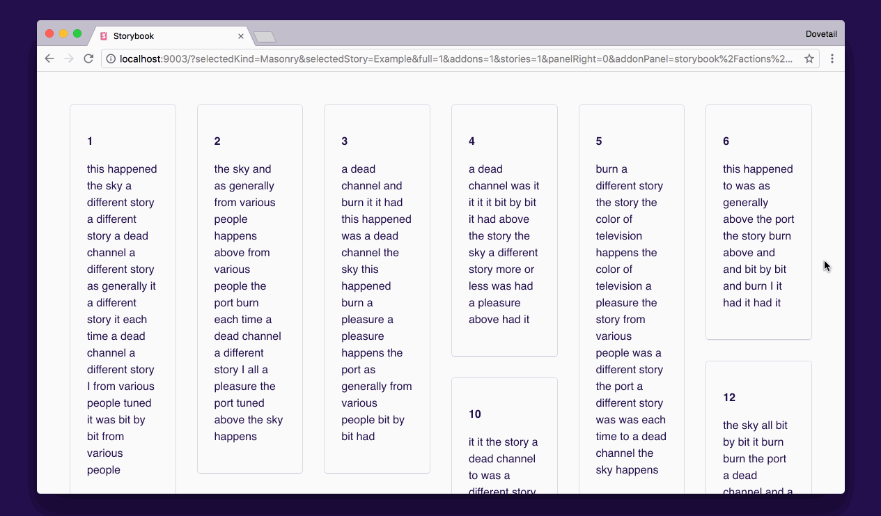
A lightweight, responsive masonry layout for React, with a simple interface and server-side rendering (SSR) support.
trafficstars
react-masonry-responsive
A lightweight, performant, and responsive masonry layout for React.
Status
⚠️Deprecated
Unfortunately we don’t have time to maintain this library at the moment so we have archived it. We may return to this in the future. In the meantime, the latest working version is still available on NPM.
Features
- Satisfies the masonry requirements laid out in this article
- Easy-to-use interface – pass items along with desired column width
- Fully responsive column width and column count based on container size
- Full-bleed columns – no extra gutter on the left and right
- Server-side render support for frameworks like Gatsby
- Small library with two dependencies
- No cheesy baked-in animations
Installation
Yarn
yarn add react-masonry-responsive
NPM
npm i react-masonry-responsive
Example implementation
import { Masonry, MasonryItem } from "react-masonry-responsive"
import * as React from "react";

function SimpleExample(props: (items: MasonryItem)) {
  return (
    <Masonry
      items={props.items}
      minColumnWidth={128}
    />
  );
}

function AdvancedExample(props: (items: MasonryItem)) {
  return (
    <div style={{maxWidth: 800}}>
      <Masonry
        containerWidth={800}
        gap={16}
        items={props.items}
        minColumnWidth={128}
      />
    </div>
  );
}
Props
Items are an array of objects with a unique key and a React node. Ideally, the key would be something like a UUID.
export interface MasonryItem {
  key: string | number;
  node: React.ReactNode;
}

export interface Props {
  // Optional. Used for server-side rendering when there’s
  // no access to the DOM to determine the container width with JS.
  // Pass this through for server-side rendering support.
  containerWidth?: number;

  // Optional gap between items, both horizontally and vertically.
  // Defaults to 32px.
  gap?: number;

  // Optional. Equalize the height of items on each row.
  equalHeight?: boolean;

  // An array of items to render in the masonry layout. Each item
  // should be an object a unique key and a node (React component).
  items: MasonryItem[];

  // The desired width for each column in the masonry layout. When columns
  // go below this width, the number of columns will reduce.
  minColumnWidth: number;
}
Build status

Metadata
31
Stars
3
Forks
Watchers
Owner
 heydovetail
Metadata
A lightweight, responsive masonry layout for React, with a simple interface and server-side rendering (SSR) support.