hello
 hello copied to clipboard
Applications menu
Hello!
This operating system looks pretty interesting. I want to suggest a few UI ideas.
First of all, a few words about an application menu. I like the idea of a global menu. Because it is always in sight, you can work with it quickly, thanks to the fact that it is located at the edge of the screen. However, I think the notification area and clock on the right end are redundant there. This area contains items that are not relevant to the application. Also, many applications duplicate themselves there. For example, messengers, that have an icon in the dock (or taskbar) and in the notification area. So, I think that the menu should be exactly the menu, i.e. a list of commands for the application and, maybe for the system, in a small part.
 Another useful thing is the ability to detach a top level menu item. This is not a new idea, something like this has been in GTK a long time, and similar in NeXTSTEP. For example, this is useful for the concept of a spatial file manager because the main window of the file manager only displays the contents of a folder, and links to locations are not a folder content. I also think that there should be no fundamental difference between a menu and a toolbar. Both are a set of commands for the application, the only difference is that there is text in the menu, and icons in the toolbar. Consequently, one can be converted to another through the settings (right click), at the request of the user. For this example, Places panel will contain icons: a house, a screen, etc...
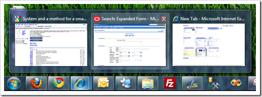
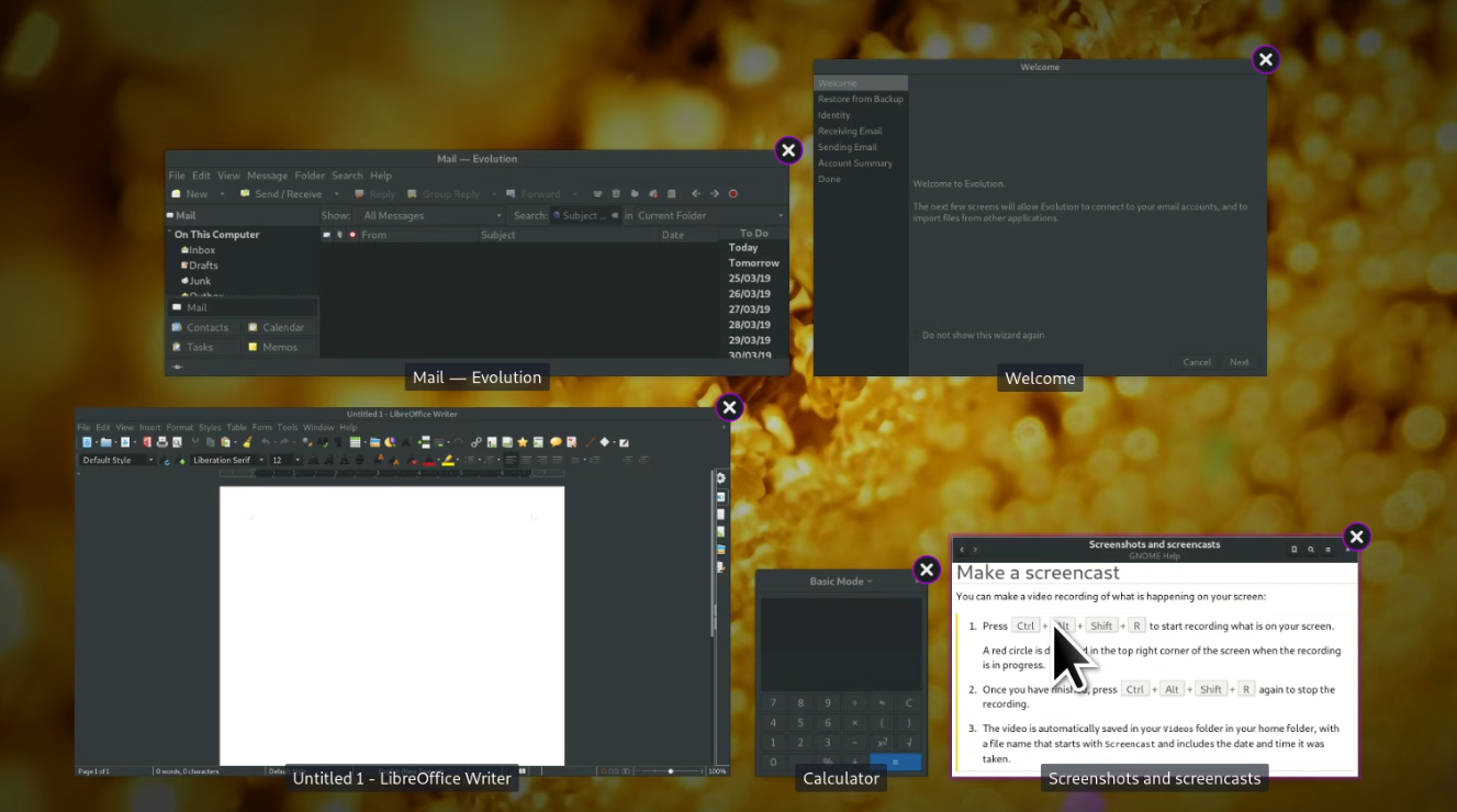
 About the dock. While the application is not running, the icon (launcher, for pinned apps) in the dock is just a placeholder. When the application starts up, it should create a small window to replace the icon. It can be just a picture, or a small useful window, like system load information in CPU Load app. Any item other than an pinned launcher icon in the dock is an application’s small windows. Not the dock draws the icon, but the app.
 There shouldn't be such thing as a special notification area. But should be two areas at the dock: a primary area (big icons on the mockup) and a secondary area (small icons). Each application can be in any of them, but only in one. User can have different options for primary and secondary areas, like that type of notifications show or not, etc..., and can drag apps from one area to another at any time. The dock should send an event to the application like ‘area changed’. So application can adapt content, make it smaller or bigger. For the above example, when moving to the secondary area, CPU Load application may just show "58", because there is no place for the graphics.
Tablet mode. Yes, I have already read about “unwelcome technologies”. But my suggestion won't break the desktop. It is just an another view for same widgets.
 Swipe from the left edge of the screen and here is global menu, right under left thumb. Same thing with the dock on the right side.
hello @ls0h and thanks for sharing your thoughts.
We are thinking of removing the Dock altogether, or at least making it optional.
No one less than Bruce "Tog" Tognazzini, Apple Employee #66 and Apple's first Interaction Designer who was instrumental in the Human Interface Guidelines, provides scientific evidence against the Dock:
https://www.asktog.com/columns/044top10docksucks.html
And here are the famous Human Interface Guidelines:
If you are a designer, a human interface professional, or an engineer, this book contains information you can use to design and create products that fit the Macintosh model. It provides background information that can help you plan and make decisions about your product design. Even if you don’t design and develop products for the Macintosh, reading this book will help you to understand the Macintosh interface.
Source: Apple Computer, Inc., 1992, Macintosh Human Interface Guidelines, First Printing, November 1992. Addison-Wesley Publishing Company. ISBN 0-201-62216-5
Swipe
is not something you do with a mouse...
against the Dock
Thanks for the answer! Interesting text. However, it seems to me that some of the problems from the list have already been solved. For example, document previews were "invented". And, therefore, documents are now easier to distinguish from each other. Actually, I'm not a big fan of the macOS dock. How many times I tried it, it always seemed not customizable enough. Linux has a similar problem with this. So I even created my own dock - DockBarX. Although, it was a very long time ago, and the project is being developed by other people now. But, I think the dock is better than the classic taskbar (like windows 95) in nowadays. Same with old classic Mac OS. The application list in the upper right corner of the screen (as it was introduced with Multi Finder) was convenient then. It's not enough nowadays, because computers now run dozens of applications, each with many windows. The user needs to group it somehow and switch between.
Thanks @ls0h. Indeed things have changed sice the Classic days in how we use computers (but not always for the better). So I am really a bit undecided regarding the Dock. Most likely we should make it optional. Which also means that we need to design the other parts of the system in a way that allows the system to work ergonomically also when there is no Dock.
The application list in the upper right corner of the screen (as it was introduced with Multi Finder) was convenient then. It's not enough nowadays, because computers now run dozens of applications, each with many windows. The user needs to group it somehow and switch between.
How about an Applications menu that shows the applications as menu items, and all windows those applications have open e.g., as submenu items?
I was just thinking about some kind of menu for applications. I asked myself, what do I do more often: switching between applications or using the menu within the application? Switching occurs much more frequently. Therefore, if make a vertical dropdown menu with a list of running applications, items will not be visible until the user clicks on it. User will not know what applications he running. So, better to use horizontal menu:
 Maximized window:
 Menu with a list of windows:
 When user simply clicks on the name of the application, the application is brought to the foreground. If user clicks and pulls down, a menu with a list of windows will appear.
You may notice that the menu of the application itself is no longer at the edge of the screen. It may seem that it will be difficult to review all the app menu items. It doesn't have to be. It can be done so that the cursor sticks to the application menu after pressing the mouse button and until releasing it. It will prevent the user from accidentally clicking into other applications.
P.S.: The advantage of this approach is that if the application does not have a menu, then only the list of applications is shown.
The menu needs to be at the top edge of the screen in order to take advantage of Fitts’s Law; see the section on "Fitts’s Law" on https://asktog.com/atc/principles-of-interaction-design/.
in order to take advantage of Fitts’s Law
This is exactly what I'm talking about. Fitts’s Law, not for the menu, but for switching between applications. There are many applications running on computers nowadays. Switching between applications happens more often than working with menus. How did I write this text? I saw a new message notification (desktop popup), switched to the mail app. I clicked on the link from the email and went to Github in the browser. I wrote some text, checked some words in the dictionary app (my native language is Russian) and switched back to the browser. I have worked with three applications in 5 minutes and have never opened a single menu. So, the list of apps at the top edge of the screen will allow you to switch between apps quickly.
Switching between applications happens more often than working with menus.
Really? Do you have any empirical evidence for this? Indeed, if this is the case then app switching should be implemented in a way that benefits from Fitts’s Law (in this regard, the Dock is not so bad after all). But I'd assume accessing commands within applications is far more frequent than switching between different applications?
If the menu of running applications was to the right end of the screen and could be made to be permanently open, thus it would benefit as much as the dock being at a border screen. It would be closer to the universal menu bar making it faster in the case of switching from menu to dock. It would essentially be a vertical dock as a familiar list of items with icons and text.
Regarding the Dock? Why not look at the way GnuSTEP and Rox deal with the desktop and running apps. The ability to iconify a running application onto the desktop itself is, in my opinion, a beneficial idea. If the Desktop metaphor were to approached logically, then we would look at the fact that, much like a real life desk, the work we do is on the desk, organized into folders or in little bins.
Why not view running applications in the same way? Simply minimize to a desktop icon, and when it's time to work on the file in question, simply click on the icon to activate the window.
Simply minimize to a desktop icon
This may be logical but violates POLA for switchers from the Mac.
Good idea... very clever!
This would be (Classic) Mac-like behavior but slightly extended.
If the menu of running applications was to the right end of the screen and could be made to be permanently open
Are you talking about something like this?

much like a real life desk
When there are a lot of things on a real life desk, It is difficult to find one thing. Try to find a little ticket (app icon) under a stack of papers.
Are you talking about something like this?
...almost: the top menu bar should cover the entire width of the screen, the menu should have some sort of title (either "Applications or - more likely - the name of the currently foremost application). I do like the individual windows being submenus of the application names.
What @velissarious was suggesting is that there should be a way to (optionally!) keep that menu in the open (dropped down) state permanently (until the user chooses to close it). Permanently open menus are not known from the Mac, so we'd need to think how to best enable this (e.g., by adding a checkable menu item "Keep this menu open" at the end?)
Also check the prior art at https://guidebookgallery.org/screenshots/running, specifically under "mac os" and "rhapsody". I think if we implement something like I suggested in the previous post then we'd continue in the same tradition (= no POLA violation for long-time Mac users) but take it to the next level by adding something valuable to it.
Cross-reference: https://github.com/helloSystem/Menu/issues/21

Exactly, but probably on the right-hand side of the screen because we want Search to be the first item (and because of POLA for switchers from Classic Mac).
@ls0h in your example above, the window "Applications" is a window of the application called "Filer". Which makes for an interesting challenge... I'd say let's just use an icon for the menu name, and have "Filer" an item in that menu, and "Applications" a submenu of "Filer",
we want Search to be the first item
I completely agree.
Exactly, but probably on the right-hand side of the screen because
Sorry, I can't understand from the description, what is the difference from https://github.com/helloSystem/hello/issues/148#issuecomment-792967719
Forgive the crudity of the mockup but I hope this explains it:

Notes
- The top-right green icon would be the icon of Filer (the application to which the "Applications" window belongs)
- In the "Filer" submenu, the topmost submenu would be "Applications" (the topmost window regarding its z-stacking that belongs to Filer)
- One should think about the sorting in th Applications menu. Application names sorted by the z-stacking of the windows, or alphabetically?
- Below "Another one", there might be a separator line followed by a "Keep open" menu item that would keep the Applications menu in an opened (dropped down) state all the time, resulting something vaguely similar to BeOS/Haiku's "Tracker" in the upper-right corner of the screen:

Source: https://guidebookgallery.org/screenshots/beos5


Your English is fine :-)
Generally, I like maximising use of space.
Having title bar of a maximised window alongside its menu breaks the wish for its (three) controls to be at, or near, top left.
(I prefer the close control to be adjacent, not faraway.)
Also, there might be difficulty with applications that have a wide array of menus.
An option https://github.com/helloSystem/Menu/issues/48 for the menu to appear on demand would allow the width of the title bar to be maximised.
https://github.com/helloSystem/hello/issues/148#issuecomment-790845397
… list of windows:
:100: to having the menu (list), not a submenu, visible in response to a single click.
I thought that this, or something like it, was discussed a few weeks ago, although I can't find it in GitHub. The closest that I can find is in Matrix:
more importantly i would like to get a Windows menu in (probably showing the name or icon of the fontmost app)
The name, ideally.
Found:
Window menu
switching between 5 open filer windows is a tough use case, which is handled quite well in this example, however the click targets are nested and quite small, so i don't feel it quite fits the "quickly switch to another open application" use case.
classic windows taskbars (pre 7) handled this poorly, either cutting off the name or awkwardly deciding when to stack windows together
windows 7 had a decently elegant solution with taskbar previews
and mac os x at the time still had the "which window is going to open?" feeling when clicking a dock icon. i don't recall that being much of an issue because macs had spaces and expose
gnome overview is pretty nice for the 5 filer windows use case, but it can be jarring having all of your windows fly away just to pull up one you can't see
but, bringing it back to thoughts about the classic mac style app switching
- the icons are small in the mockup, it'd be nice to have them be a bit taller
- long window names can make this really messy
- integrated with search it has the potential to be amazing
Thanks for your toughts @briaguya-ai
the icons are small in the mockup, it'd be nice to have them be a bit taller
The icons should be as large as the application icons in the System menu (and all menus for that matter).
long window names can make this really messy
We need to use QFontMetrics::elidedText to put ... in the middle of window names in this menu if needed.
integrated with search it has the potential to be amazing
Full ack ;) :100:
If case you want to play with the System 7.5 Applications menu, you can do so right in your browser: https://archive.org/details/AppleMacintoshSystem753

after playing around with the system 7.5 menu i have some thoughts on icon sizes
this screenshot is from an instance of 7.5 running at 640x480, my crude measurements put each item within the menu at 130x20
it looks like in 1996 (saw that's when 7.5.5 came out) apple was selling the power mac 5400 AIO. the 5400/1 supported 640x480 at 16 bit color, and up to 800x600 at 8 bit color. the 5400/200 supported 800x600 at 16 bit color, up to 1024x768 at 8 bit. so we can assume users of system 7.5 were generally running at resolutions between 640x480 and 1024x768. i don't believe the menu height scaled with screen resolution. this means on the 15" display (30cm wide by 23 cm high) click targets would work out to be
| screen resolution | click target width | click target height |
|---|---|---|
| 640x480 | 6cm | 9.6mm |
| 800x600 | 4.875cm | 7.6mm |
| 1024x768 | 3.8cm | 5.99mm |
| modern desktop/laptop resolution | icon height at 640x480 equivalent | icon height at 800x600 equivalent | icon height at 1024x768 equivalent |
|---|---|---|---|
| 2013 13.3" macbook air (pre retina) running at 1440x900 (128 ppi) | 48px | 38px | 30px |
| 2013 27" imac running at 2560x1440 (109 ppi) | 41px | 32px | 26px |
given this context, my gut feeling as a user of 1440p monitors is i like the height of 40px
- you can have a dozen open apps and only use the top third of the screen
- it still feels very clickable
- it's easy to test out in system 7.5 by scaling your browser to 200%
extra thought around icons after looking at https://github.com/helloSystem/hello/issues/143
the elementary os hig suggests 16, 24, 32, 48, 64, and 128px icons
if we're dealing with bitmaps then just padding 32px out to 40px seems ok, but if different resolutions require different scaling it could lead to some strangly inconsistent appearance
part of me wants to say all icons should be svgs so scaling isn't ugly and we don't need to pad things
We do have HiDPI mode that increases all sizes by a factor of two.
my experiences with HiDPI as a binary option as opposed to a spectrum has been mixed at best. viewing 4k as HiDPI 1080p is great, but there are some monitors where HiDPI makes everything feel too big and a lack of it makes everything feel too small
this gets even more complicated when you start plugging external monitors into laptops, where the dpi differences can lead to strange resizing of elements (out of scope for this conversation but definitely still on my mind)
bringing it back to the application switcher
- it should be sized appropriately for the display
- a user of system 7.5 had decently large click targets considering the low resolutions used, variability in menu size was considered normal when switching resolutions
- 40px at 1440p non HiDPI seems good to me (but that's just one opinion)
- there are lots of different possible resolution/dpi combos where different sizes make sense
- coming up with good default sizes for all of those is complicated