purple text hard to read in dark terminal
In GitLab by @juhp on Nov 20, 2022, 15:02
In my terminal at least with a black background, purple text on black is hard to read, as used by the ghcup.sh install script.
So I feel it might be better not to use colored text in the text installer. Just an usability/accessibility suggestion for improvement anyway.
So I feel it might be better not to use colored text in the text installer.
I think colored text is crucial. People barely read anything on their screen (this is from experience with users seeking help).
Purple reads fine here. An alternative might be red.
Well I guess it is subjective, but also probably dependent on one's terminal and its colour scheme.
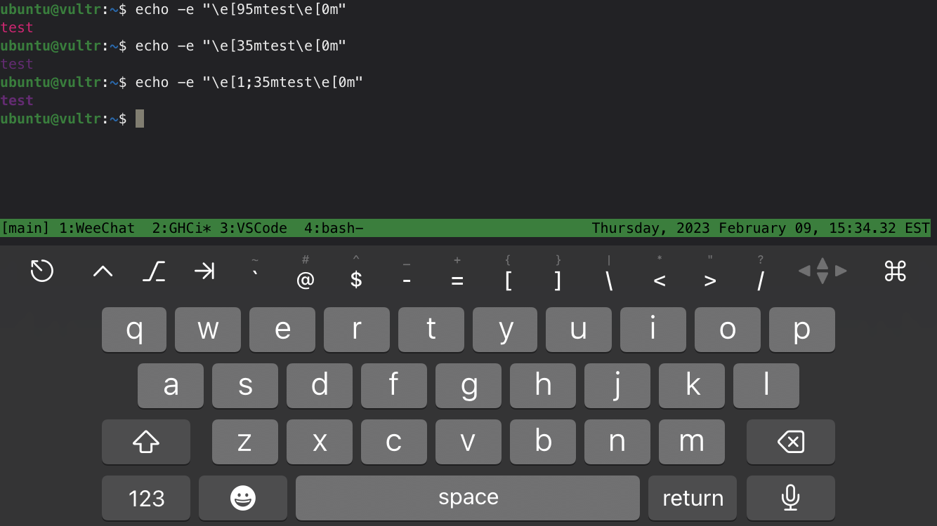
Anyway here is a screenshot from default Fedora 37 gnome-terminal:
 I wouldn't say it is impossible to read but the contrast in this case seems poor IMO, so I kind of have to "squint" to read it.
Perhaps you could use white text for the lines with the actual questions and prompt choices and purple for the explanations for example?
Perhaps you could use white text for the lines with the actual questions and prompt choices and purple for the explanations for example?
Don't like the idea.
The purple text is borrowed from chocolatey, which also uses purple, but on blue background. On proper black background, it's also easy to read. Your background isn't strictly black, I think.
At any rate, figuring out terminal background color seems to be hard: https://stackoverflow.com/questions/2507337/how-to-determine-a-terminals-background-color
So dynamically changing colors seems to be difficult.
I'm open to suggestions of better colors. But white is not one.
If you suggest a different colorscheme, make screenshots for black, white and blue backgrounds with it. Otherwise this discussion is somewhat hard to be conclusive.
This is very hard to read on a mobile device in daylight, even in the screenshot with a darker background above. Bright purple or red instead of dark purple would be a definite improvement and would fulfill the eye catching color requirement.

Here are a few variations in purple—bright magenta, dark purple, and bold purple: