nomad
 nomad copied to clipboard
UI readability and consistency regressions with Nomad 1.8
Hello Team,
We noticed what we consider as UI regression introduced with changes in Nomad 1.8. These affect the readability and spacing in the Nomad UI and present a regression from their previous appearance which used to be more readable and consistently spaced and sized. We understand that these things are highly subjective and not everyone will share our perspective, but wanted to point these out nevertheless.
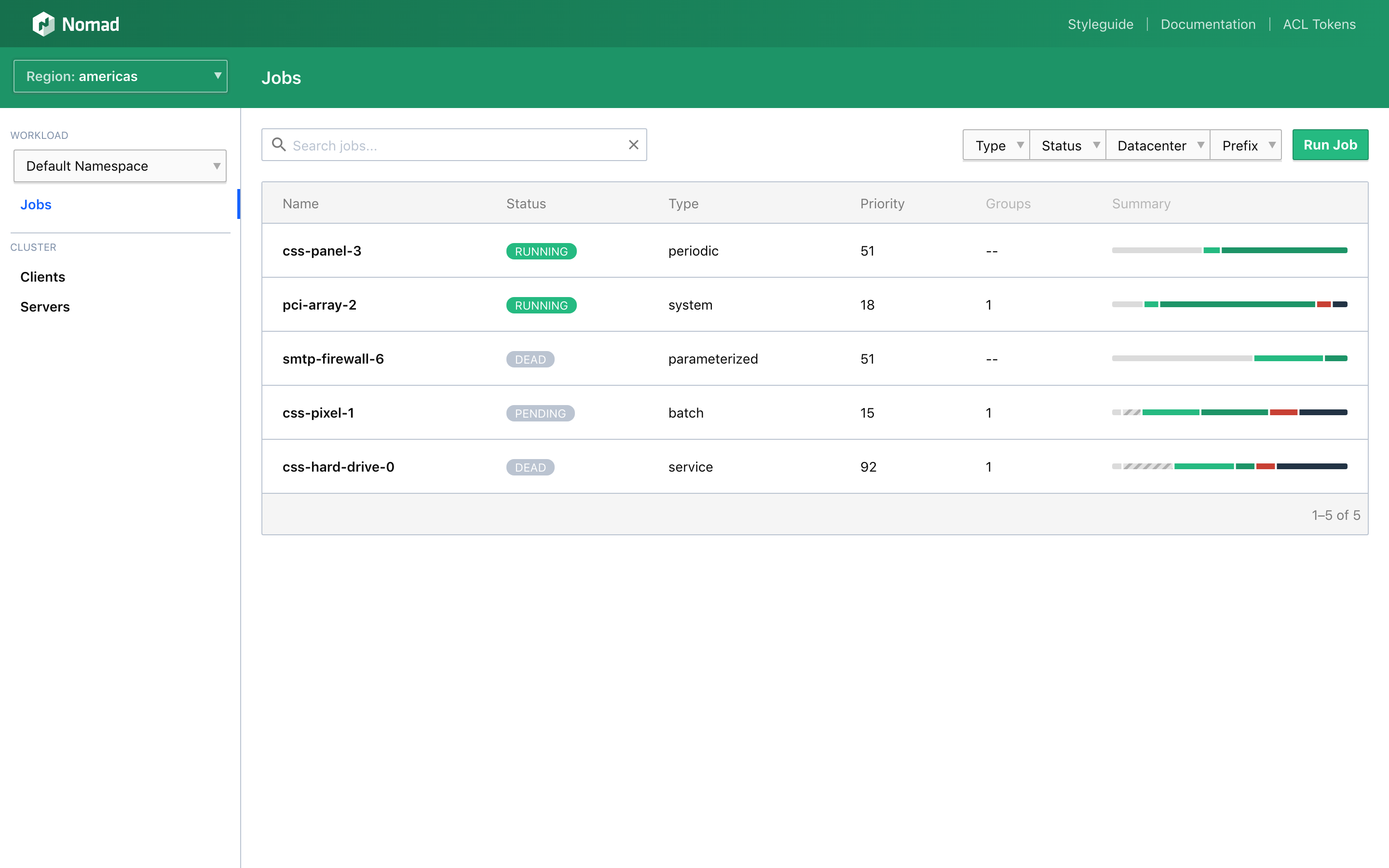
Specifically, the new job page has experienced the following changes (see screenshot)
- Inconsistent fonts, font sizes and colors between different columns of the jobs.
- Less prominent colors and badges/pills for the job status.
- Excessive whitespace / padding within cell contents, especially with the small fonts.
Our suggestion here is to restore some or all of the old UI layout for better readability.
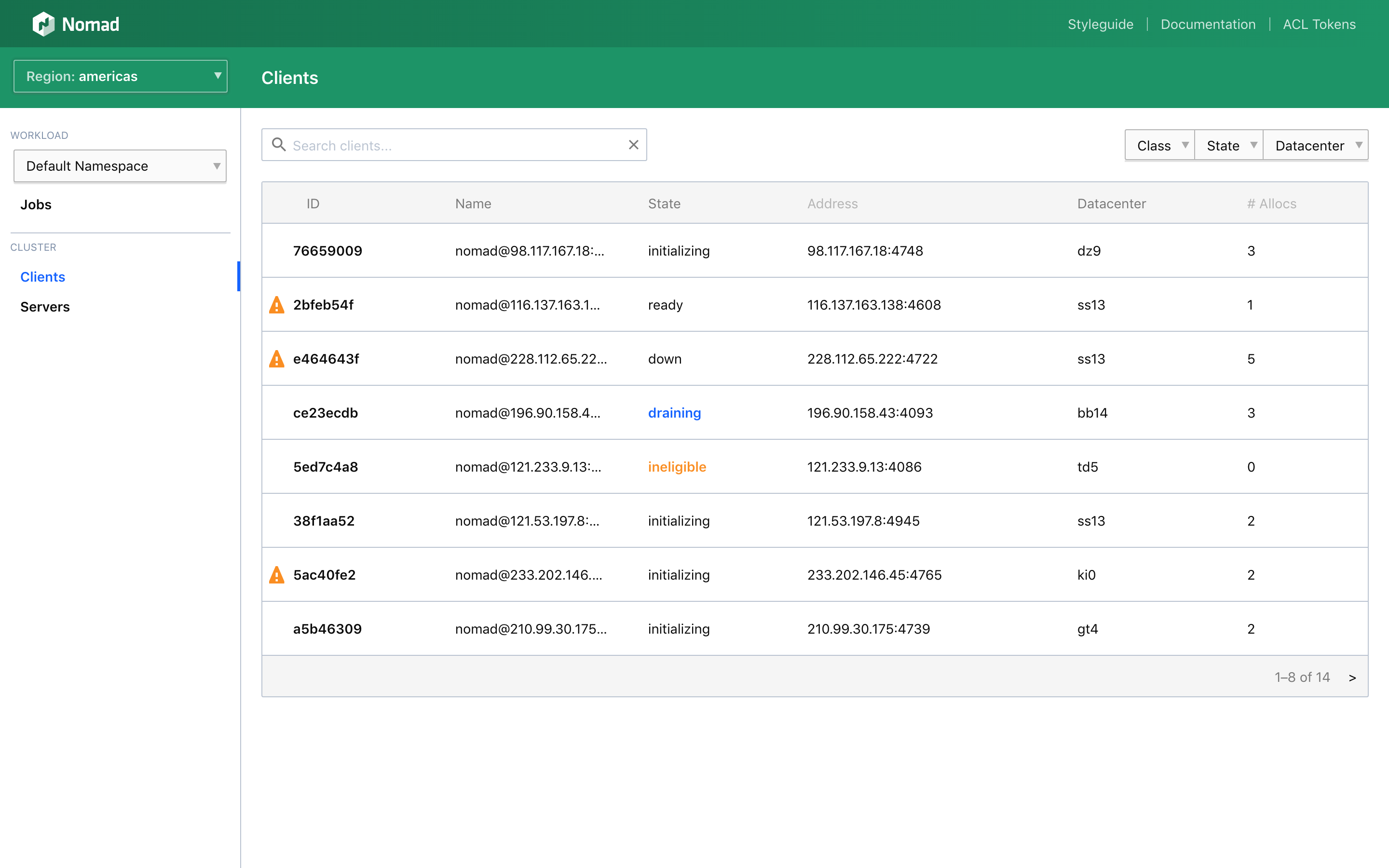
With regards to the client page, the following changes were noticed (see screenshot):
- Excessive vertical whitespace due to introduction of the new "Eligible" and "Not draining badges" in a cell.
Our suggestion would be to either omit these badges for their default states (eligible / not draining), or to show these badges within a new div under the hostname so that the table row is only extended by a single row instead of two rows. The goal should be to fit every client into a single row if possible. The old UI is a good example of that:
Thank you for your work on this great product!