kmenu
 kmenu copied to clipboard
 harshhhdev
:rainbow: An animated and accessible command menu
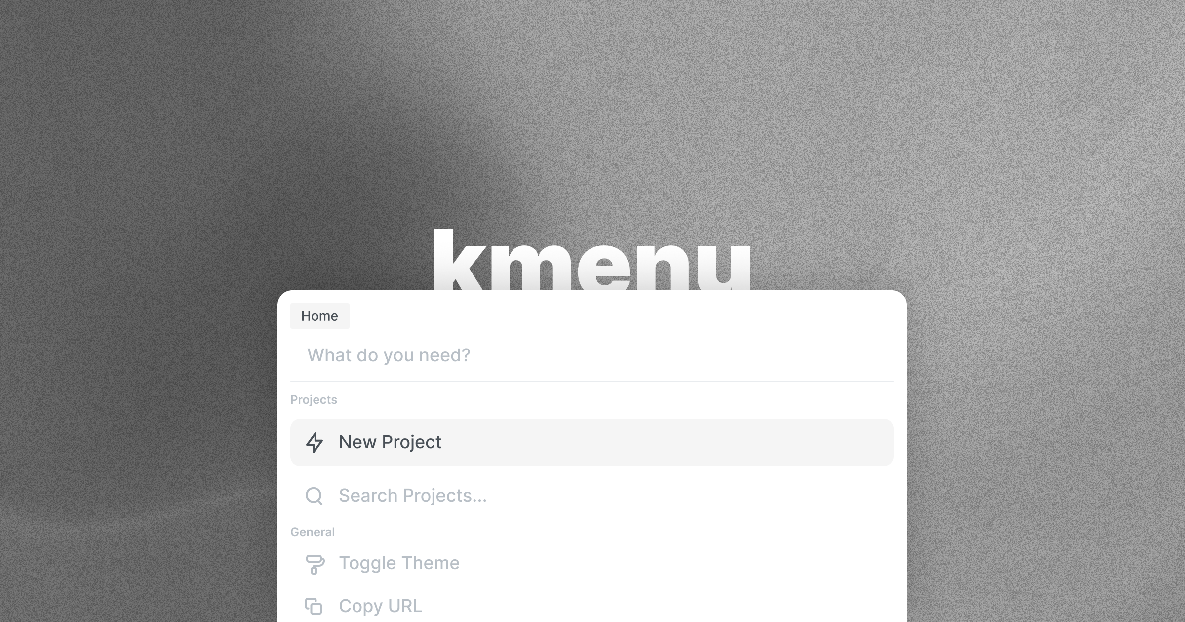
🌈 Animated and accessible cmdk interface
Demo · NPM · Product Hunt · StackBlitz · CodeSandbox
🚀 Quickstart
Having trouble? Unsure of something? Feel free to ask away in the discussions.
Install the npm package:
yarn add kmenu
Using the Provider
After you install, you must wrap your application around the MenuProvider component. Want to learn how you can customise your menu configuration? Check out the MenuConfig section.
Inside the MenuProvider, you can pass in the theme configuration which all of the menus will use. All props are optional, and you can also pass in props if your commands or sections have extra margin between them. Here's a look:
| Parameter | Description | Type | Optional |
|---|---|---|---|
| config | The config file passed onto the palette | Config | ✅ |
| dimensions | The values of the height of the palettes (px) | Dimension | ✅ |
Now, here's a look at the dimensions object:
| Parameter | Description | Type | Default | Optional |
|---|---|---|---|---|
| commandHeight | The height of each command in the palette (px) | number | 54 | ✅ |
| sectionHeight | The height of each category/section in the palette (px) | number | 31 | ✅ |
Below is an example:
import { MenuProvider, MenuConfig } from 'kmenu'

const App = () => {
  const config: MenuConfig = { /* ... */ }

  return (
    <MenuProvider config={config}>
       {/* ... */}
    </MenuProvider>
  )
}
Adding commands
After you've installed the package, you can now begin adding commands onto the command menu.
The commands are broken up into two arrays. One array contains the different categories of the commands, and another array contains the commands itself. Here's a look at how you can define categories:
| Parameter | Description | Type | Optional |
|---|---|---|---|
| category | The name of the category the command will be displayed in | string | ❌ |
| commands | An array of commands passed onto the category | Command | ❌ |
Awesome. Now here's a look at how you can create commands:
| Parameter | Description | Type | Optional |
|---|---|---|---|
| icon | The icon displayed next to the command | ReactElement | ✅ |
| text | The text displayed on the command | String | ❌ |
| perform | The action to perform | void | ✅ |
| href | The link to open | void | ✅ |
| newTab | Whether or not the link should open in a new tab | boolean | ✅ |
| keywords | Search keywords for the command | string | ✅ |
| shorcuts | The keyboard shortcuts to activate this command | Shortcut | ✅ |
| closeOnComplete | Whether the menu should close when the command is run (default: false) | boolean | ✅ |
As you might notice, the commands give you the ability to define custom shortcuts.
Each shortcut can have two target keys and a modifier that would be used in conjunction with a single target key. Note that if you're using a modifier, you can only use a SINGLE target key. Here's a look at how you can create shortcuts:
| Parameter | Description | Type | Optional |
|---|---|---|---|
| modifier | The modifier key used in conjunction with the target key | enum (shift/alt/ctrl/meta) | ✅ |
| keys | The target keys for this command | Tuple [string, string?] | ❌ |
After you've created all your commands, you must pass them into the useCommands hook, which returns a getter and a setter for the commands. For a reference, check out the section on the useCommands hook.
Anyways, now that you have an underlying idea of how commands work, here's an example of how to create the commands (using TypeScript):
import {
  Search,
  Copy,
  Globe,
  GitHub,
  AlertCircle,
  GitPullRequest,
  Zap,
  Edit2,
  Plus,
  Settings,
  Code,
  Command as Cmd,
  Terminal
} from 'react-feather'

const main: Command[] = [
  {
    category: 'Socials',
    commands: [
      {
        icon: <FiGlobe />,
        text: 'Website',
        href: 'https://hxrsh.in',
        newTab: true,
        keywords: 'home'
      },

      {
        icon: <FiTwitter />,
        text: 'Twitter',
        href: 'https://twitter.com/harshhhdev',
        newTab: true,
        shortcuts: { modifier: 'alt', keys: ['t'] }
      },
      {
        icon: <FiGithub />,
        text: 'GitHub',
        href: 'https://github.com/harshhhdev',
        newTab: true,
        shortcuts: { keys: ['g', 'h'] }
      },
      {
        text: 'Dribbble',
        href: 'https://dribbble.com/harshhhdev',
        newTab: true
      },
      {
        icon: <FiLinkedin />,
        text: 'Linkedin',
        href: 'https://linkedin.com/in/harshhhdev',
        newTab: true
      }
    ]
  }
]

const Component = () => {
  const [commands, setCommands] = useCommands(main)

  /* ... */
}
useKmenu Hook
useKmenu is a utility hook that gives you some useful functions and information about the current status of the menu. You can use these for a multitude of different things such as nested routes on the command menu or for toggling the menu through a button on your UI.
Here's a list of all the information it provides:
| Parameter | Description | Type |
|---|---|---|
| input | The current text in the search bar of the menu that is currently open | string |
| setInput | The setter function to change the open state | Dispatch<SetStateAction |
| open | The index of the menu is currently open | number |
| setOpen | The setter function to change the open state | Dispatch<SetStateAction |
| toggle | The function for toggling the main menu open/close | void |
With that, here's also a code example of how you could use this hook!
NOTE: YOU MUST WRAP YOUR COMPONENT INSIDE THE MenuProvider TO USE THIS HOOK
import { useKmenu } from 'kmenu'

const Component = () => {
  const [input, setInput, open, setOpen, toggle] = useKmenu()

  return (
    <div>
      <p>The current text on the search bar is: {input}</p>
      <p>The index of the menu which is currently open is: {open}</p>
      <button onClick={toggle}>Toggle Menu</button>
    </div>
  )
}
useCommands Hook
With kmenu v1, you can now dynamically compute and define commands.
When commands are inputted into the useCommands hook, they're returned into an object of command-menu parsable commands, and they require an initial value of the commands you'd like to pass in.
NOTE: YOU CANNOT USE SetCommands DIRECTLY INSIDE OF A useEffect HOOK AT RENDER
Here's an example of the hook live in action:
import { CommandMenu, Command, useCommands } from 'kmenu'

const Component = () => {
  const main: Command[] = [ /* ... */ ]

  const [commands, setCommands] = useCommands(main)

  return
    <CommandMenu commands={commands} index={1} main />
}
Customising the menu
You can easily customise the colours on your command menu as well. Here's a list of properties that are customisable:
NOTE: ALL PROPERTIES ARE OPTIONAL
| Parameter | Description | Type | Default |
|---|---|---|---|
| backdropColor | The colour of the backdrop (include opacity) | string | #FFFFFF90 |
| backdropBlur | The backround blur of the backdrop (px) | number | 2px |
| backgroundColor | The background colour of the menu | string | #FFFFFF |
| borderWidth | Width of the border surrounding the menu | number | 1px |
| borderColor | The colour of the border surrounding the menu | string | #3F3F3F |
| borderRadius | The radius of the menu (px) | number | 10px |
| boxShadow | The shadow of the menu | string | 0px 0px 60px 10px #00000020 |
| inputBorder | The colour of the border below the search bar | string | #E9ECEF |
| inputColor | The colour of the text in the search bar | string | #000000 |
| placeholderText | The placeholder input text in the search bar | string | 'What do you need?' |
| headingColor | The colour of the command category headings | string | #777777 |
| commandInactive | The colour of the icon and text when the command is inactive | string | #828282 |
| commandActive | The colour of the icon and text when the command is active | string | #343434 |
| barBackground | The background colour of the active bar (include opacity) | string | #FFFFFF20 |
| shortcutBackground | The background colour of the keyboard shortcut | string | #82828220 |
Setting up the menu
Here are all the options available on the menu:
| Parameter | Description | Type | Optional |
|---|---|---|---|
| commands | The commands for this menu to display | Command[] | ❌ |
| index | The index of this menu | number | ❌ |
| main | Whether or not this is the first menu that'll be displayed | boolean | ✅ |
| placeholder | The placeholder text on this particular menu | string | ✅ |
| preventClose | Whether or not the menu is togglable | boolean | ✅ |
| value | The default value on this particular menu | string | ✅ |
| preventSearch | The placeholder text on this particular menu | boolean | ✅ |
Once you have added commands to the menu and configured it to you likings, you can add it into your application. Add in the CSS file for styling. Optionally, if you'd like to FULLY customise the styles on the menu to your likings then you can copy the index.css file from the repository and import that instead. You'll also need to create a useState hook for handling the state.
NOTE: YOU MUST WRAP YOUR MENU INSIDE OF THE MenuProvider FOR IT TO WORK
import { useState } from 'react'
import { CommandMenu, Command, MenuConfig } from 'kmenu'
import 'kmenu/dist/index.css'

const Component = () => {
  const commands: Command[] = [ /* ... */ ]
  const config: MenuConfig = { /* ... */ }
  const categories: string[] = [ /* ... */ ]

  return (
    <MenuProvider config={config}>
      /* ... */
      <CommandMenu
        commands={commands}
        index={1}
        main
      />
      /* ... */
    </MenuProvider>
  )
}
/* ... */
export default Component
That's about all the configuration you'll need to do in order to get a basic command menu to work!
Nested Menus
This library also provides support for nested menus and commands. Here's an example to help you out:
import { useState } from 'react'
import { Menu, Command, useKmenu, useCommands } from 'kmenu'
import 'kmenu/dist/index.css'

const Component = () => {
  const main: Command[] = [
    {
      icon: <FiGlobe />,
      text: 'Website',
      href: 'https://hxrsh.in',
      newTab: true,
      keywords: 'home',
      category: 'Socials'
    },
    {
      icon: <FiArrowRight />,
      text: 'Nested Example...',
      perform: () => setOpen(2),
      category: 'Utility'
    },
  ]

  const nested: Command[] = [
    {
      icon: <FiGlobe />,
      text: 'Demo',
      href: 'https://kmenu.hxrsh.in',
      newTab: true,
      keywords: 'home',
      category: 'Resources'
    },
    {
      icon: <FiGlobe />,
      text: 'GitHub',
      href: 'https://github.com/harshhhdev/kmenu',
      newTab: true,
      keywords: 'source',
      category: 'Resources'
    },
  ]

  const [input, open, setOpen, toggle] = useKmenu()
  const [mainCommands, setMainCommands] = useCommands(main)
  const [nestedCommands, setNestedCommands] = useCommands(nested)

  return (
    {/* ... */}
    <CommandMenu
      commands={mainCommands}
      index={1}
      main
    />
    <CommandMenu
      commands={nestedCommands}
      index={2}
    />
    {/* ... */}
  )
}
/* ... */
export default Component
If this isn't enough, there's also an example directory which you can clone and experiment around with to build nested routes!
useShortcut hook
This library also ships with a custom React hook called useShortcut which you can use to define your own shortcuts within your application.
| Parameter | Description | Type | Optional |
|---|---|---|---|
| targetKey | The key that the shortcut is listening for | string (must be valid key) | ❌ |
| modifier | The modifier key which can will activate the shortcut | enum (shift/alt/ctrl/meta) | ✅ |
Here's an example:
import { useShortcut } from 'kmenu'

const Shortcut = () => {
  const shiftS = useShortcut({ targetKey: 's', modifier: 'shift' })

  /* ... */
}

export default Shortcut
The example below will run when someone uses the keyboard shortcut shift+s.
💻 Development
Run the project locally
git clone https://github.com/harshhhdev/kmenu.git
Setting up the project
cd kmenu
yarn

# Setup example directory
cd example
yarn
Next, start the development server:
yarn start
This should compile an instance of your project to the dist folder. It should re-build everytime you save a new change.
Using the package
You can test the built package locally by running the example repository:
cd example

# Start development server
yarn start
Awesome. Your React development server should now be running on port 3000.
🔧 Tools Used
🤞 Contributing
After setting up the project, and making changes:
git add .
git commit -m "commit message"
git push YOUR_REPO_URL YOUR_BRANCH
This codebase is well-documented and has comments explaining just about everything in here. All contributions are welcome! Anything from fixing a typo in the documentation to opening an issue to fix a bug or add an enhancement are welcome.
Inspirations
Metadata
Owner
 harshhhdev
Metadata
:rainbow: An animated and accessible command menu