311-data
 311-data copied to clipboard
Investigate relationship between air quality data and 311 requests
Overview
LA's air quality is not the best. I wondering if there is any relationship between air quality and the different 311 requests.
State of California has divided the state into multiple Air Quality Management Districts. LA (barring Orange County) is under the jurisdiction of South Coast Air Quality Management District.
Preliminary Steps (High-level)
- [ ] Reach out to South Coast Air Quality Management District to get access to API get the data / web scrape data source to get realtime data from the monitoring stations
- [ ] Define and set up boundaries surrounding for each monitoring station within the South Coast Air Quality Management District
- [ ] Aggregate 311 Requests data based on the specified districts in the previous step and conduct statistical analysis to test relationship between air quality and the different 311 request types, number of 311 requests, request time to close, and other specific metrics at the monitoring station level
- [ ] Deliver reccomendations for the specific neighborhood council under which the monitors are located. Explore local incentive programs that could drive up air quality improvements.
Resources/Instructions
- LA Air Quality RealTime Data
- EPA Air Quality Data API Documentation
- South Coast Air Quality Management District
- 311 requests data from list of Data Sources
- California Air Resource Board Air Quality Incentives
@joshuayhwu On August 2, 2022 Zoom Meeting with Josh Wu, we discussed some steps which are needed for this project. Below are the steps which was discussed.
- Use the API from EPA Air Quality Data to get the AQI of PM2.5, O3, PM10 from the monitoring stations which are located within the Los Angeles NC area.
- Draw an appropriate circle around each monitoring station.
- Plot 311-requests data within the cicles or calculate the number of requests in each circle, and possibly show the AQI value within each station.
- Do a regression and see if there is a correlation between request number and air quality.
I plan to finish the fisrt step approximately in the next two weeks.
@joshuayhwu Today, on August 3, 2022, I used the API from the EPA Air Quality Data to get some air quality data, but found out that some stations don't have the needed data. For example the station in West LA and North Hollywood only have O3 and N02 data. (We don't need NO2).
I have reached out to South Coast Air Quality Management District to ask for the API to get the air quality data from their stations or other stations which don't belong to them. I am still wating for the respond.
@susanklm Thanks for the update!
If SCAQMD doesn't reply anytime soon, you can use O3 and N02 as depend variable instead of AQI. The current process looks good!
@joshuayhwu OK. If SCAQMD doesn't reply, I will use O3 and NO2. However, there is a station in Long Beach (Hudson) which only has PM10 and a station in Long Beach (Route 710) only has PM2.5 and NO2. I will ignore these stations and use the information from the nearby stations which have O3 and NO2.
@nichhk @joshuayhwu I have looked into the PurpelAir. The PurpleAir sensor only measure airborne particulate matter (PM) data, and the data comes from many individuals. We can purchase our own PurperAir sensor, connect it to the Wifi and share our data with the public. The measurement of PurpleAir is a little different from AirNow which is an air quality website maintained by a partnership of states, the federal government, Canada and Mexico.
I found the AirNow API - Web Services and found out we can get the AQI of PM10, PM2.5, Ozone, NO2, CO, and even SO2. Since AirNow is maintained by the goverment, it seems it is more reliable. So I think is better to use the data from AirNow.
PS: SCAQMD has replied my email and said they don't have their API.
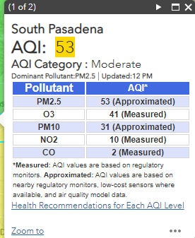
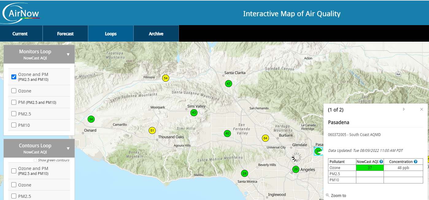
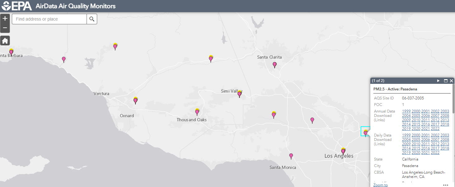
@joshuayhwu After a closer look at the AirNow data and EPA AirData. It seems that these two sites (which both are related to EPA) get the data from SCAQMD. For example if we look at the South Pasadena data from SCAQMD, we will see that it says Ozone - measured, while PM2.5 and PM10 - approximated, since they only have sensor to measure Ozone in that location. And if we look at the AirNow data, we also see that Pasadena only have Ozone data. But if we look at EPA AirData, we see that it has Ozone and an extra PM2.5 in the same location. So there is a small differences although the data seems to come from the same location.

So as overall, I think that the AirNow Data, EPA AirData, and SCAQMD data come from the same sensors. Their data are about the same with a little bit differences. Also, the API from EPA AirData and the API from AirNow provide us with different information, for example AirData have daily AQI, but no hourly data like the ones from AirNow.
I think probably we can take the AQI data from EPA API and use the method similar to the ones in the AirNow and apply it to the daily data. In this method, we only need to gather the Ozone and PM data. If Ozone and PM exist in a monitoring station, then we will pick Max(Ozone, PM) as the AQI, if only PM exist for example, then we will use PM as the AQI. Let me know what you think.
@susanklm
Thanks for taking the time to explore the different resources!
From your notes, it seems like the AQI is simply the maximum value of the 5 measures and the government resource is the most reliable. Moving forward, I think we will need call the API and grab whatever value is available (best if there is AQI directly from the API), then select the maximum value from the 5 measures in our dataframe operations.
I encourage you start playing around with the API and see how much data you can pull, what the dataframe looks like, and how much data we can get at once. That way we can start to at least have a rough draft of what the problem statement looks like.
Some anonymous source reccomended this tool for finding areas disproportionately affected by air pollution.
I also think that given the limited sensors available from government website, Nich's suggestion on PurpleAir could potentially work? I would suggest contacting them and see if there is free API available? That way even though it's just PM measure, the coverage is higher. Let me know what you think
@joshuayhwu
I think it is better to grab Ozone, PM2.5 and PM10 (instead of grabing all five including NO2, CO) since I think it is a more common method. For exampe the site which you just posted, OEHHA only mention Ozone and PM2.5. Similarly AirNow by EPA, only posted Ozone and PM and picked Max(Ozone, PM) as AQI. Also note that EPA took their data from SCAQMD. I just realized that after taking a closer look, that's why their data is about the same.
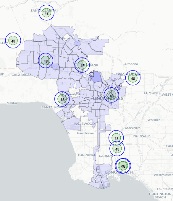
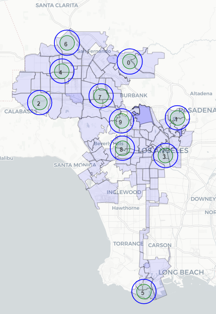
I have plotted the monitor stations from EPA below. We can see that the coverage is not much. Ignore the number 48. It's just a test.
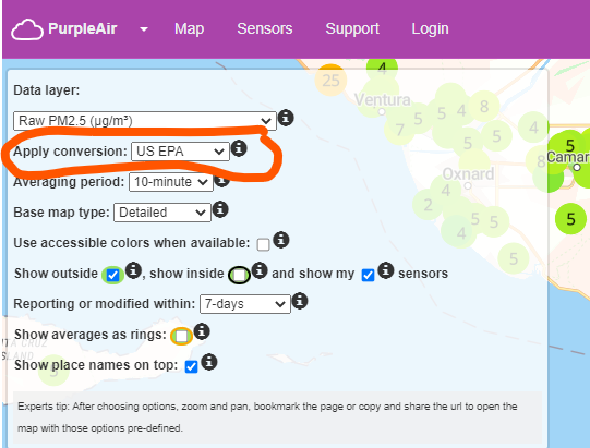
Purple Air has an API, we can try to get the PM data. But as I mentioned before, their data is ldifferent than EPA. But we can try. They have their own API. I can check it out. Also, since there are so many sensor, we have to pick few of them. And maybe we can apply conversion like below to get the reading closer to the EPA.
@susanklm thanks for the update! Apologies for the delay. I agree with using the Ozone, PM2.5/10. Given the government data coverage is not much, should we focus on using Purple air instead to have more granular data?
After you have play around with the API (if available), let's try to do some exploratory analysis on the dataset we have.
@joshuayhwu I have contacted purpleair at [email protected] since last Thursday to request the API key. However, I have not received any reply until now. Moreover, I tried to call them several times but always got disconnected after waiting for a certain period of time. I will try to call them again.
@susanklm thanks for the update! If there is still no response from them let's start with the government data instead? I would recocomend doing the following exploratory analysis:
- What are the attributes available for the dataset? What are the date ranges? What are the distribution of values?
- How big should the boundary be for each monitor to capture any meaningful insight? (i.e. how big should the circle be in order to capture the surrounding requests?). Let's experiment with a few sizes
- Based on where the the monitors are located and where the 311 requests are clustered, what are some particular requests types might biased our analysis?
Feel free to add anything else onto this!
@joshuayhwu I just received the API Key from PurpleAir after posting questions on their forum and calling them today. I will get their data and try to do exploratory analysis.
@susanklm Thanks so much for the update! Looking forward to the EDA and what you find there!
Sorry I'm a bit late, but I saw that you can download PurpleAir data as a CSV directly from the map. Does that look easier to use?
@nichhk Yes, I see that we can download some data as a CSV. But I think there are some data which can be obtained only through the API. I think maybe I will get the data through both the CSV and API.
@joshuayhwu Just want to let you know that actually I have been trying to push my jupyter notebook to github but could not since the file size is too big. I think I have to figure out a way to upload the large size file to the github.
@susanklm I took a look at the notebooks and I really like the exploratory analysis! Thank you for putting the work into visualizing the information!
For next steps, let's hypothesize that the air quality station with more 311 requests have worse air quality as measured by AQI/PM2.5/PM10 (dependent variable). The goal is to 1) generate some features to predict that dependent variable, and 2) construct and optimize a model based on R^2, RMSE. Some possible features you might consider are dummy variables for the request type, the datetime of the request, the distance of the request from the air quality station, or even a time series of air quality (e.g. PM2.5 on the previous day) - any other feature engineering you see fit.
Because we have so many air quality stations and so many 311 requests, we would need to sampling on one or both sides. I would reccomend trying stratified sampling based on NC and ignore overstepping the boundary problem for now. So loop through the NC list and use the get_sensors_df function, and randomly select 3 of them for instance. Then for each of those air quality stations, you would have to sample (or use all) the 311 requests that are within the bounding circumference of the air quality station. Finally, create a data frame with the air quality of station at a particular datetime aggregate (e.g. a year-month), then having features like number of 311 requests, avg/max/min distance of 311 requests, share of a particular request type...etc to run a regression.
Computation is definitely a problem we need to try resolve - consider using google colab if you want to leverage some computational power from google. The rest of the team would also like to see some work-in-progress from data science. So let's aim to have a short 5-10 minute demo presenting your work here during team meetings. I think you're doing a lot of great work here so keep it up!
Let me know if you want some more clarifying questions / thoughts - additional ideas are always welcome!
@joshuayhwu In the past few days I have been combining the data from Purple air 10 sensors with the 311 requests data. From purple air API, we only have daily average AQI. On the other hand, from the 311 requests data, we have minute- by-minute basis requests. So in order to combine them, I took the 311 request data and 1) calculated the average distance from the requests to each sensor in a day, and 2) calculated the total number of requests in a day. I will use that two features, the average distance and total number of requests in a day to do regression analysis againts the daily AQI values which I got from purple air.
I plan to finish the regression analysis before the meeting this Wednesday. How about let me finish this one first, then I will try to do another anaylsis using your idea. I have updated my GitHub repository. I plan to do another update before the meeting.
@joshuayhwu I have posted an updated GitHub repository file which contains my linear regression analysis.
@joshuayhwu After looking at the NC Map, I don't think it is possible to get at least 1 sensor per NC because the circles will be overlapping. Even we reduce the radius, the circles will still be overlapping. From the current map of the sensor, I think probably I can add 5 - 10 more sensors without making the circle overlapping. Or, I can reduce the radius of the circles to 1.5 mi or 1 mi to get more sensors. Let me know what you think.
@susanklm Thanks so much for the comprehensive updates!
For the overlapping sensors, it seems like it'll be hard to fix a particular sensor per NC. Given the constraints mentioned in your updates, I'm leaning towards taking the a random sample of 10-15 non-overlapping sensors multiple times (regardless of NC) and test the correlation between air quality and the surrounding 311 requests. That way, we can make a more generalize statement regarding air quality and 311 requests rather than being NC specific (at least for now).
For the jupyter notebook, really appreciate the documentation! It seems like average daily distance of requests doesn't correlate that well with the AQI (kinda expected I guess?). From your jupyter notebook "This is not surprising since there are plenty of variables that can affect AQI, for example, number of cars in the area, vegetation, factories, population density, etc. can affect the AQI values in an area". Based on this EDA, what features do you think we should incorporate into predicting air quality? Is there anyway 311 requests data could help serve as a proxy ?
If you do think it's worthwhile to continue pursuing the 311 route, one way is to change the metric from average distance of requests to min/max distance of requests; alternatively incorporate more features like count of a particular type of requests. Another way is to use multiclass-classification for the Level of Concern instead of linear regression directly. If not, try to see if there are data available on the features you mentioned. We can discuss more during meeting this week / slack if you prefer.
@joshuayhwu I think I will start figuring out how to sample the sensors first. Our first sample was found using brute force since at that time I ddn't have a complete access to the API (PurpleAir didn't allow me to get the historical data from the API at the begining). So for this week I will create a function to find the sensors with complete daily PM2.5 and PM10 data, then I will create a function to sample 10-15 non-overlapping circles. If I have time, I will create dataframe for each sample.
@susanklm as per our discussion during team meeting, we'll probably wrap this issue up and make a demo on the analysis methodology on Oct 12. It would be great if you could select a few notebooks and show a demo for 10-15 mins if you're comfortable with it?
@joshuayhwu When you said demo, you mean presentation of the project right? OK, I will clean up few notebooks and present the steps which I took. It probably will take less than 10 minutes.
@susanklm thanks! letme know if youhave any questions / want to do a run through before presentation.