 h2oai
h2oai
ui.activity_stream
via @sandruparo
Design
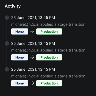
Proposed API
interface ActivityState {
  /** State text **/
  text: S
  /** Tag background color. **/
  color?: S
}

interface ActivityStreamItem {
  /** The activity title. **/
  title: S
  /** The caption, displayed below the title. **/
  caption: S
  /** Original state identifier. **/
  from?: ActivityState
  /** Final state identifier. **/
  to?: ActivityState
}

interface ActivityStream {
  /** The card's title **/
  title: S
  /** The activities listed in this card. **/
  items: ActivityStreamItem[]
}
cc @lo5
Looks good, except:
- Design needs refinement (see my comments in the design review).
- Would be good to have a
title,subtitle(optional),captiontriad on each item. Most uses of activity feeds / streams (e.g. see here and here) have both titles and dates. So having both atitleand andsubtitlewould let users utilize them interchangeably for titles and dates, depending on which field they want to emphasize more. - Having state transitions in this component seem too specific, and probably not applicable to 80% of the use cases for this card. The design of the states needs refinement (@sandruparo - needs to be more subtle - they almost look like buttons right now, and subdue the tite/caption). I would recommend not implementing any features that haven't passed the review.
- If you really want to include state transitions, replace the
from/towith a singlestate_transition?: ActivityStateTransitionattribute, whereActivityStateTransitioncontainsfromandto. This opens up the possibility of including other variations in theActivityStreamItemAPI (say, "Joe tagged X as P, Q, R", asset thumbnails, etc.
Thanks @lo5! Will wait for design team to apply suggested refinements before proceeding to implementation.
New link for updated activity card: https://xd.adobe.com/view/bbce983d-f43f-4eb4-a3de-b2316fb4149c-ee9d/
@lo5 I wonder whether this makes more sense as a card or form item. I originally thought of it as a card, but the proposed designs imply otherwise:
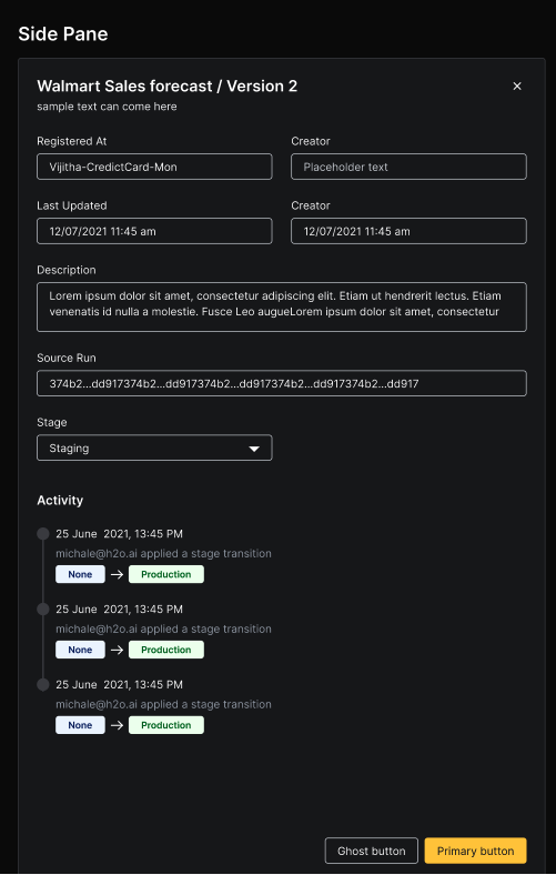
@mturoci Yes for mlops we needed an activity stream for the sidenav. So we have used the same component designed for the card in order to keep the consistency. Better if we can have this as a common component so that it can be use anywhere.
cc: @sandruparo @mtanco
@mturoci - we can temporary hold this task since this has been deprioritized by MLOps team. Until then design team will refine it and will update in the style guide. Let's park it for now. @lo5
@mturoci Either option is fine. The advantage with the card option is that it can be backed by buffers. Shipping this as a form component could be a quick first cut.