Support for timestamps as x-axis scale
Is your feature request related to a problem? Please describe
Model monitoring is trying to show the number of predictions generated by a deployment within time intervals, and wants to use a histogram to do so. We are encountering a problem where we need to set x_min and x_max for an interval, but when the x axis is timestamp (string) this is not possible.
Example of timestamp x-axis:

Describe the solution you'd like
We would like support for timestamps for x axis
Describe alternatives you've considered
- conversion of timestamp to epoch, but this would not be user-friendly to display
Additional context
Workaround ideas welcome!
@shereezhang Here is some example code with Prithvi's suggestion showing how you can use strings of dates in a histogram plot:
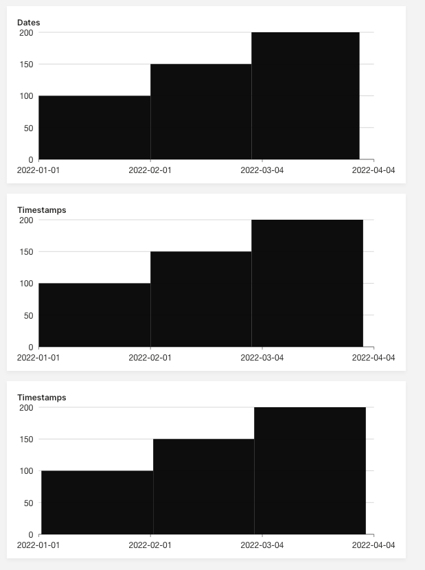
from h2o_wave import main, app, Q, ui, data


@app('/')
async def serve(q: Q):
    q.page['ex1'] = ui.plot_card(
        box='1 1 4 3',
        title='Dates',
        data=data('low high price', 3, rows=[
            ("2022-01-01", "2022-02-01", 100),
            ("2022-02-01", "2022-03-01", 150),
            ("2022-03-01", "2022-03-31", 200),
        ]),
        plot=ui.plot([ui.mark(
            type='interval',
            y='=price', y_min=0,
            x1='=low', x2='=high', x_scale="time"
        )])
    )

    q.page['ex2'] = ui.plot_card(
        box='1 4 4 3',
        title='Timestamps',
        data=data('low high price', 3, rows=[
            ("2022-01-01 00:00", "2022-02-01 00:00", 100),
            ("2022-02-01 00:00", "2022-03-01 00:00", 150),
            ("2022-03-01 00:00", "2022-03-31 23:59", 200),
        ]),
        plot=ui.plot([ui.mark(
            type='interval',
            y='=price', y_min=0,
            x1='=low', x2='=high', x_scale="time"
        )])
    )

    q.page['ex3'] = ui.plot_card(
        box='1 7 4 3',
        title='Timestamps',
        data=data('low high price', 3, rows=[
            ("2022-01-01 06:00 PM", "2022-02-01 06:00 PM", 100),
            ("2022-02-01 06:00 PM", "2022-03-01 06:00 PM", 150),
            ("2022-03-01 06:00 PM", "2022-04-01 06:00 PM", 200),
        ]),
        plot=ui.plot([ui.mark(
            type='interval',
            y='=price', y_min=0,
            x1='=low', x2='=high', x_scale="time"
        )])
    )

    await q.page.save()
@lo5 Note that in all three the plot only shows the date, note the timestamp - developers would probably expect to see the format that they use (not tracked, WDYT?). Also their is a hover tool tip issue tracked in #1474
@mtanco @lo5 Thank your quick response, this worked fine after applying the suggestions, But now I encountered the same problem for the box plot, and this suggestion seems not to be working for it.
This is the output
This is the debug console. You can see data on the right side
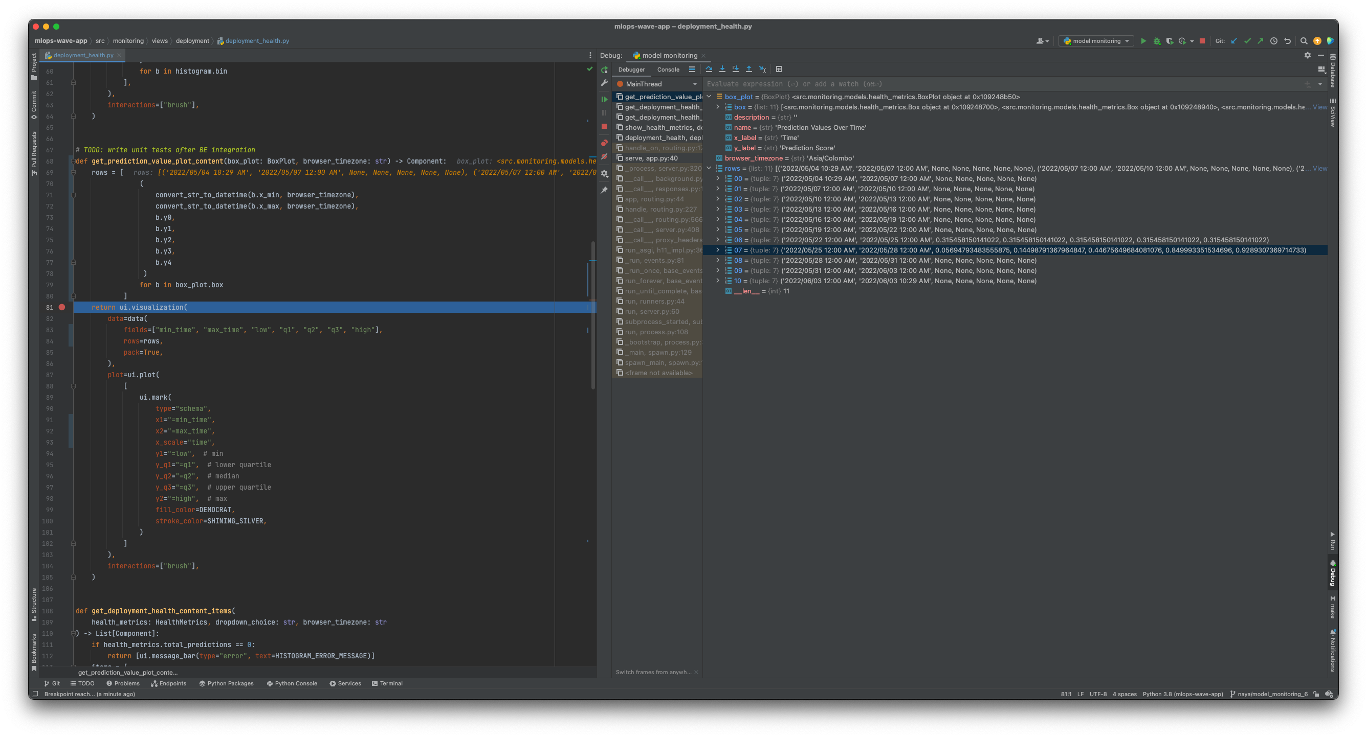
and in the browser console, I get something like this,
index.bd6889b4.js:41 Uncaught (in promise) TypeError: Cannot read properties of undefined (reading 'scales')
    at r.processData (index.bd6889b4.js:41:68369)
    at r.init (index.bd6889b4.js:41:58791)
    at r.initGeometries (index.bd6889b4.js:41:32108)
    at r.renderDataRecursive (index.bd6889b4.js:41:29637)
    at r.paint (index.bd6889b4.js:41:27540)
    at r.render (index.bd6889b4.js:41:18181)
    at i (index.18a7e732.js:3:21346)
Any thoughts?
Hi @Nayananga, is there a reason for using a range (x1 & x2) for the box? In the examples we're just using a single x value: https://wave.h2o.ai/docs/examples/plot-schema/
In general I think it's common to have a box plot per "category" or aggregated time (like a day).
@lo5 is it possible to show time differences by providing timestamps? If we explicitly provide times, then showing time differences between 2 days would be problematic
@lo5 is it possible to show time differences by providing timestamps? If we explicitly provide times, then showing time differences between 2 days would be problematic
raised a specific issue here https://github.com/h2oai/wave/issues/1613 CC @dulajra