Themable character choices
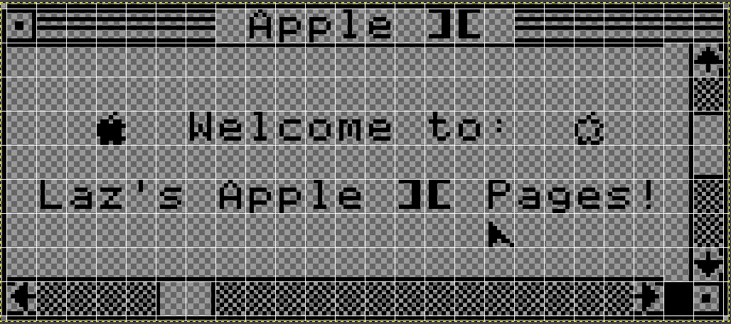
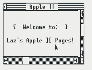
Right now it seems that most of the characters that Cursive outputs are chosen in string literals in the source code for the components that implement them. It would be nice for themes to be able to choose how to draw certain widgets. In Unicode 13, a new block (called Symbols for Legacy Computing) has been added containing characters from old home computers which are specifically meant for TUIs. By allowing themes to make use of these, it would be possible to create themes that look like this for Cursive.

The above TUI is made entirely using characters from the Apple II's MouseText character set (which was incorporated into this new block). Of course, since font support for these characters can't be relied upon in all terminals, having this be a feature of themes would be useful, since it allows the program to fall back to more commonly available box-drawing characters.
Whoo looks sexy!
Will have a look. Might need some up-to-date fonts to try that. EDIT: Found Fairfax from KreativeKorp, might work.
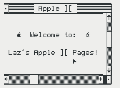
I found a non-scaled version and made a best-guess cell-split
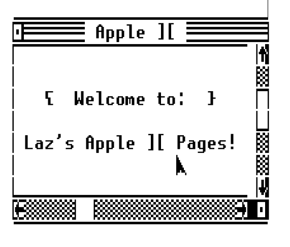
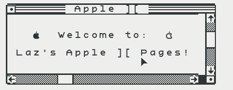
Looking at the glyphs it seems that it differs from the way Fairfax HD renders it on my computer: the "right open squared dot" character (🮼) does not go all the way to the right end of the cell. Same thing for the left/right arrows. Here's what I got so far (just a ascii art mockup, no real code yet):
Will wait to see other fonts bring support for this, it may work better. Might also look for more square font.
I was testing it using UNSCII personally. I only managed to recreate the top bar, so it's neat that you were able to recreate the whole thing so quickly!
Thanks, will try that! Though it seems to be missing the apple logo icons.
Hmm in libreoffice it renders correctly with Fairfax
With unscii there's some weird line spacing
Back in the terminal unscii has the same problem as fairfax:
I'm no font-rendering expert so I have no idea why different applications render things differently. :shrug:
Anyway, that should be enough to test and at least output the correct characters.
And here's the text I used if you want to try (here's hoping github doesn't mangle it up):
▁▁▁▁▁▁▁▁▁▁▁▁▁▁▁▁▁▁▁▁▁▁▁▁▁
▕🮼🮁🮁🮁🮁🮁🮁 Apple ][ 🮁🮁🮁🮁🮁🮁🮁🮁▏
▕▔▔▔▔▔▔▔▔▔▔▔▔▔▔▔▔▔▔▔▔▔▔▔▕🮸▏
▕ ▕🮕▏
▕ Welcome to: ▕▔▏
▕ ▕▁▏
▕ Laz's Apple ][ Pages! ▕🮕▏
▕ 🮰 ▕🮕▏
▕▁▁▁▁▁▁▁▁▁▁▁▁▁▁▁▁▁▁▁▁▁▁▁▕🮷▏
▕🮵🮕🮕🮕🮕🮕▏▕🮕🮕🮕🮕🮕🮕🮕🮕🮕🮕🮕🮕🮕🮕🮶█🮼▏
▔▔▔▔▔▔▔▔▔▔▔▔▔▔▔▔▔▔▔▔▔▔▔▔▔
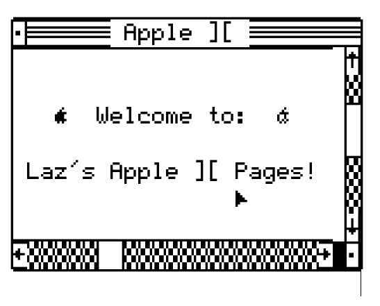
EDIT: Woo Kreative Square from KreativeKorp looks perfect for this (still the weird spacing issue, but that may be the terminal fault apparently):
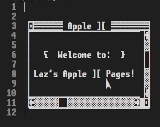
I copied the text you put in the last post and pasted into Visual Studio Code, where I configured the font size to be exactly the same as the line height. The result looks fairly good. This is in UNSCII.
The main differences with our current dialogs:
- 3-lines title bar. We can try to only keep the middle line and see if it's acceptable for now. We can look into 3-lines title bars, but it may be a bigger change.
- Fancier scrollbars:
- Scrollbar has 3 characters: start (up/left arrow), end (down/right arrow), and middle (checkboard pattern).
- Similarly, the scroll "thumb" has 3 characters: start and end for the separator bars, and middle (a blank cell here)
- Finally there's an extra blank cell to the right of the horizontal bar. (We could just say it's part of the "ending" characters.)
The mouse itself doesn't have a cursor right now - that's probably out of scope.
Then it'll just a matter of correct font and theme colors to match the original look and feel.