Improve Dark Map Style
In contrast to light mode, where the map is very colorful, in dark mode, it is displayed only in different shades of dark gray. This makes the map very hard to read. If possible, please adjust the map colors to make it more readable.
Thanks for this great app!
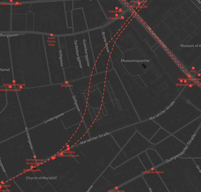
I modified the dark style to include train routes, bus stops (with name) and public transport stations. All these features are colored in red. I could not get the bus-lines as there doesn't seem to be that information on mapbox.
The style should be available here: mapbox://styles/bkqtnte10yz/cjycpzmlr2e5o1coxn307w5yz
If this is considered sufficient I want make the same additions to the light style.
Great! Can you post an example screenshot?
The style should be exported and embedded into the app: https://docs.mapbox.com/android/maps/overview/styling-map/#style-object
This is what the map looks like:
I was able to download the style.JSON file, but I don't know where to put it because I can't find the current one.
Can you give me a hint how to continue?
I'd need to check Mapbox docs myself. Maybe start by uploading the JSON here.
Oh, so it's not just swapping out the old style. I think I'll try to read up on the docs then.
Transportr_Dark(cjycpzmlr2e5o1coxn307w5yz).zip
The old style is a default style, so changing it is a bit more work. It is defined here: https://github.com/grote/Transportr/blob/master/app/src/main/res/values/themes.xml#L20
As a start, you could just replace @string/mapbox_style_dark with your style URL just to see if it works and then make it available as an asset/resource inside the app.