 grafana
Make <CollapseBox /> component
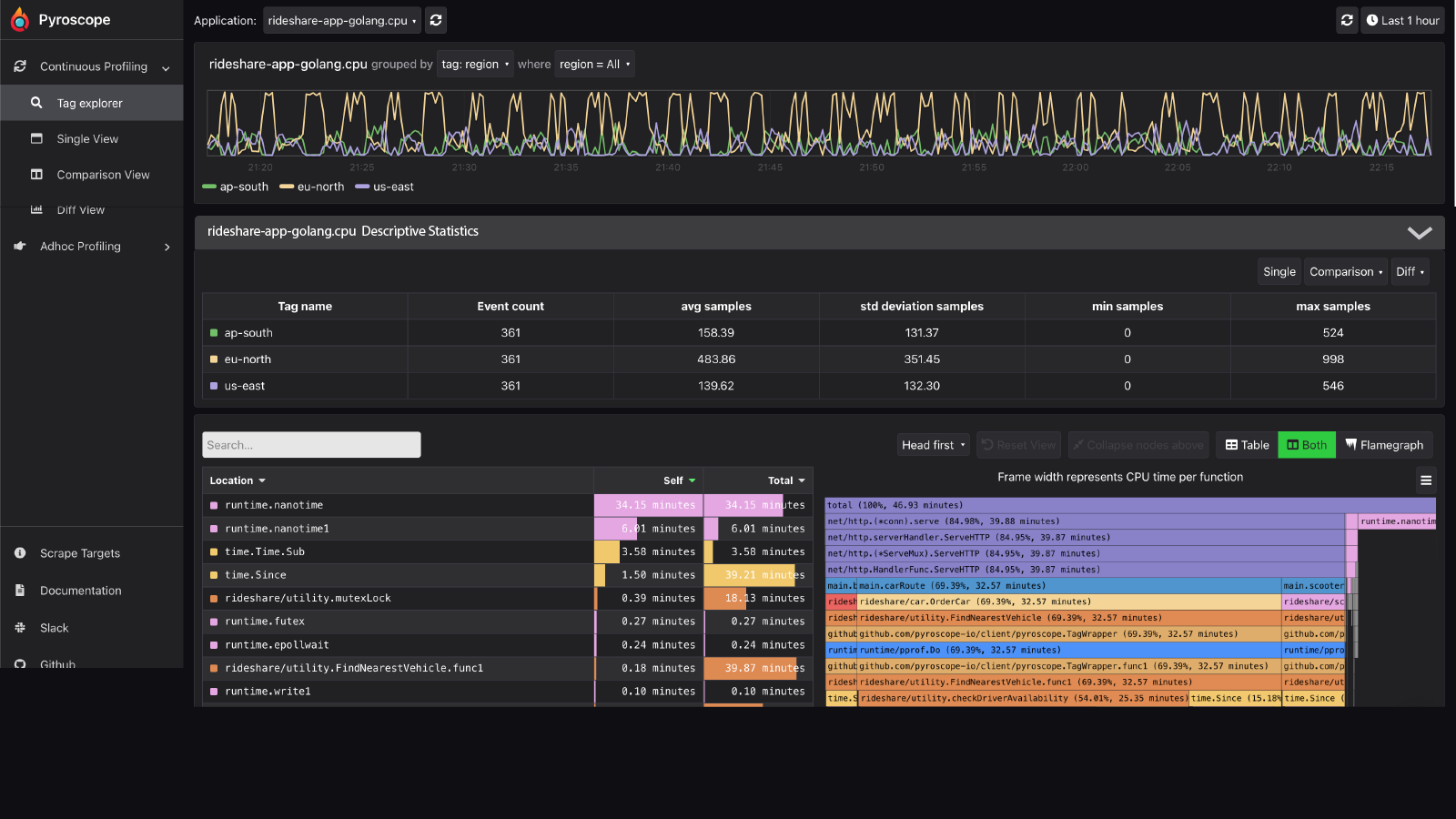
In a page like the tag explorer, sometimes you want to collapse this box to hide the information inside (and see more of the flamegraph at the same time as the timeline.
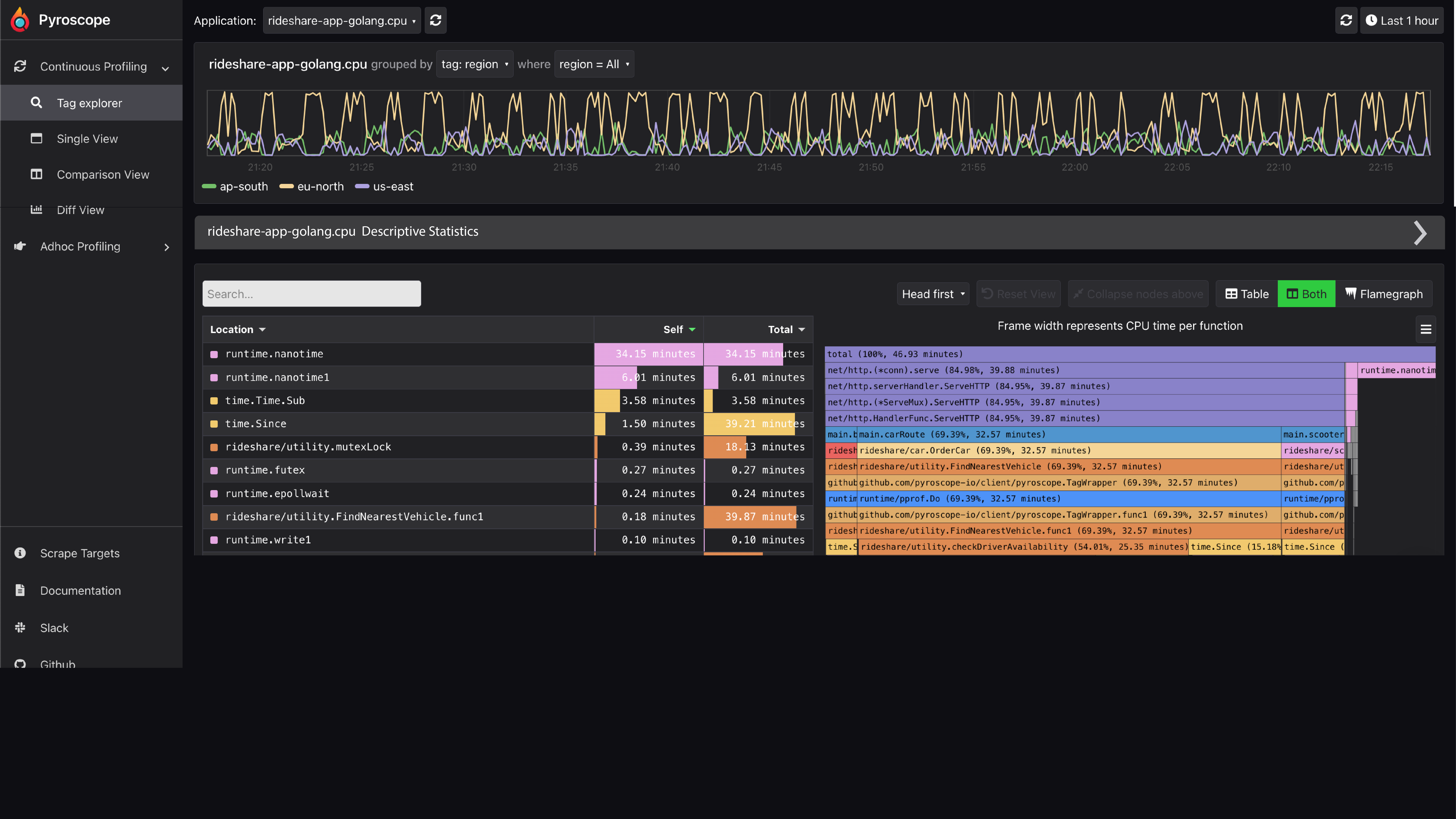
Open
Closed
We should make it so that you can hover over a panel, like the "Descriptive Statistics" panel and the arrow will appear similar to this video, but instead of opening a dropdown the arrow can open or close the panel
https://user-images.githubusercontent.com/23323466/185299368-df52ec7a-0b08-440a-81f6-f6deb118e8ba.mov
~We could probably enable this feature for the <Box/> component via a parameter~
We should create a new component similar to <Box/>called <CollapseBox /> that collapses
I am thinking a CollapseBox component instead, that wraps the Box one :)
Reason is that not all boxes can just be collapsible straight way, one example from your screenshot is that a title is now required:

Which is much cleaner to maintain if there's a component with those specific requirements.