govtrack.us-web
 govtrack.us-web copied to clipboard
Bring back the vote maps
I just had a sudden flashback of update e-mails with maps that showed what the votes looked like on a map of the United States. What ever happened to those?
The old Perl scripts were too annoying to keep running. We'd also need to generate new cartogram base maps for the new districts. I don't like displaying normal maps because it distorts the information (e.g. many tiny districts are not visible).
Any thoughts about revisiting this issue? I could see this implemented in two ways:
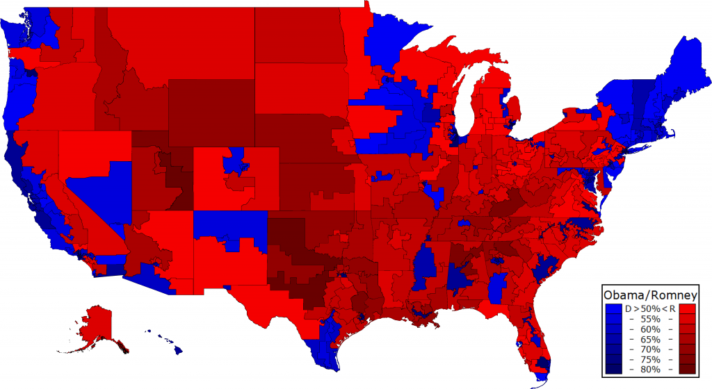
- A state map with each state having a color representing the ratio of Yays/Nays. Something along the lines of

- A representative map with each district a red/green color for yay/nay. Something along the lines of
I'm not particularly biased one way or the other. I do like the latter a little better, but @JoshData makes a good point about misrepresentation. I'd love to help get this implemented.
Hello!
I'd love to have your help, but I have two base requirements for something like this:
- It can't distort the result of the vote. The area shaded on the map must be proportional to the number of votes cast.
- It has to be accessible to users with color-blindness. There is no single color scheme that can be seen by all people. So it has to either use lightness only, or it needs a toggle between two color schemes.
Sorry I'm really picky on this one. :) But aside from that, it would be great to have your help.
I personally disagree with the first point. What would you expect the map to look like then? Something like this or this? I see where you're coming from, but if you're going to distort the map that much, I feel it defeats the purpose of a map in the first place. Given a bill, I would find it helpful to know if there are any geographic correlations.
In regards to color-blindness, there are certainly options available (on that website, go to 'diverging' in the dropdown and check the 'colorblind safe' option).
The old maps were something more like the latter, a cartogram. All the old maps are gone, but they used to be at a URL like the following:
http://www.govtrack.us/data/us/109/gen.rolls-geo/s2006-157-small.png
As for the colors, if that page can be trusted (and I have no reason to believe otherwise), it looks like our colorscheme would probably be:
- red: #CA0020
- light red: #F4A582 / #EF8A62
- white: #F7F7F7
- light blue: #92C5DE / #67A9CF
- blue: #0571B0
(The light colors apparently change depending on if the darker colors are present; the second values are the ones to use if there are only 3 colors.)
http://colorbrewer2.org/index.php?type=diverging&scheme=RdBu&n=5 http://colorbrewer2.org/index.php?type=diverging&scheme=RdBu&n=3
What would you expect the map to look like then? Something like this or this?
Yes.
I personally, like the former better (with the squares), but either work. If we go the cartogram route, is our only limitation getting the population data for each congressional district?
Even easier: Treat every district (or, for the Senate, every state) as having the same population (e.g. "1"). One district one vote. But I like the NYT-style map too.
Hey --edit-edit--, do you know if there's a reason NYT stopped using square-block cartograms for roll call vote maps?
Ooops, wrong handle. Hey @dwillis, do you know if there's a reason NYT stopped using square-block cartograms for roll call vote maps?
We still do them on occasion, but mostly we try to present maps with the actual state shapes.
@JoshData Good idea just using the district count instead of population count. If we can decide a specific cartogram style, I could start working towards it
EDIT: Also, found some other cartogram styles here
Not a district count. Just a fixed, constant number.
Either style works for me. There's a third possible style e.g. https://www.popvox.com/bills/us/113/hr1825/report#nation
More numeric background on this problem: http://razor.occams.info/blog/2013/12/23/50-of-the-u-s-population-lives-in-1-of-the-land-area/
- Half of the population in the continental United States lives in just 1% of the continental U.S. land area.
- Six congressional districts, all in New York City, are smaller than one pixel in a typically sized map.
- Republican-held congressional districts cover 3.2 times more land area than Democrat-held districts despite Republicans only having 1.2 times as many seats in Congress.