site-kit-wp
 site-kit-wp copied to clipboard
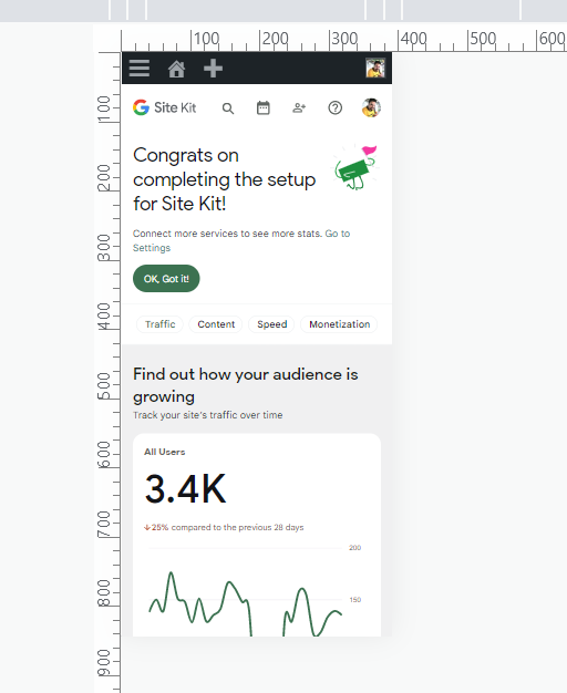
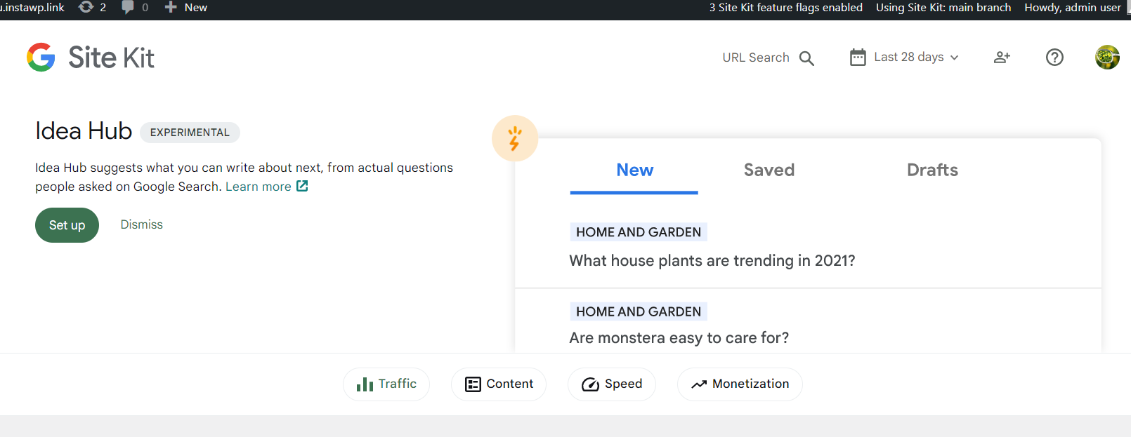
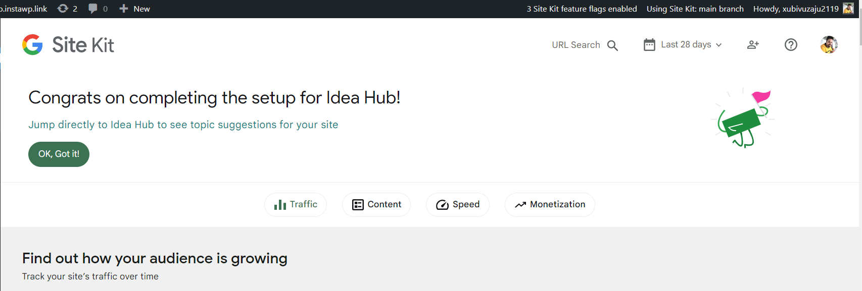
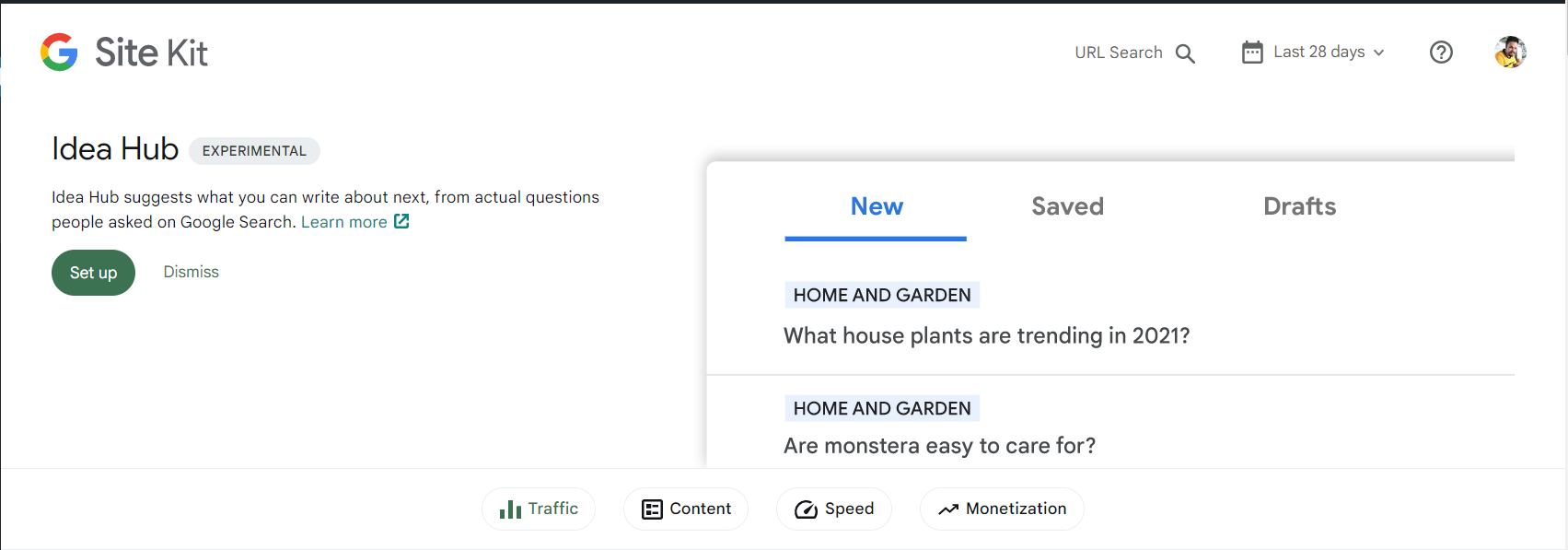
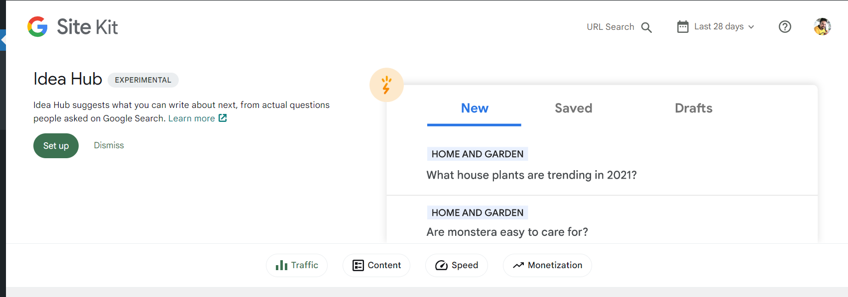
Successful set up banner icon is small as compare to Figma design
Asana bug bash task: https://app.asana.com/0/1202913874897532/1203046400278414
Successful set up banner icon is small as compare to Figma design. It is looking very small and cornered on big screens.
Do not alter or remove anything below. The following sections will be managed by moderators only.
Acceptance criteria
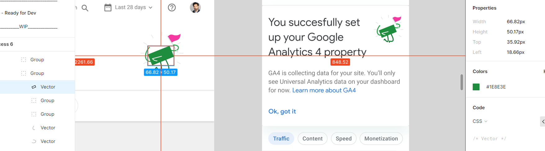
- The image size for the Success Banner should be increased as per the Figma design.
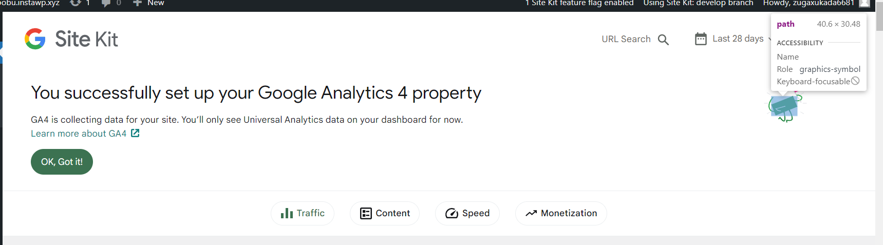
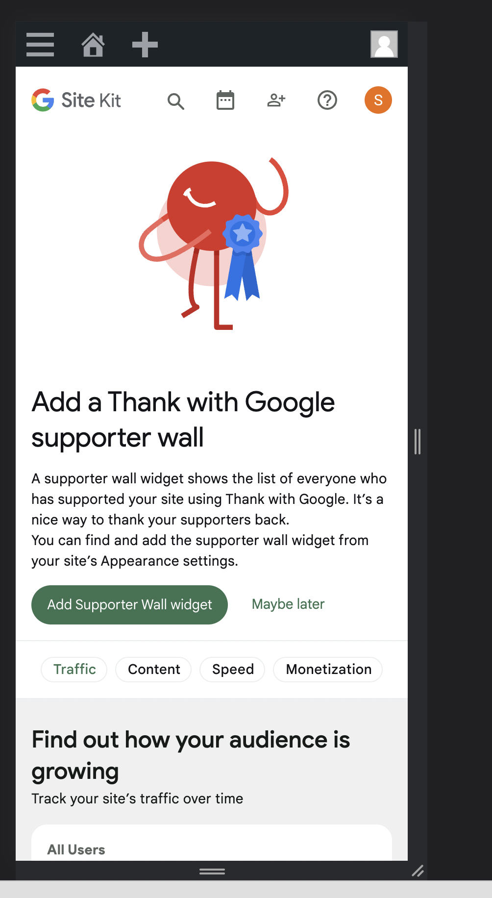
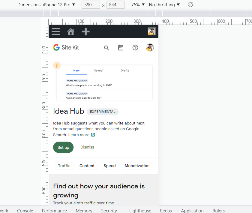
- Additionally, the image should appear besides (and not above) the title as shown in Figma for mobile screen sizes.
- These changes should apply to all icons for every success banner, not just the Thank with Google ones. See @sashadoes's comment below: https://github.com/google/site-kit-wp/issues/5934#issuecomment-1277966586
- Essentially, the success banners should be consistent regarding icon size/placement, in line with what's in the Figma design for Thank with Google.
Implementation Brief
- Inside
BannerNotificationhttps://github.com/google/site-kit-wp/blob/48952f8f09ed585bb3b6b1cf3fd4fd7f88b4fafc/assets/js/components/notifications/BannerNotification/index.js#L266-L272 - Place a new block with
WinImageSVGnext to the.googlesitekit-publisher-win__titlewrapper (containing the title and the badge) and make it visible only on mobiles. At the same time, the "original"WinImageSVGshould be hidden for mobiles. With this scenario FE will show "original"WinImageSVGon tablet+ screens and "small"WinImageSVGon mobiles. - Wrap
.googlesitekit-publisher-win__titleblock andWinImageSVGin a newflexcontainer and make them inline as on design WinImageSVGshould have110pxheighton tablet+ screens and72pxon mobiles
Test Coverage
Cover this implementation (render) with Unit tests. (Use setViewportWidth for different windows)
QA Brief
Changelog entry
Hi @FlicHollis.
Checked the implementation for this one.
I see that FE uses one implementation for several success banners.
So eg. for Add a Thank with Google supporter wall banner we have the same appearance on mobiles.
 Do we need to fix it as part of this ticket?
Thanks in advance!
Do we need to fix it as part of this ticket?
Thanks in advance!
cc @aaemnnosttv @tofumatt
@sashadoes you're asking if this should apply to all success banners or just the one for TwG? If so, I believe the change should be consistent for all rather than only for TwG. I think that should make it a bit more straightforward to do as well. Was that your understanding as well @tofumatt ?
I didn't actually realise the other banners were off as well, but I think fixing any other affected banners that use the same/similar code/styles makes sense to do as part of this issue, yes 👍🏻
So let's make all of the banners consistent as part of this issue. I've amended the ACs, let me know if something is off but otherwise should be ready for an IB 🙂
Hi @aaemnnosttv and @tofumatt. After some time spent on this, I came up with 2 possible ways to fix it. I would like to ask you for a review and advice as it seems to be more complex than just tweaking styles. The approaches are down below:
-
Change the
BannerNotificationlayout: create a new block (egHeader) where placeWinImageSVGhttps://github.com/google/site-kit-wp/blob/48952f8f09ed585bb3b6b1cf3fd4fd7f88b4fafc/assets/js/components/notifications/BannerNotification/index.js#L455-L469 next totitlehttps://github.com/google/site-kit-wp/blob/48952f8f09ed585bb3b6b1cf3fd4fd7f88b4fafc/assets/js/components/notifications/BannerNotification/index.js#L266-L272 inside new<Row>/<Cell>container. Then adjust thegetContentCellSizeProperties&getImageCellSizePropertieshelpers to work with new layout. This looks like a good option, butWinImageSVGshould have a 0px height for the tablet+ screens in order to avoid unnecessary space under thetitlebefore thedescription(text and CTA) block.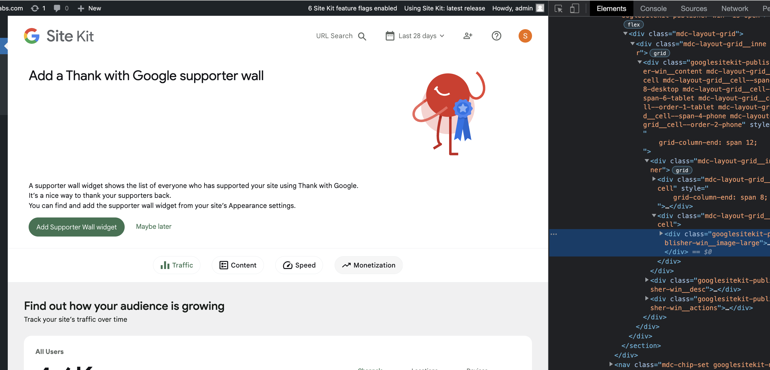 Alternatively, FE can use
 grid-template-areasin order to recompose grid blocks for different screens. -
Place an extra block with
WinImageSVGnext totitleand make it visible only on mobiles. On the same time the "original"WinImageSVGshould be hidden for mobiles. With this scenario FE will show "original"WinImageSVGfor desktops + tablets and "small"WinImageSVGfor mobiles.
Also, I would consider breaking down BannerNotification into smaller and more dedicated layout components. As the 545 line component which serves so many cases looks not so easy to support and adjust.
The 0px height trick strikes me as a bit of a CSS hack; I'd prefer us avoid them whenever possible. 🙂
In this case, using different markup for mobile/non-mobile viewports is fine with me if it's just imagery and not actual content, which it seems to be here.
So I think I'm more a fan of number 2 👍🏻
In terms of refactoring the component into smaller chunks—fair point, but we should probably do that as a separate issue so we can review the refactoring separately from this fix 🙂
@sashadoes Thanks for the IB and I suggest we make the following tweaks to it:
- Let's avoid putting code in the IB as it can prompt the engineer working on the code to just copy and paste, and the IB reviewer will tend to CR the code at the IB stage. For e.g we are trying to avoid nesting CSS selectors within media queries.
- About the comment to implement option 2, instead having the engineer to go through the list of comments, can you copy over the approach within the IB?
- About the following:
Inside BannerNotification put a new WinImageSVG block next to title
- Can you be more explicit (without the code), and rather mention putting
WinImageSVGnext to the wrapper containing the title and the badge? Reading the IB, I thought we should putWinImageSVGnext to thetitlevariable.
- Can you be more explicit (without the code), and rather mention putting
- Instead of using
display: inline-block, how about we useflexon the parent element and the set thegooglesitekit-publisher-win__titleto grow if there's noWinImageSVG. - Why should we set the
heightofWinImageSVGto120px? :thinking: Checking at the designs, I noticed the icon is105px. Let me know if am missing something here :grin: . - About the tests needed, I don't think we need unit tests, rather we should add a new scenario to our VRT suite (if not already present). Most likely since it's a global change, VRT images will need to be updated.
Thanks @sashadoes . A few more tweaks:
- Can you update the "Test Coverage" section to remove unit tests and instead add scenarios within the VRT suite?
- Let's make sure that if there's no
WinImageSVGprovided, the wrapper containing the title and the badge should expand to be 100% wide. - Can you let me know about the height of the SVG? As per my previous comment, the height is 105px, but in the IB you suggested 110px.
Thanks!
@sashadoes IB looks good. However can you let me know about the following?
Can you let me know about the height of the SVG? As per my previous comment, the height is 105px, but in the IB you suggested 110px.
Thanks @sashadoes . LGTM. For future IBs, instead of adding the height and width of the SVGs in the IB, you can just say to style the SVG as per the designs in Figma (which I added in the designs). That'll reduce confusion and the designs will be the single source of truth :)
@mohitwp I am unsure if you have started the QA on this ticket but wanted to highlight a regression that appears to be from this ticket. Please could you add this to any other observations you find.
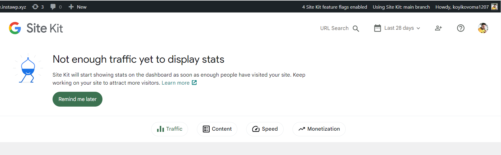
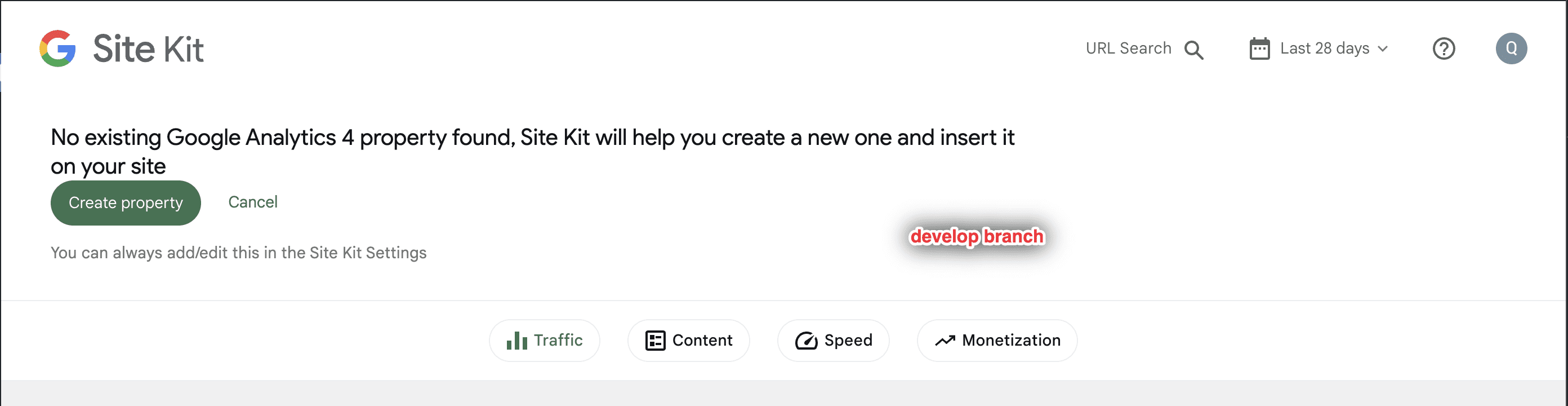
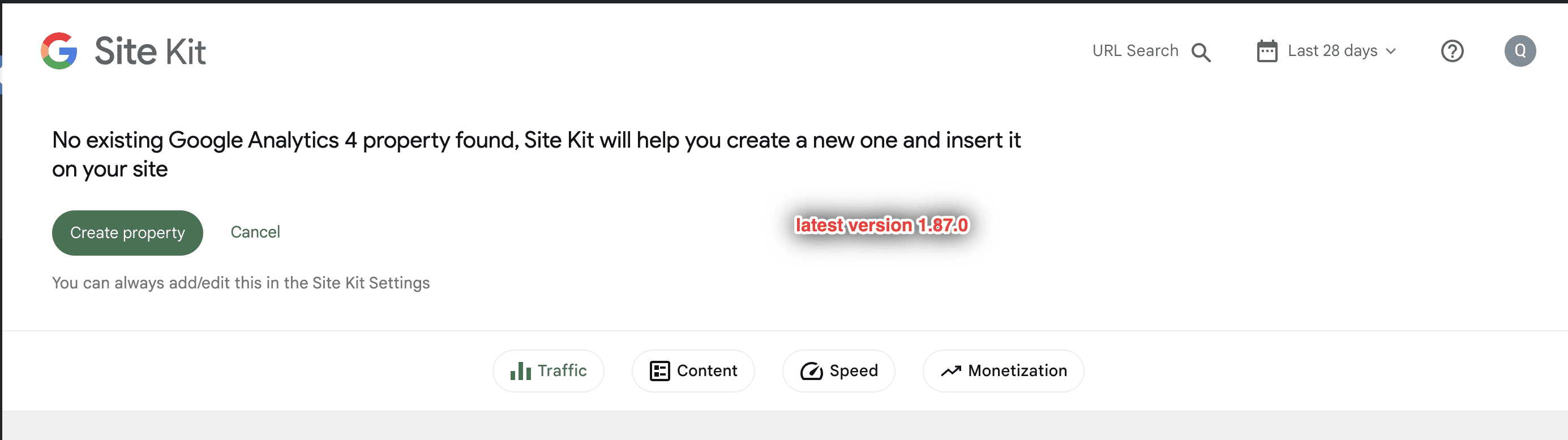
- The GA4 Activation banner looks different between develop and latest version. There’s no padding around the text and CTA on develop. Here are the screenshots.
QA Update ❌
Thank you @wpdarren
@sashadoes @asvinb
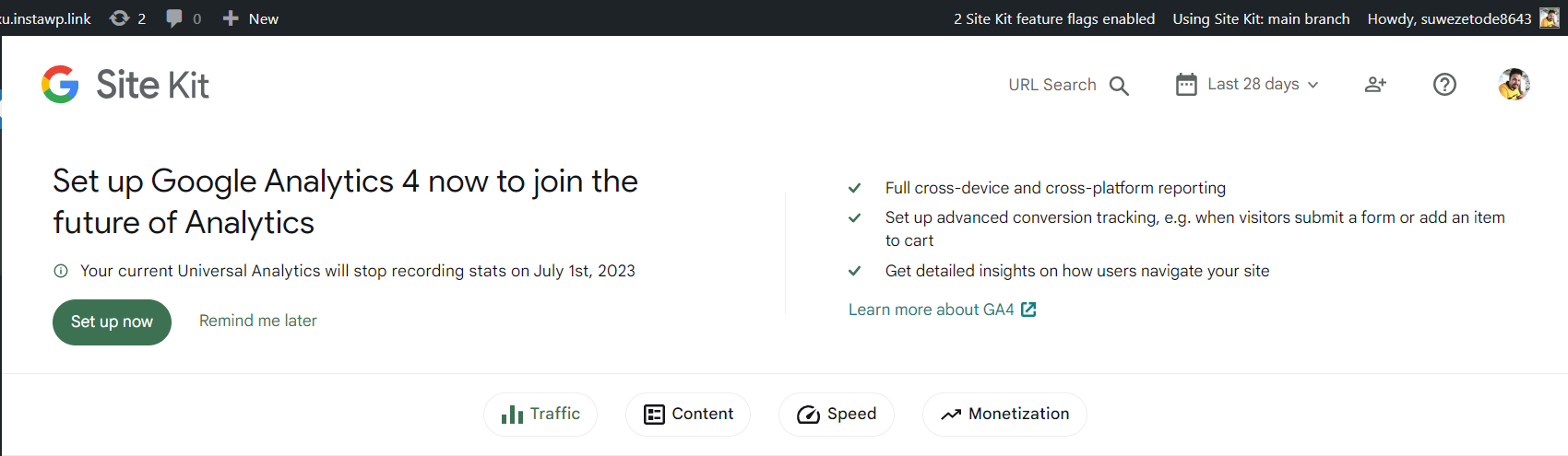
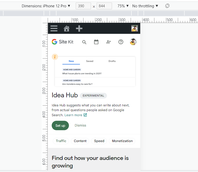
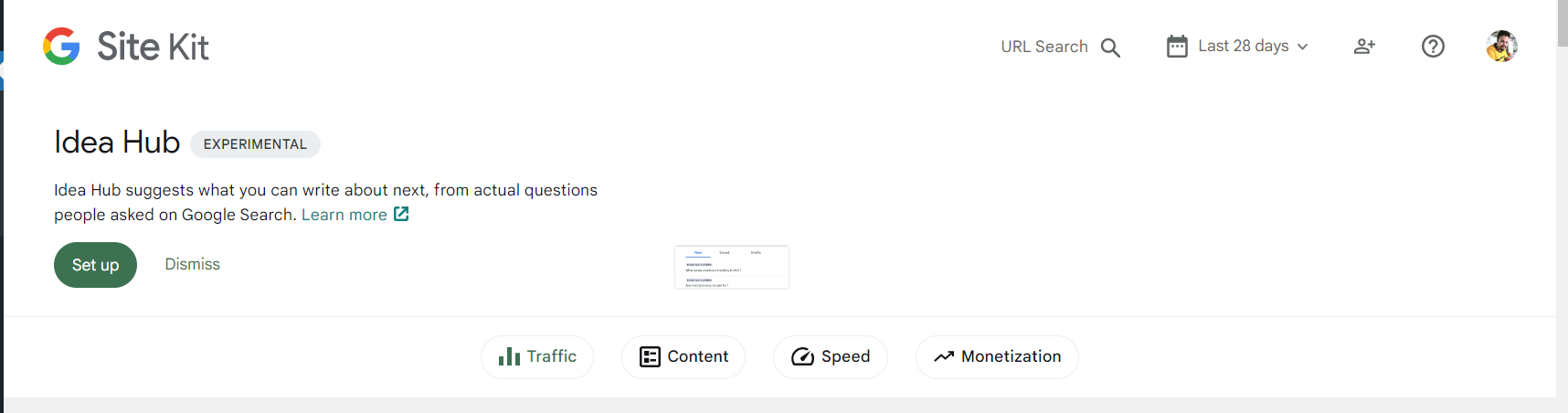
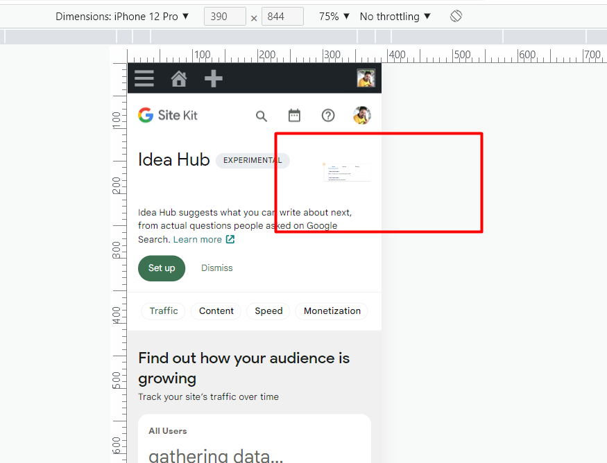
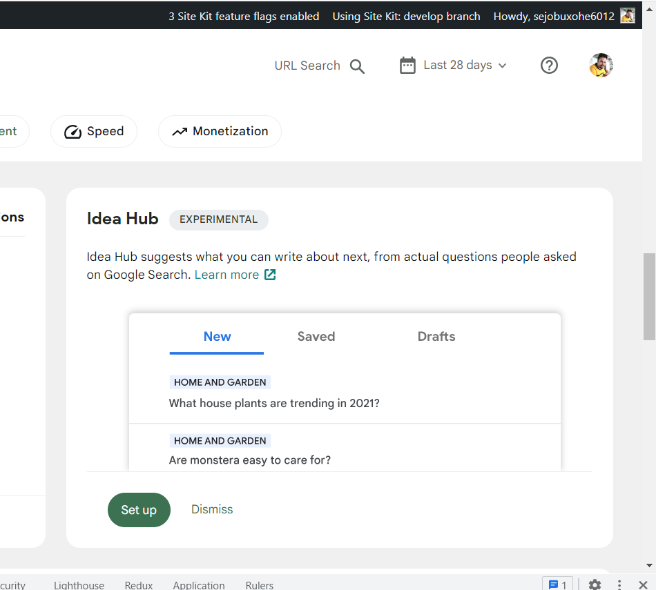
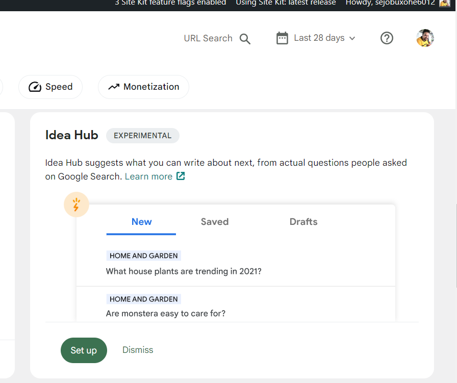
Apart from the issue reported above by Darren. I've found that Idea hub set up banner image is got tiny on develop. Let me know if this is not due to changes introduced in connected PR.
@tofumatt Can you review followup PR please? Basically there was a CSS regression but most importantly the Idea Hub notification is different from other notifications due to the large SVG. Not sure if we can have the notification consistent with the other ones since that'll mean a new SVG. Let me know what you think
QA Update ❌
Issues
- On dev Idea hub setup banner SVG looking bigger than latest and orange part of Image is missing in both banner and widget.
- In mobile banner svg looking very small.
dev
latest-
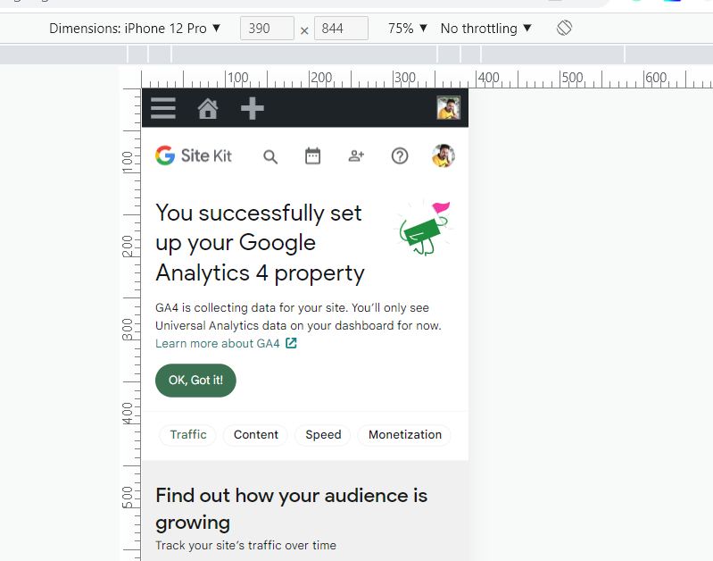
QA Update ✅
- Verified on main branch.
- Verified all success set up banners, Idea hub set up banner and GA4 banners.
- Issues reported above are now resolved.
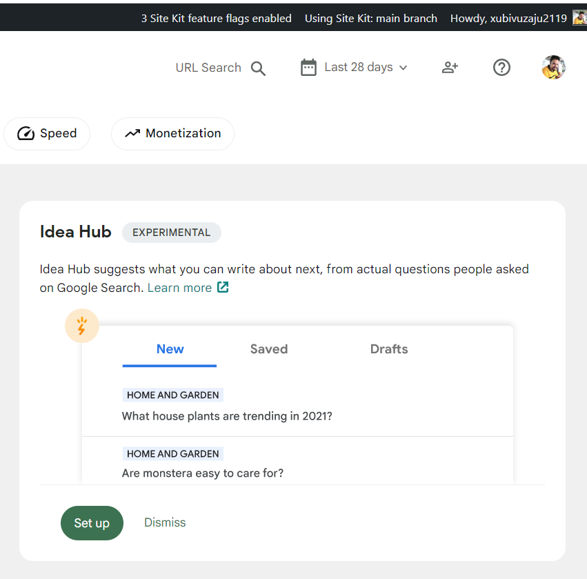
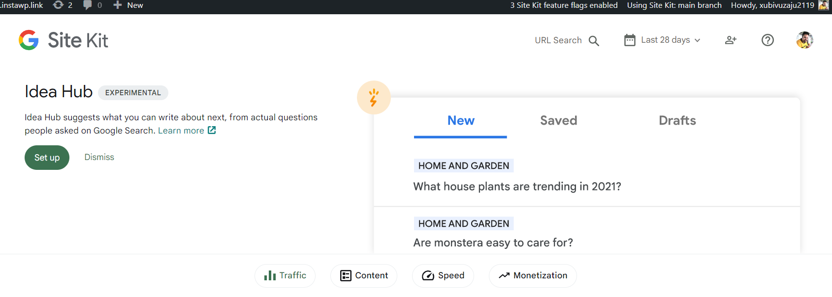
- Idea hub set up banner is looking fine on desktop and mobile.