Implement new design for Review screen of User Input page with the new Inline Edit interface
Feature Description
The review screen of the User Input page should be updated to implement the new Figma design for User Input v2.
Also, 'Edit' functionality of User Input Review screen is a way for users to make changes to their answers before submitting. Currently, clicking it takes the user back to the questions screen which is a cumbersome UX. To make the experience better, the new Inline edit interface from the Figma design should be implemented. It is similar to how Edit Settings behaves on the Connected Services page. ie. expend the question for editing, lock out other questions, etc.
Do not alter or remove anything below. The following sections will be managed by moderators only.
Acceptance criteria
- The review screen of User Input page should follow the new design for desktop and mobile.
- This screen should also implement the new inline 'Edit' functionality as seen in the Figma design.
- Clicking on Edit should expand the question with all available answers where user can update their choice(s).
- Clicking "Edit" on an already opened question should close it and update the answer.
- Clicking "Edit" on a different question while another one is open should close the previously opened one and expand the new one.
- If the minimum answer requirement is not met and the user closes the inline editor, an error message should be raised as seen in the design.
- Similar error message should also be displayed when the user tries to save the answers while not answering a question.
- The layout, typography, positioning of various UI elements and text copies should exactly follow the design
Implementation Brief
Test Coverage
QA Brief
Changelog entry
@kuasha420 I'm not sure it's worth separating the design implementation of the questions and the review step into their own issues. I would think these should be doable together without much extra work. What do you think?
@aaemnnosttv Instead of bloating #5890 further, how about adding this one with #5893 ?
@aaemnnosttv I have updated this issue to address Inline Edit interface here. We can further tweak this one and close #5893 . What do you think?
Regarding your comment about inline Editing in Settings page, I think we can make #5897 dependent on this one.
Looks good, but the mocks in the Figma design don't seem to show other questions as being "greyed out"/"disabled" when not open:
Should that be part be omitted from the IB?
@tofumatt good spot, the other question should be off screen or not visible at all. There was a discussion about adding some animation ie. sliding in and out the questions, but that discussion got stalled and we didn't have anything definitive from the UX team.
cc @eclarke1
@kuasha420 It'll be a weird UX experience when the user clicks on a question to "Edit" and the other questions are not visible. Consider editing the third question and the first 2 questions are no longer visible which will trigger a big layout shift and can be confusing for the user. I can still see the greyed out other questions on small screens designs: https://www.figma.com/file/CdtrHB0HAjfGRWTnTMMQI0/SummaryWidget?node-id=1764%3A46682
I think for consistency with the Module Settings page and the user input settings, #5897 we should keep the greyed out feature when a question is being edited. Curious to hear your thoughts @tofumatt @aaemnnosttv
I agree with @asvinb… greying them out seems like a good compromise and I think indicates better how it should work. It's also more consistent with the rest of our UIs.
Also I see the greyed out is in mobile but not desktop. I think I mostly looked at the desktop so thought it wasn't part of the design.
Let's go with the greyed out inactive questions, so let's adjust the IB for that, even though it's not in the desktop design. 👍🏻
@tofumatt Something just came to mind, so if we grey out the inactive questions that bring another issue where the only way to deselect an active question would be to click on the "Edit" button again. The "Back" and "Save" buttons are at the bottom of all the questions, so it'll be a rather awkward experience. The user won't know how to "deselect" an active questoin. On the user input settings page, we don't have this issue since the active question has its own "Confirm Changes" and "Cancel" button. https://www.figma.com/file/CdtrHB0HAjfGRWTnTMMQI0/SummaryWidget?node-id=910%3A24351 Maybe on the review screen we should have a "Confirm Changes" and "Cancel" buttons as well, and the "Save" button at the bottom of the page will save the settings. 🤔
What do you think?
@asvinb Oh! I just noticed, the mobile view with the greyed out "inactive" questions is actually the admin screen, editing the questions, and not the "initial" User Input page, outside of Site Kit settings. On the non-settings view, there's no greying out of "inactive" questions.
It looks like there's intentionally a difference in the design, probably partially because of what you pointed out. I don't think we should be adding more buttons to the UI; I think for the non-settings UI we shouldn't be greying things out.
Since this is the review screen, let's not do the greyed-out UI at all.
Having realised this is dependent on #5890 I'm parking it back in EB for now.
QA Update: ❌
@kuasha420 I have a number of observations between figma and what I am seeing on my test site. It's possible that these are known issues, but didn't want to make any assumptions.
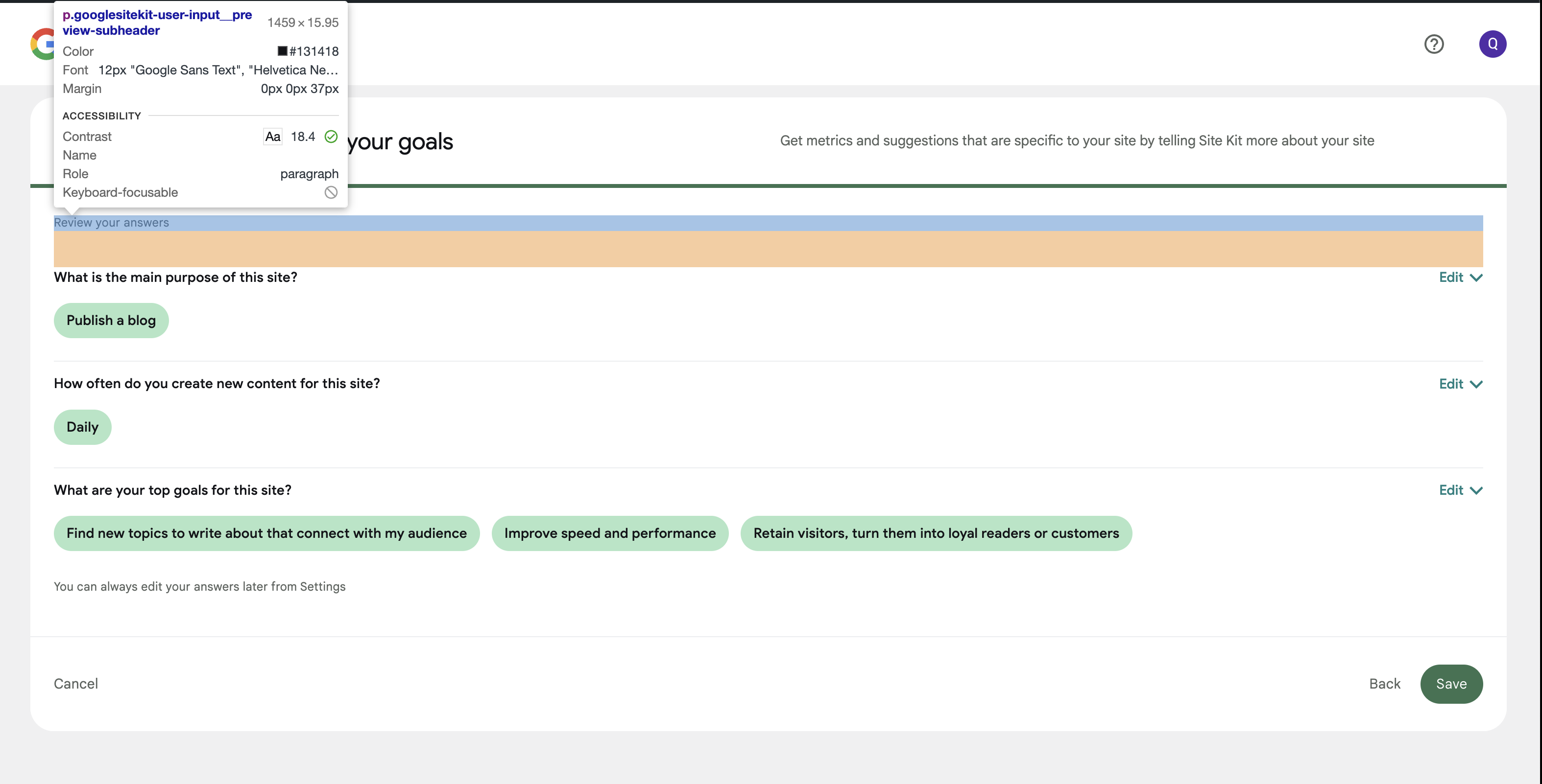
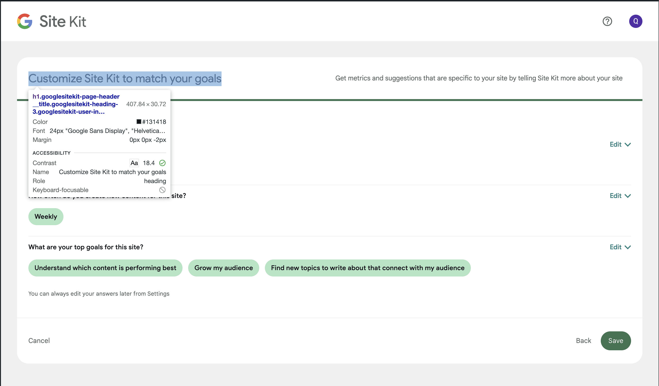
- The header
Customize Site Kit to match your goalsis font size 22px in figma but is showing up as 24px.
- The sub header text
Get metrics and suggestions that are specific to your site by telling Site Kit more about your sitehas a font color of#6C726Ebut I see#5f6561on my test site.

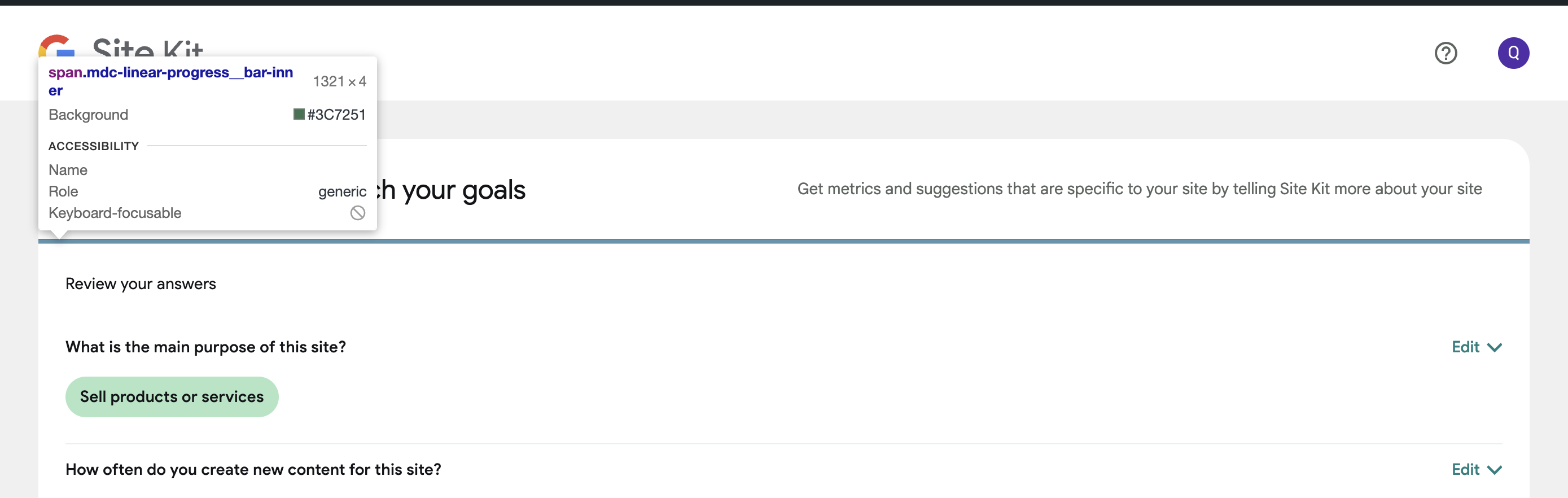
- The progress bar is
#45655Con figma but on my site it is#3c7251
- The
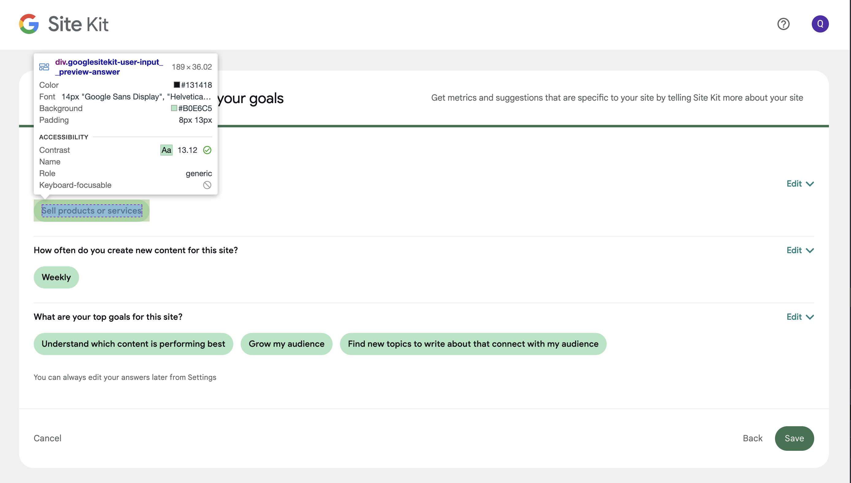
Review your answerstext isGoogle Sans Text at 12pxon figma but my site isGoogle Sans Display at 14px

- The answers with the shade of green background are different. On figma it is
#B8E5CAbut on my site it is#b0e6c5
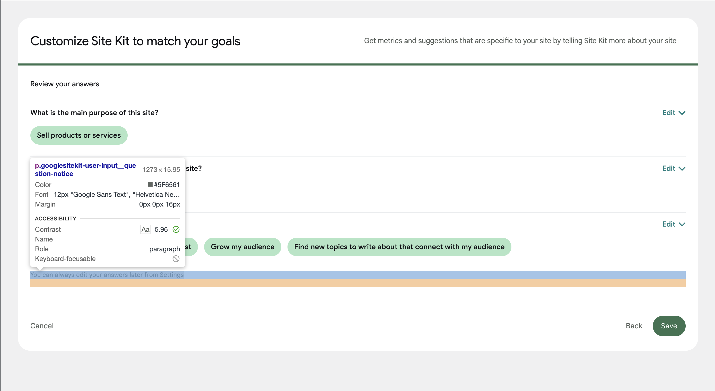
- The text
You can always edit your answers later from Settingshas a font color of#6C726Eon figma but#5f6561on my test website.
@wpdarren As far as I recall, Most of the styling inconsistencies are the result of we sticking with our own size/colors defined in SCSS instead of following Figma. Since @techanvil originally worked on this one, I'm delegating this one to him for further clarification and tweaks if needed. Cheers.
@wpdarren thanks for raising these, I've looked into each point.
- 1, 2, 5 and 6: These have been implemented using the correct token/variable, and will be fixed via #6328.
- 3: This is a mistake on Figma, confirmed by Sigal on Slack who is updating the Figma files. The implementation is correct as it stands.
- 4: This needs an update to use the correct token/variables, which I have created a followup PR for: #6387.
QA Update: ⚠️
@techanvil @kuasha420
Three observations:
-
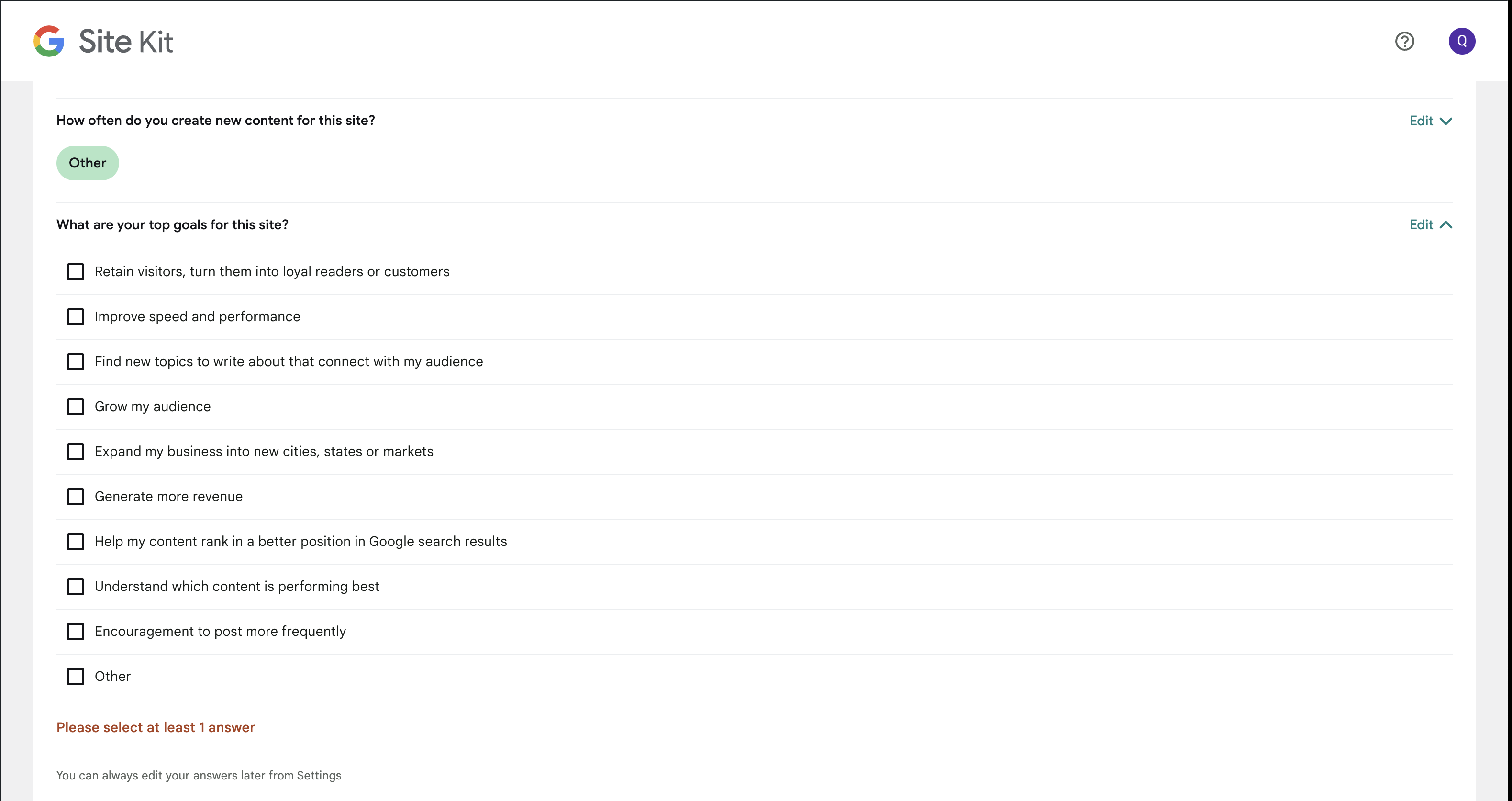
Re the Figma design here - for the radio button questions. It’s suggesting that you can save without selecting an option, which is not true for the first two questions. I am assuming this figma design does not apply here, correct? I didn't want to make an incorrect assumption.
-
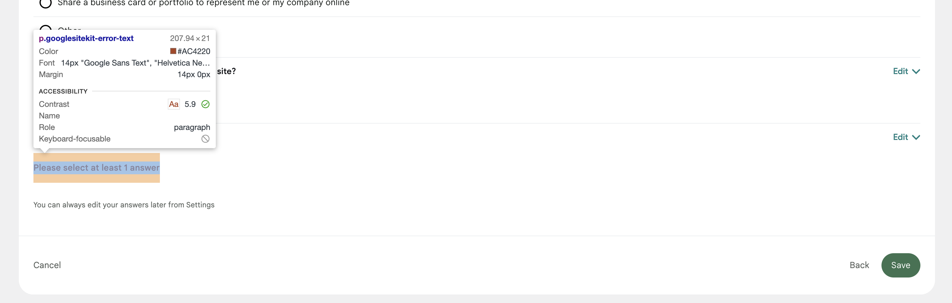
The font colour of the error message when you do not select enough answers is different between figma and my site. Figma shows as
#D53E36but my site is#ac4220
- When I select 'Other' for one or all of the questions, there is no field to enter a response. I understood that this is because we are setting up on the service site, a popup to appear asking for more information. Is that correct? If so, is the error message that is in the QAB correct?
@wpdarren thanks for raising this.
-
Our implementation is correct. This was decided in this issue by @tofumatt to disable the save button.
-
This is another of those GM2+ inconsistencies that will be fixed up by the follow up issue created by Evan.
-
This is also expected as we have removed the text field from the other field and turned it into a regular answer.
Cheers.
QA Update: ✅
Verified:
- The review screen of User Input page follows the new design for desktop and mobile.
- Tested the review screen on supported browsers and various devices.
- This screen implements the new inline 'Edit' functionality.
- Clicking on Edit expands the question with all available answers where user can update their choice(s).
- Clicking "Edit" on an already opened question closes it and updates the answer in the review screen.
- Clicking "Edit" on a different question while another one is open closes the previously opened one and expands the new.
- On the 3rd question. When the minimum answer requirement is not met and the user closes the inline editor, an error message is raised as seen in the figma design.
- The layout, typography, positioning of various UI elements and text copies follows the design, other than issues highlighted. Note: issue 4 in the highlighted comment has been fixed as per screenshot below.
Screenshots