Implement new design for User Input questions
Feature Description
The question screens of the User Input page should be updated to implement the new Figma design for User Input v2.
Do not alter or remove anything below. The following sections will be managed by moderators only.
Acceptance criteria
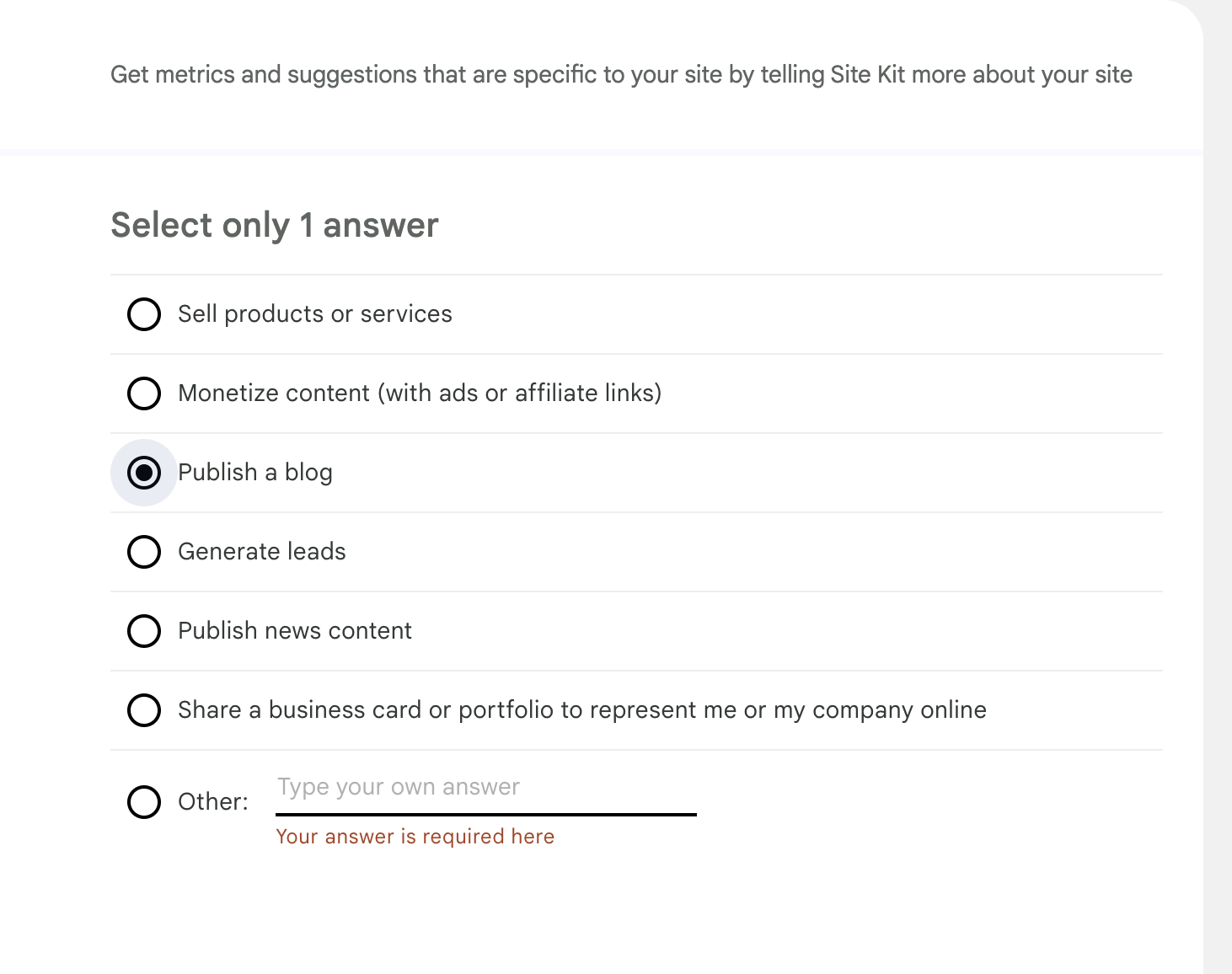
- The questions in the User Input page should implement the new design for desktop and mobile.
- The layout, typography, positioning of various UI elements and text copies should exactly follow the design.
- No answers should be selected by default and the
Nextbutton should be keptdisableduntil user selects required minimum number of answer(s). - The User Input page should also implement the
Cancelbutton as seen on the design.- It should be available on all the questions page as well as the Review page.
- Clicking on it should take the user back to Site Kit Dashboard.
- If a question has "Other" as an answer option, clicking it should open a text field for custom answer.
- If " Other" option is picked and the text field is empty when user clicks "Next/Review", an error message should be displayed under the text field as seen in the design.
Implementation Brief
Test Coverage
QA Brief
Changelog entry
@kuasha420 right now there is a possibility that we may remove the open-text input fields for "Other" choices. See the PRD for details.
Otherwise, I believe I raised the question on another issue as well but will the questions use a shared component between the dedicated page and the settings page? They're mostly the same are they not? We should avoid duplicate/conflicting efforts between these similar instances as much as we can. Let me know what you think.
@aaemnnosttv sounds good to me. I have combined #5892 with this one. For the other field, where can I follow the discussion?
For the other field, where can I follow the discussion?
See this thread although there may be another place too.
- No answers should be selected by default and the
Nextbutton should be keptdisableduntil user selects required minimum number of answer(s).
A site-specific answer should be preselected if it has already been answered by another user, otherwise a user's own answers would be blank/unselected at this point.
- If a question has "Other" as an answer option, clicking it should open a text field for custom answer.
As mentioned above, it sounds like this might change so let's try to word this in a way which doesn't block the issue moving forward here if possible.
Apart from these details, LGTM
Made the necessary changes accordingly. Since Evan is OOO this week, anyone else can have a look and move it to IB if the changes makes sense. Cheers.
@kuasha420 @tofumatt A note about the following:
If " Other" option is picked and the text field is empty when user clicks "Next/Review", an error message should be displayed under the text field as seen in the design.
Right now, the "Next" button is disabled if the "Other" option is selected and the user does not input something in the textbox. I think from a UX point of view it's much better right now in the sense that the user already knows that he cannot continue unless he enters something in the textbox, which itself has focus when the "Other" option is selected. If we implement the logic as per the designs whereby the user sees an error message, it'll require the user to have an additional click on the "Next" button only to find out he cannot continue to the next page.
Let me know what you think.
@asvinb Oh, right, good point.
I've updated the ACs to say that the "Next/Review" button should be disabled, but that error message should appear if the user focuses then blurs that input whilst leaving it blank.
I think that's the best UX, where we notify the user that their input isn't valid only after they've interacted with the input field.
QA Update: ❌
@nfmohit I have a number of observations. Some of them could be related to the Figma designs not being accurate but do not want to make any assumptions.
-
The text
Get metrics and suggestions that are specific to your site by telling Site Kit more about your sitehas a different font colour on Figma (#6C726E) compared with thedevelopbranch. (#5f6561) -
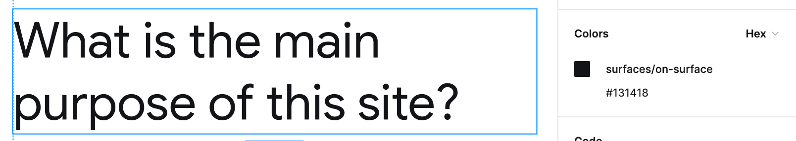
The text
Select only 1 answerhas the same issue as above but also the Figma design suggests it should be 18px but on develop it is 20px. The font weight is correct at 500. -
The questions have a different font colour on Figma designs as
#161B18compared with develop (#333935) -
When I have two admins I do not see the text
Your answers will apply to the entire WordPress site: any other admins with access to Site Kit can see them and edit them.which is detailed in the Figma designs. -
I've noticed weird behaviour with the '
Other' option on all of the questions. I click on the option, and then click into the input field to type my answer, and text appears in red underneathYour answer is required hereIf I decide not to select the 'Other' option and instead select another answer, the red text still appears underneath.
- There is a styling issue on the first edit link when you are viewing a summary of the responses. See screenshot.
Thank you for sharing your findings, @wpdarren!
The text
Get metrics and suggestions that are specific to your site by telling Site Kit more about your sitehas a different font colour on Figma (#6C726E) compared with the develop branch. (#5f6561)
I believe the Figma designs aren't accurate here. The color is defined as surfaces/on-surface-variant, which is #5f6561 in our codebase.
The text
Select only 1 answerhas the same issue as above but also the Figma design suggests it should be 18px but on develop it is 20px. The font weight is correct at 500.
Same as above. The typography is defined as title/large, which is 20px in our codebase.
The questions have a different font colour on Figma designs as
#161B18compared with develop (#333935)
Addressed in the follow-up PR #6229.
When I have two admins I do not see the text Your answers will apply to the entire WordPress site: any other admins with access to Site Kit can see them and edit them. which is detailed in the Figma designs.
This happens because the question What is the main purpose of this site? isn't supported by the Google proxy where the answers are being currently saved. This should be fixed once #5898 is merged.
I've noticed weird behaviour with the 'Other' option on all of the questions. I click on the option, and then click into the input field to type my answer, and text appears in red underneath Your answer is required here If I decide not to select the 'Other' option and instead select another answer, the red text still appears underneath.
As discussed in Slack, we'll not be addressing this here since the text field associated with the Other option will be entirely removed as a part of #6181.
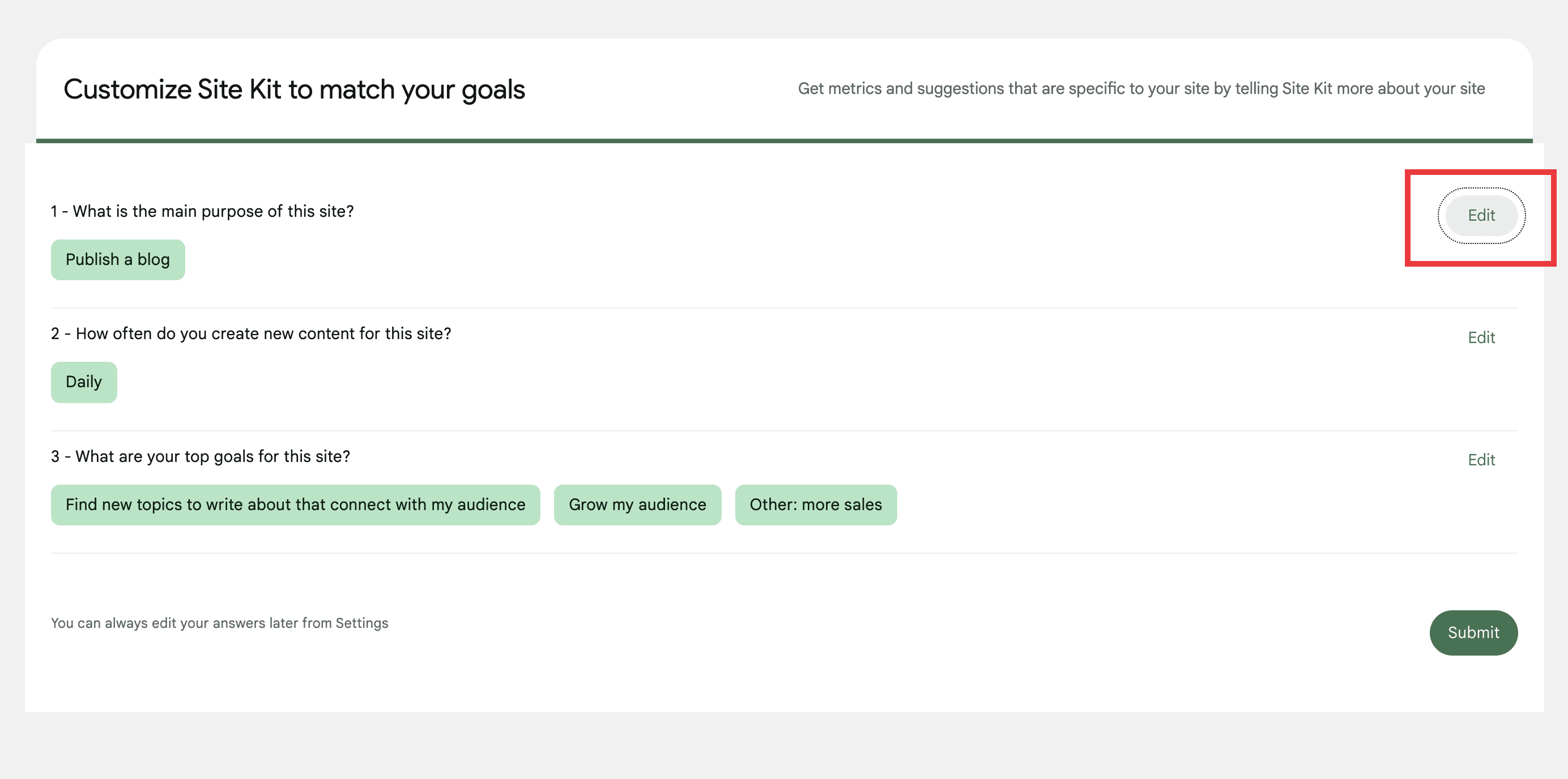
There is a styling issue on the first edit link when you are viewing a summary of the responses.
Also as discussed in Slack, this isn't a regression from this issue. Also, the entire Preview screen will be re-designed as a part of #5891.
I believe the Figma designs aren't accurate here. The color is defined as
surfaces/on-surface-variant, which is#5f6561in our codebase.
@nfmohit I'm not sure why Figma would be off as we should definitely be consistent with variables that are intended to reference the same token. I've raised this internally – perhaps Figma has changed since we initially implemented it?
The text
Select only 1 answerhas the same issue as above but also the Figma design suggests it should be 18px but on develop it is 20px. The font weight is correct at 500.Same as above. The typography is defined as
title/large, which is20pxin our codebase.
Figma does show 18px so I wonder if this was missed initially (which initially implemented it with rem but also commented it as 20px) or also changed?
The questions have a different font colour on Figma designs as
#161B18compared with develop (#333935)Addressed in the follow-up PR #6229.
Maybe we're not looking at the same thing, but I see surfaces/on-surface which uses the same hex we have defined for it.
This PR seems to address something else. @wpdarren what were you referring to in your observation?
@nfmohit the important thing here is that we're using the proper tokens in the styling as the design but Darren can only see the end result of course. Ultimately, these all look like simple updates to our variables which affect all places they're used (i.e. go beyond the scope of this issue) so we need to align with design to make sure we're using the right values.
Anything which is specific to a variable change should probably happen in a dedicated issue and we can double-check everything. Everything else seems to be a non-issue, but again please make sure the correct tokens are used from the design.
@wpdarren I've merged the PR @nfmohit opened to correct the color of the choices but it seems there may be more fundamental misalignment with the GM2+ color palette for which we should confirm and if needed address in a separate issue as this would be more of an amendment to the GM2+ implementation rather than anything specific to user input. It might be best to add a QA:Eng here to check that the implementation uses the proper variables/tokens for the palette, that way it will naturally be fixed together if we update those definitions the the aforementioned follow-up issue.
Back to you for another pass 👍
QA Update: ⚠️
@nfmohit I know that we have some misalignment with the GM2+ color palette but I am still seeing the issue that I reported before, these are:
The text
Select only 1 answerhas the same issue as above but also the Figma design suggests it should be 18px but on develop it is 20px. The font weight is correct at 500.
According to Evan's comment above, I am thinking that this should be fixed. Am I correct?
@wpdarren the text you're referring to uses title/large as @nfmohit mentioned. This correlates to this variable in our styles, so this would be corrected in the GM2 alignment.
https://github.com/google/site-kit-wp/blob/c2c618b5d9311365693371cc4525bc8eee865c3f/assets/sass/config/_variables-mui3.scss#L180
@nfmohit the important thing here is that we're using the proper tokens in the styling as the design but Darren can only see the end result of course. Ultimately, these all look like simple updates to our variables which affect all places they're used (i.e. go beyond the scope of this issue) so we need to align with design to make sure we're using the right values.
Anything which is specific to a variable change should probably happen in a dedicated issue and we can double-check everything. Everything else seems to be a non-issue, but again please make sure the correct tokens are used from the design.
Absolutely understood and agreed, thank you for the clarification, @aaemnnosttv! I thought the same way, which is why I followed the usage of the tokens defined in the Figma designs and used the relevant SCSS variables. I didn't change the variable values as a part of this issue because I assumed something might be off with the consistency and would need to be addressed separately.
I believe the Figma designs aren't accurate here. The color is defined as
surfaces/on-surface-variant, which is#5f6561in our codebase.@nfmohit I'm not sure why Figma would be off as we should definitely be consistent with variables that are intended to reference the same token. I've raised this internally – perhaps Figma has changed since we initially implemented it?
The text
Select only 1 answerhas the same issue as above but also the Figma design suggests it should be 18px but on develop it is 20px. The font weight is correct at 500.Same as above. The typography is defined as
title/large, which is20pxin our codebase.Figma does show 18px so I wonder if this was missed initially (which initially implemented it with rem but also commented it as 20px) or also changed?
Understood. This could be an inconsistency between the Figma designs (tokens) and our variable values. Please do let me know if you want me to create issues to update these if needed based on the internal discussions.
Thank you!
QA Update: ⚠️
@aaemnnosttv @nfmohit thank you for clarifying this. Has a ticket being created for these GM2+ issues?
I am sorry, but I have a few additional observations that I felt were worth raising.
- There's a weird UX/UI behavior when you click on the 'cancel' button on any of the questions. Initially, the loading animation appears and then question 1 is loaded. The AC says:
Clicking on it should take the user back to Site Kit Dashboard.
https://user-images.githubusercontent.com/73545194/205002999-9228ef91-b0f5-4ca4-8d65-455df35e831b.mp4
- On question 3, the completion bar at the top is fully across the top, where on the figma design it is around 75%

- When you first load the user input, on the first question, the first answer appears highlighted. Not sure if this is expected, or, it'll be fixed with another ticket.

I think that's it. Testing is completed on this ticket, but would love some thoughts on my observations above.
Very interesting findings, thank you @wpdarren!
There's a weird UX/UI behavior when you click on the 'cancel' button on any of the questions. Initially, the loading animation appears and then question 1 is loaded. The AC says: Clicking on it should take the user back to Site Kit Dashboard.
Hmm, I can't seem to be able to replicate this on my end. Here's a screencast:

I think you might be stuck in a scenario where the User Input is required and you can't get past to the Dashboard unless you answer the user input questions. We're removing this as a part of #5900. Can you normally navigate to the Site Kit Dashboard when this happens?
I do see the loading animation. Do you think it should be removed when cancelling?
On question 3, the completion bar at the top is fully across the top, where on the figma design it is around 75%
Good spot! I'll open a quick PR to address this.
When you first load the user input, on the first question, the first answer appears highlighted. Not sure if this is expected, or, it'll be fixed with another ticket.
This isn't a regression from this issue because it happens in the main branch. Screenshot:

Looking forward to hearing your feedback. Thanks!
This isn't a regression from this issue because it happens in the
mainbranch
@nfmohit please check against the last release as the main branch is already prepared for the upcoming release so it can't be used to check for regressions at this point.
I left a review on your PR which looks good but wasn't created from main 🙂 so this is back with you to recreate that.
This isn't a regression from this issue because it happens in the
mainbranch@nfmohit please check against the last release as the
mainbranch is already prepared for the upcoming release so it can't be used to check for regressions at this point.
@aaemnnosttv My bad. Here's a screenshot from the latest release:

However, if you think we should remove the initial focus, I can update that in my PR.
CC: @wpdarren
I left a review on your PR which looks good but wasn't created from
main🙂 so this is back with you to recreate that.
On it now, thank you!
@nfmohit re your questions.
Hmm, I can't seem to be able to replicate this on my end. Here's a screencast: I think you might be stuck in a scenario where the User Input is required and you can't get past to the Dashboard unless you answer the user input questions. We're removing this as a part of https://github.com/google/site-kit-wp/issues/5900. Can you normally navigate to the Site Kit Dashboard when this happens?
No, I am not able to navigate to the dashboard. Here's what happens.
https://user-images.githubusercontent.com/73545194/205259483-919c2ec4-7975-4f09-83aa-4ac497b29118.mp4
I do see the loading animation. Do you think it should be removed when cancelling?
It feels an odd experience to jump to another screen with the loading animation and then load the dashboard. I can create a ticket for this since it probably needs a conversation with Evan/Felix re the implementation here. What do you think?
Re. my observation: When you first load the user input, on the first question, the first answer appears highlighted. Not sure if this is expected, or, it'll be fixed with another ticket.
This isn't a regression from this issue because it happens in the main branch.
I agree this is an issue on the latest version 1.88.0 with the userinput feature flag enabled, but since this is related to the design of the user input screens, do you think we should fix it here, or, should I create a new ticket?
Thank you for your kind feedback, @wpdarren!
Hmm, I can't seem to be able to replicate this on my end. Here's a screencast: I think you might be stuck in a scenario where the User Input is required and you can't get past to the Dashboard unless you answer the user input questions. We're removing this as a part of #5900. Can you normally navigate to the Site Kit Dashboard when this happens?
No, I am not able to navigate to the dashboard. Here's what happens.
Okay, it looks like what I had thought. You might be stuck in a scenario where the User Input is required and you can't get past to the Dashboard unless you answer the user input questions. We're fixing this as a part of #5900.
I do see the loading animation. Do you think it should be removed when cancelling?
It feels an odd experience to jump to another screen with the loading animation and then load the dashboard. I can create a ticket for this since it probably needs a conversation with Evan/Felix re the implementation here. What do you think?
I agree. A ticket for this to confirm would be fab, thank you!
Re. my observation:
When you first load the user input, on the first question, the first answer appears highlighted. Not sure if this is expected, or, it'll be fixed with another ticket.This isn't a regression from this issue because it happens in the main branch.
I agree this is an issue on the latest version 1.88.0 with the userinput feature flag enabled, but since this is related to the design of the user input screens, do you think we should fix it here, or, should I create a new ticket?
Absolutely. I've updated the PR to remove the initial focus. But I'm not 100% sure if it should actually be removed from an accessibility perspective. @aaemnnosttv What do you think? If you think otherwise, I can add it back. Sending it back to you for CR & MR.
Thank you folks!
@wpdarren Based on this comment from @aaemnnosttv, we're not removing the highlight/focus on the first option. We need to create a separate issue to address this. Thank you!
QA Update: ✅
Verified:
- The interface of the questions is same to same as the Figma designs linked in the ACs.
- The other points in the ACs.
- The
Components > User InputStorybook story.
https://user-images.githubusercontent.com/73545194/205589459-576652af-4ef7-4e65-85be-43dee8c5ee5f.mp4
QA note: there are a few observations that I will create tickets for as per the comments above.