Submenus lack indentation on mobile
Submenus aren't indented in the mobile version.
This is problematic with a mix of submenus and leaves, because it's impossible to tell which leaves belong to a menu:
 vs
vs

Let me take a look. I think the idea was that the bold-formatted entries indicated a top-level item, but perhaps that isn't clear enough?
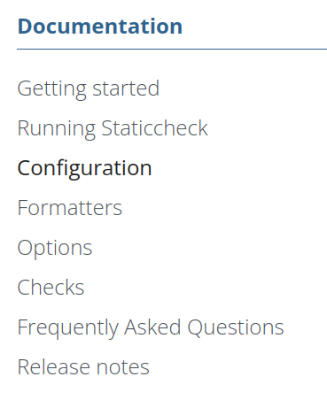
I think so, too. But it's ambiguous when a section is followed by a page on the same level.
*Section*
  Page
  Page
Page
becomes
*Section*
Page
Page
Page
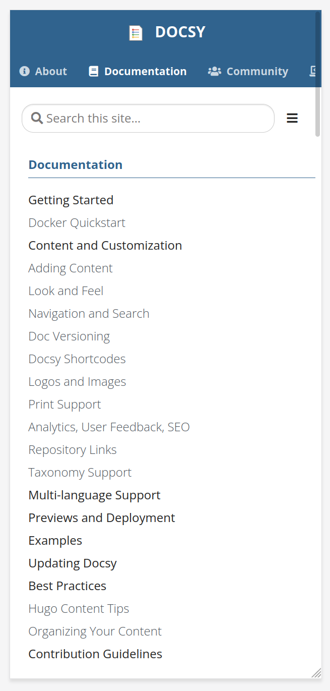
Hmm, yes, we've used Hugo content bundles for all our top level pages in the example site and user guide, so they come up as bold even if they're a single page (as you can see in your screenshot above: Examples is a single page), I can see how that would be more confusing if they weren't....
@narrenfrei you did a lot of "regular" sidebar work, any thoughts?
You can adjust the indentation for mobile (and make it a little more compact on desktop), by using the following SCSS:
.td-sidebar-nav__section .ul-1 ul {
  padding-left: 1rem;
}
If you only want this on mobile then wrap the above using an appropriate @include media-breakpoint-* { ... }.
Of course, we could make the above style suggestion the docsy default. WDYT @LisaFC?
Hmm, yes, we've used Hugo content bundles for all our top level pages in the example site and user guide, so they come up as bold even if they're a single page (as you can see in your screenshot above: Examples is a single page), I can see how that would be more confusing if they weren't....
@narrenfrei you did a lot of "regular" sidebar work, any thoughts?
If I can remember right, the mobile navigation had also before my sidebar works no intention, but maybe I be wrong. I would also prefer a intention also on sidebar navigation.
@chalin's suggestion is right. At the moment we use 1.5em for padding-left on wide screens because we have so nice alignment also if someone uses the possibility of icons in the navigation. But in my opinion also 1em on all screen widths would be OK and maybe the better way.
Just revisiting this while going through old issues and actually do think a slight indent would work as default. @chalin, thoughts while you're deep in a giant pile of CSS?