Redesign Quick Open
Closes https://github.com/godotengine/godot-proposals/issues/3788
Features:
- dynamic switching between list and grid view
- support for filtering files from addons
- history of recently opened files
Still not decided on what kind of design to go with. Current one is most standard, but might have problems with long file paths.
For long file paths, ellipsis (…) can be used, with only the end of the path showing. Label has built-in support for automatic ellipsis in master, but I'm not sure if it can be used with right-aligned text to show only the end of a string. If this doesn't work, then you'll have to implement ellipsis manually.
This PR is ready for review! There are a few gui/theme issues I can't figure out, but these aren't blocking issues and fixing it could increase the scope too much (for me at least), so I think it's better if they are be fixed later.
- Good way to implement padding (and other things) in AcceptDialog, see https://github.com/godotengine/godot-proposals/issues/3832
- Labels in list view could be better, see: #56915
- On popup, sizing/positioning is sometimes wrong, probably related to some internal sizing override.
- Currently all arrow keys are redirected to the results container to allow keyboard selection in grid view. I think it's better that way, but perhaps there is a way to switch focus off of the label and only then redirect the input.
I also looked into making the dialog a singleton. It makes some sense given that we allocate all these nodes for the results on startup. However, that only works if only one object subscribed to the quick open signal at any moment.
The current looks of this dialog goes very against the overall visual style of the Godot editor:
- The place holding the main contents should be the dark area, but instead it's the bottom part.
- The icon for changing the view mode is at the bottom, when it would better placed to the right of the search bar.
- The text of the items in list mode seem to be truncated for no good reason.
- I think the bottom text should rather be a tooltip when hovering an item.
- Not really a big fan of windows resizing by themselves.
- There are no borders.
What's the status of this? The remarks from the previous comment should be addressed. Also the PR needs rebase.
What's the status of this?
The new dialog is functional, although there are still some things I don't like in the code. I've already mentioned a few styling issues, and I don't know how to fix them. Any help with theming/UI issues, or code review would be appreciated.
The current looks of this dialog goes very against the overall visual style of the Godot editor:
To me, it's kind of clear that Godot's design might be lacking, which is why I redesigned this dialog in the first place. I designed it precisely without caring about what 'style' Godot has, only caring about what a Quick Open dialog needs.
- The place holding the main contents should be the dark area, but instead it's the bottom part.
I'm okay with making the results part darker, but I think the bottom part should still be even darker. Here is what it looks like (ignore the white dialog border, I think it happened after rebasing, maybe a theme update?).

- The icon for changing the view mode is at the bottom, when it would better placed to the right of the search bar.
No, that would not be better. It would no longer be a simple search bar, and even on it's own, that place is not a better location. There is free space at the bottom, and putting it there also doesn't break the simple design of search bar + search results.
- The text of the items in list mode seem to be truncated for no good reason.
There is a good reason, as I've explained in the post above.
- I think the bottom text should rather be a tooltip when hovering an item.
No.
- Not really a big fan of windows resizing by themselves.
I don't think it works well with Godot's separate windows, but I have seen this style work in other software. It's up for debate whether we want to keep this or not.
- There are no borders.
So?
To me, it's kind of clear that Godot's design might be lacking, which is why I redesigned this dialog in the first place. I designed it precisely without caring about what 'style' Godot has, only caring about what a Quick Open dialog needs.
If you think Godot's overall UI design needs changes that's completely fine, but this sort of thing needs to be done as a whole and with proper discussion on what said changes should be (the proposals repository would be the perfect place for that).
Having a section of the editor look and act differently from the rest just adds confusion to the user, who expects things to behave consistently across the editor.
If you think Godot's overall UI design needs changes that's completely fine, but this sort of thing needs to be done as a whole and with proper discussion on what said changes should be (the proposals repository would be the perfect place for that).
Top down, bottom up. Both is possible, but I have no interest in getting bogged down in discussions over what 'design rules' Godot should follow. I think it's more effective to try to design a small isolated component, and maybe others can take that further.
Actually, I think that because of this top down approach, Godot's style (which was supposed to have gotten a complete overhaul in 4.0 btw) has remained so stagnant, even when there is so much room for improvement.
@stijn-h Just want to say that I think this change is brilliant.
I'd like to salvage this PR and apply the suggested modifications to get this merged. I personally agree with your stance on the UX but it's more important to me that this gets into the engine.
Let me know what you think.
@stijn-h Just want to say that I think this change is brilliant.
I'd like to salvage this PR and apply the suggested modifications to get this merged. I personally agree with your stance on the UX but it's more important to me that this gets into the engine.
Let me know what you think.
Thanks, the current version is actually already a stripped down version of what i originally had in mind to get it merged quicker. But, other than the new merge conflicts, the only problem i had was fixing the supposed memory leaks. I think it had something to do with the label nodes. If you want to help with that it would be appreciated!
@stijn-h I could not reproduce the memory leak when using the new quick open dialog, can you send me a minimum reproduction project or tell me how to reproduce it?
I found 2 leaks at exit but I don't think these are what you were referring to.
Relevant part of the logs:
leaks Report Version: 4.0, multi-line stacks
Process 77278: 177136 nodes malloced for 22779 KB
Process 77278: 2 leaks for 432 total leaked bytes.

STACK OF 1 INSTANCE OF 'ROOT LEAK: <malloc in RendererRD::TextureStorage::canvas_texture_get_uniform_set(RID, RenderingServer::CanvasItemTextureFilter, RenderingServer::CanvasItemTextureRepeat, RID, int, RID&, Vector2i&, Color&, bool&, bool&)>':
15  dyld                                  0x182f77e50 start + 2544
14  godot.macos.editor.arm64              0x104f04754 main + 404
13  godot.macos.editor.arm64              0x104ede6f4 OS_MacOS::run() + 116
12  godot.macos.editor.arm64              0x104f2fbd8 Main::iteration() + 988
11  godot.macos.editor.arm64              0x1083ee82c RenderingServerDefault::_draw(bool, double) + 328
10  godot.macos.editor.arm64              0x108379930 RendererViewport::draw_viewports() + 1968
9   godot.macos.editor.arm64              0x108378670 RendererViewport::_draw_viewport(RendererViewport::Viewport*) + 5632
8   godot.macos.editor.arm64              0x1083351a4 RendererCanvasCull::render_canvas(RID, RendererCanvasCull::Canvas*, Transform2D const&, RendererCanvasRender::Light*, RendererCanvasRender::Light*, Rect2 const&, RenderingServer::CanvasItemTextureFilter, RenderingServer::CanvasItemTextureRepeat, bool, bool, unsigned int) + 356
7   godot.macos.editor.arm64              0x1083329f0 RendererCanvasCull::_render_canvas_item_tree(RID, RendererCanvasCull::Canvas::ChildItem*, int, RendererCanvasCull::Item*, Transform2D const&, Rect2 const&, Color const&, RendererCanvasRender::Light*, RendererCanvasRender::Light*, RenderingServer::CanvasItemTextureFilter, RenderingServer::CanvasItemTextureRepeat, bool, unsigned int) + 580
6   godot.macos.editor.arm64              0x1084da2e8 RendererCanvasRenderRD::canvas_render_items(RID, RendererCanvasRender::Item*, Color const&, RendererCanvasRender::Light*, RendererCanvasRender::Light*, Transform2D const&, RenderingServer::CanvasItemTextureFilter, RenderingServer::CanvasItemTextureRepeat, bool, bool&) + 2728
5   godot.macos.editor.arm64              0x1084d965c RendererCanvasRenderRD::_render_items(RID, int, Transform2D const&, RendererCanvasRender::Light*, bool) + 884
4   godot.macos.editor.arm64              0x1084d6ddc RendererCanvasRenderRD::_render_item(long long, RID, RendererCanvasRender::Item const*, long long, Transform2D const&, RendererCanvasRender::Item*&, RendererCanvasRender::Light*, RendererCanvasRenderRD::PipelineVariants*) + 4888
3   godot.macos.editor.arm64              0x1084d8400 RendererCanvasRenderRD::_bind_canvas_texture(long long, RID, RenderingServer::CanvasItemTextureFilter, RenderingServer::CanvasItemTextureRepeat, RID&, RendererCanvasRenderRD::PushConstant&, Vector2&) + 164
2   godot.macos.editor.arm64              0x1086492bc RendererRD::TextureStorage::canvas_texture_get_uniform_set(RID, RenderingServer::CanvasItemTextureFilter, RenderingServer::CanvasItemTextureRepeat, RID, int, RID&, Vector2i&, Color&, bool&, bool&) + 216
1   godot.macos.editor.arm64              0x108a7e6c8 operator new(unsigned long, char const*) + 24
0   libsystem_malloc.dylib                0x18310ac20 _malloc_zone_malloc_instrumented_or_legacy + 128
====
    1 (320 bytes) ROOT LEAK: <malloc in RendererRD::TextureStorage::canvas_texture_get_uniform_set(RID, RenderingServer::CanvasItemTextureFilter, RenderingServer::CanvasItemTextureRepeat, RID, int, RID&, Vector2i&, Color&, bool&, bool&) 0x2ab481bd0> [320]

STACK OF 1 INSTANCE OF 'ROOT LEAK: <CGEventSource>':
9   dyld                                  0x182f77e50 start + 2544
8   godot.macos.editor.arm64              0x104f04730 main + 368
7   godot.macos.editor.arm64              0x104f1822c Main::setup(char const*, int, char**, bool) + 36252
6   godot.macos.editor.arm64              0x104f1f524 Main::setup2(unsigned long long) + 1416
5   godot.macos.editor.arm64              0x104ef75e8 DisplayServerMacOS::create_func(String const&, DisplayServer::WindowMode, DisplayServer::VSyncMode, unsigned int, Vector2i const*, Vector2i const&, Error&) + 108
4   godot.macos.editor.arm64              0x104ef8a00 DisplayServerMacOS::DisplayServerMacOS(String const&, DisplayServer::WindowMode, DisplayServer::VSyncMode, unsigned int, Vector2i const*, Vector2i const&, Error&) + 392
3   com.apple.SkyLight                    0x188151238 SLEventSourceCreate + 296
2   com.apple.SkyLight                    0x188014434 SLTypeCreateInstance + 96
1   com.apple.CoreFoundation              0x183302934 _CFRuntimeCreateInstance + 756
0   libsystem_malloc.dylib                0x18310ac20 _malloc_zone_malloc_instrumented_or_legacy + 128
====
    1 (112 bytes) ROOT LEAK: <CGEventSource 0x123968920> [112]
Using leaks -atExit -- ~/Personal/godot/bin/godot.macos.editor.arm64 -e
I could not reproduce the memory leak when using the new quick open dialog, can you send me a minimum reproduction project or tell me how to reproduce it?
Well, seems like I fixed it after all. Anyway, I should've been more specific. The CI build failed because asan detected memory leaks. You could see it in the list of checks.
Click if you're interested about the issue and the solution
This is the old log: https://github.com/godotengine/godot/actions/runs/3818883371/jobs/6496060823
You can see in the logs that asan reports "direct leaks" on lines where a Label node is allocated in the QuickOpenResult item classes.
The new dialog works by creating a bunch of results upfront, then hiding them if they are not necessary. But in the CI test, the dialog was never opened, and so the result nodes were never added as a child to either the list view or grid view, and thus none of them were freed. As a fix, I added a deconstructor that frees all the nodes. Still not sure why there were only direct leaks in the label nodes, but maybe Im misunderstanding the tool.
Anyway, to given an update on what the design currently looks like:
List view was changed because I could not get the path next to the filename to work the way I wanted to. This is probably easier to read anyway.
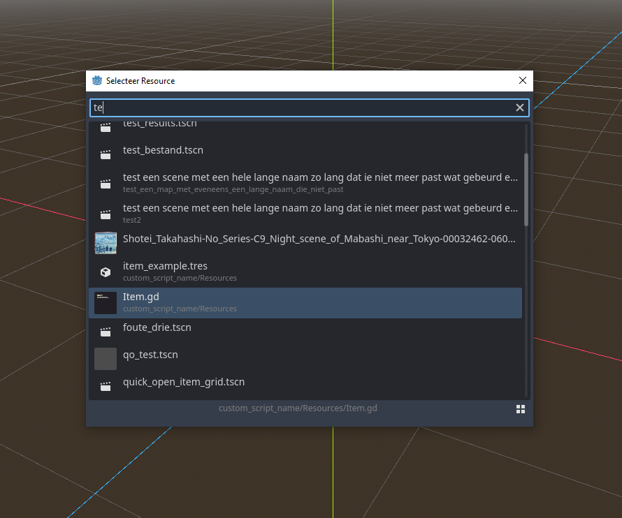
Grid view now uses FlowContainer, which makes it possible to resize the window and have the columns update automatically. I also removed redirecting the left right arrow key events to the result container, because it interfered with moving the cursor in the searchbox.
All the issues I had found myself are solved, and so are I think most other issues that were raised. The PR was already open, but now that the CI has succeeded I think it's possible to review (although it will have to wait for 4.1 I guess).
@stijn-h Awesome! Glad you figured it out and thanks for the detailed update.
I'm excited for this to happen 👍
The merge might need to wait for 4.1, but the PR can be reviewed now.
I did a quick test and a few remarks:
- is this intended that the dialog is empty when there is no search text? It should just display everything
- the names in grid view are tiny
- same with paths in list view
 While this is likely ok, the path at the bottom should be bigger.
 - "Search files by name" is a bit misleading, because it searches by the whole path
Overall the new dialog looks good to me.
EDIT: Some more notes:
- why the class was moved to an entirely new file?
- I wonder if
include_addonsshouldn't be toggleable with a button inside the dialog 🤔
why the class was moved to an entirely new file?
@KoBeWi Not OP but I'm guessing because this dialog is likely to be expanded in the future and it'd be good to have it separate for neatness sake.
I wonder if include_addons shouldn't be toggleable with a button inside the dialog 🤔
Like for example if we end up adding a few more filters like this to the dialog it'll end up needing to be moved to a new file anyway.
is this intended that the dialog is empty when there is no search text? It should just display everything
It will show all possible results at the start if the amount of possible results is below some threshold. If there is tons of files I feel like showing a bunch of them is just noise. We could do something with recently opened files here, but I don't consider that a must have feature.
the names in grid view are tiny
I think you're using a different editor scale? I've tried to improve the scaling in the latest commit. I think it looks a bit bad at 75% now, so we could stop scaling down from 100%. The text is supposed to be tiny though in grid view (8px at 100%), since there is just not much room for text.
"Search files by name" is a bit misleading, because it searches by the whole path
It still felt more natural to me than something like "Search files...".
why the class was moved to an entirely new file?
I renamed the file because I renamed the dialog class to be more consistent with how other dialogs are named. If people think having the git history is more valuable, then I can change it back. I guess if we are going to make the names consistent, this would be a good point to do it, since the whole thing is rewritten.
I wonder if include_addons shouldn't be toggleable with a button inside the dialog
I personally think this is only useful in edge case scenarios, and it also isn't a must-have feature. But I decided to try and implement in the current design to see how much it would affect the design and code. Maybe people like it this way, or they find it distracting.
It still felt more natural to me than something like "Search files...".
Can say "Search files by name and path"
Setting up a dev environment and rebasing went easier than expected, only had to downgrade scons to 4.3.0. But build times seem to have gone down quite a bit, which is very nice. I think this PR is ready now, there are some extra features that could be added, but they are not crucial.
was there a reason for renaming it to remove the "Editor" part? AFAIK we've preferred to keep that prefix to distinguish things.
I am not sure about it, but I did it because most dialogs in the editor folder don't have the prefix, except for things like EditorFileDialog.
We could do something with recently opened files here
Showing X recently opened files would be nice actually, but yeah, it's not that important. The empty space looks awkward though, it should at least have some label like "Start searching to see results" or something.
I see the text is still too small. Personally I don't mind, but it should be bigger from usability standpoint. If you are worried about space, you can make the dialog bigger.
Also the addons button should have text. Right now it gives false impression that it switches view, while they are 2 separate buttons. The text can be "Include Addons" to be shorter.
EDIT: Also maybe the layout button should display the current layout mode, like in filesystem. It's more intuitive.
it should at least have some label like "Start searching to see results" or something.
Added.
text is still too small.
Yes, forgot to fix it. I don't know if it is big enough, but I tried to make everything a bit bigger across the board. It does make the icons stand out even more, because they are so small (why don't we make them bigger?).
Also the addons button should have text. Right now it gives false impression that it switches view, while they are 2 separate buttons. The text can be "Include Addons" to be shorter.
I see your point, but it also cuts away space for the file path details. So it would be a compromise either way. I added a separator between the buttons instead, maybe that is good enough.
Also maybe the layout button should display the current layout mode, like in filesystem. It's more intuitive.
Where is this? The file dialog uses two buttons. And in the file dock, we have only one toggle button, and it uses the same design of showing the action, rather than the current state:
I think it makes more sense this way.
Aside from that I changed the base path in list view to include "res://" again. This creates a more consistent feel with files in the root folder. Otherwise, it felt like these results are not clearly separated, like you can see here: https://github.com/godotengine/godot/pull/56772#issuecomment-1368566007 I haven't heard anyone complain about it, and it is a bit redundant, but I think I prefer it like this.
I added a separator between the buttons instead, maybe that is good enough.
A nameless button looks awkward, but it's slightly better now.
Where is this? The file dialog uses two buttons. And in the file dock, we have only one toggle button, and it uses the same design of showing the action, rather than the current state:
https://github.com/godotengine/godot/assets/2223172/1dde873a-2b93-4719-ae99-c400aa200ea7
Are you on top of some old version?
Ah I just noticed that the new dialog no longer allows to open multiple files. idk how many people relied on it (not me), but technically it's a functionality regression. Also opening something instantly makes it more prone to missclicks.
Keyboard navigation is broken i grid mode. Up/down move selection left/right, left/right keys have no effect.
Are you on top of some old version?
No, you can see it in your video. The split mode works like you said. But the icon in the filter files part, which actually has the exact same grid/list view logic as here in this dialog ,does not work that way.
I just noticed that the new dialog no longer allows to open multiple files. Also opening something instantly makes it more prone to missclicks.
You want a quick open dialog to be fast, and distraction free. You have a file you want to open and want to get there the quickest way. Whether you want to edit a scene, or select a texture for a sprite. Having to click multiple times does the opposite. Look at other code editors and what they do. How realistic are your use cases, and are they worth compromising for?
Keyboard navigation is broken i grid mode. Up/down move selection left/right, left/right keys have no effect.
It used to be there, I think I removed it after moving to flow container. But it's not broken, because if the grid eats up left/right keys you cant move the cursor in the searchbox anymore. That felt bad to me. Maybe you can do something with focus, but I don't know how to shift focus to the grid and back.
You want a quick open dialog to be fast, and distraction free. You have a file you want to open and want to get there the quickest way. Whether you want to edit a scene, or select a texture for a sprite. Having to click multiple times does the opposite. Look at other code editors and what they do. How realistic are your use cases, and are they worth compromising for?
Opening is one thing, but this also affects instancing scenes. Some users might not be happy with that.
@stijn-h I realize this PR has been pending for quite some time now, but are there any plans to address the latest feedback here and try to bring this across the finish line?
Judging from a quick rebase it looks like there may be some issues with the theming, as some of the text is black for me (although I haven't seen the previous iterations beyond what's been shown in this thread):
I'm assuming this also needs to switch over to the tokenized search that was introduced in #88660.
And for whatever it's worth, I do agree with the feedback/sentiment about the removal of multi-file selection being somewhat unfortunate, for things like the scene instancing. I also found the single-click selection a bit surprising/jarring in this type of dialog in general.
Anyway, if you're too busy or otherwise unable to move this forward, let us know and perhaps someone else (like myself) could step in instead. This is a sorely needed UX improvement.