grant-hub
 grant-hub copied to clipboard
create/edit project & application: fix labels when questions have long text
User Story As a project owner, I want to know which questions are required vs. optional, so that I know what questions I need to answer in order to move to the next step
Acceptance criteria:
- [ ] Limit the width of the input title so we can always keep the required/optional tag right-aligned on Round Application form
- [ ] Limit the width of the input title so we can always keep the required/optional tag right-aligned on Create Project form
- [ ] Limit the width of the input title so we can always keep the required/optional tag right-aligned on Edit Project form
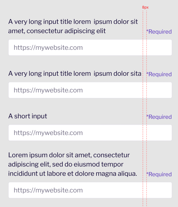
We can limit the width of the input title so we can always keep the required/optional tag on the right!

⚠️ Status Update: Moving back to "In Progress"
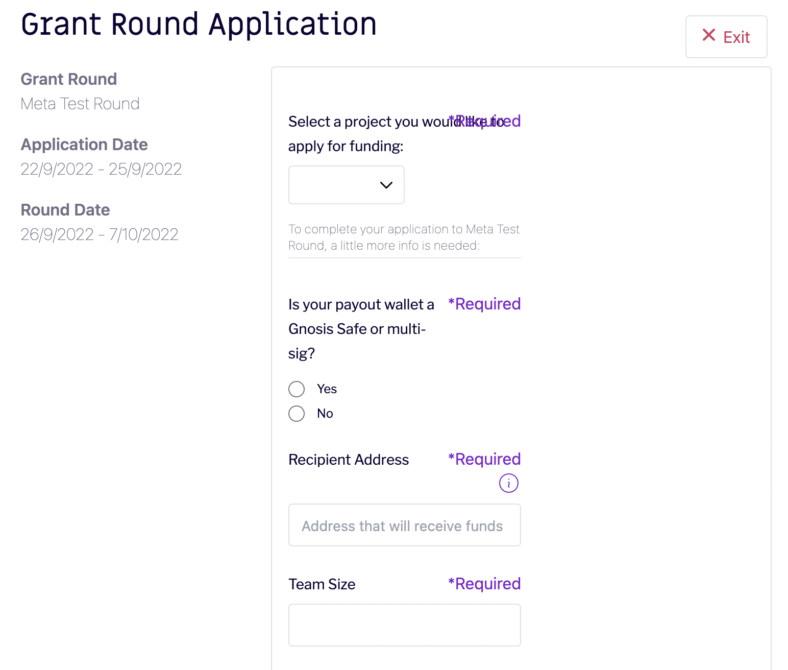
@DanieleSalatti I just tested this change on staging, and although it looks like the label and questions are no longer overlapping, it still looks pretty tight to me, and missing the 8px gap between question and label that Will shared in the screenshot above (reposting below). I believe once the question hits the threshold (to maintain a 8px gap between question and label), the remainder of the question needs to be on a newline.
Tagging in @willsputra to review and confirm as well!
Will's design update:

What the application page looks like on staging:
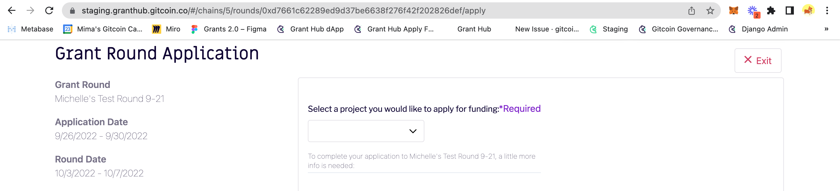
Nice catch, that first label behaves differently for some reason. I'll fix it.
✅ Status Update: Moving to "Ready for Deployment"
@DanieleSalatti just tested, & accepting changes for this ticket!