ideas

ideas copied to clipboard
Files field: improve UI of `cards` layout
Its definately no bug, its just a feeling that some users may not see the relationship between the "add" button and the selected images (especially if its just one yet) in a files field if the cards-layout is used and the size is set zu tiny.
Maybe any kind of discreet border or anything else could help?
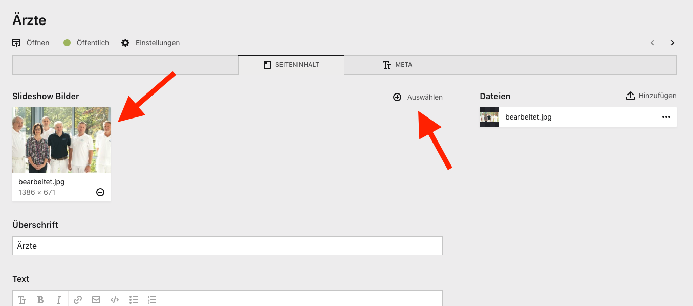
Brainstorming: For the last row, one could show a dotted outline of the not-yet-filled slots.