canoe
 canoe copied to clipboard
Improve App Icon on Desktops
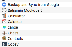
Currently app icons on desktops are just knock offs from their mobile counterparts, without giving any consideration to different Desktop OS UI's. Case in point, OSX Canoe icon is 'lost' in a see of other more prominent apps:

@stefonarch It still can be slightly enlarged. But it would be nice to provide screenshots of this in different skins (light vs. dark) and maybe different desktops (gnome, kde....etc)
It's smaller because transparent, but on white background it would be the same also without transparency.
Increased size with transparency on white bg:


+1
Le mer. 28 mars 2018 à 19:00, Ty Schenk [email protected] a écrit :
I vote for a canoe app icon to be round on macOS. Square icons are :/
[image: icon_512x512 2x] https://user-images.githubusercontent.com/7807169/38044487-cd12a72a-326e-11e8-99fc-06e0de45c532.png
— You are receiving this because you are subscribed to this thread. Reply to this email directly, view it on GitHub https://github.com/getcanoe/canoe/issues/225#issuecomment-376960185, or mute the thread https://github.com/notifications/unsubscribe-auth/AKAo9oj-SlqIosLLA2IARQdMEPwGsnOvks5ti8GugaJpZM4S-VcP .