Website screen logos are slightly off
Describe the bug
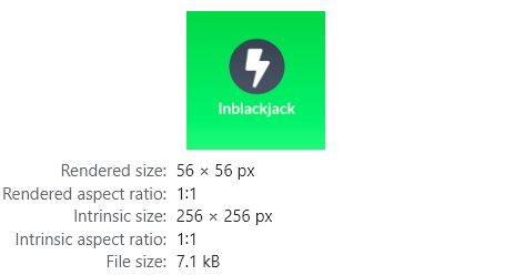
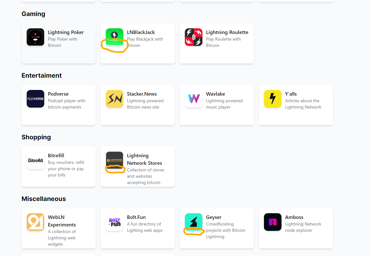
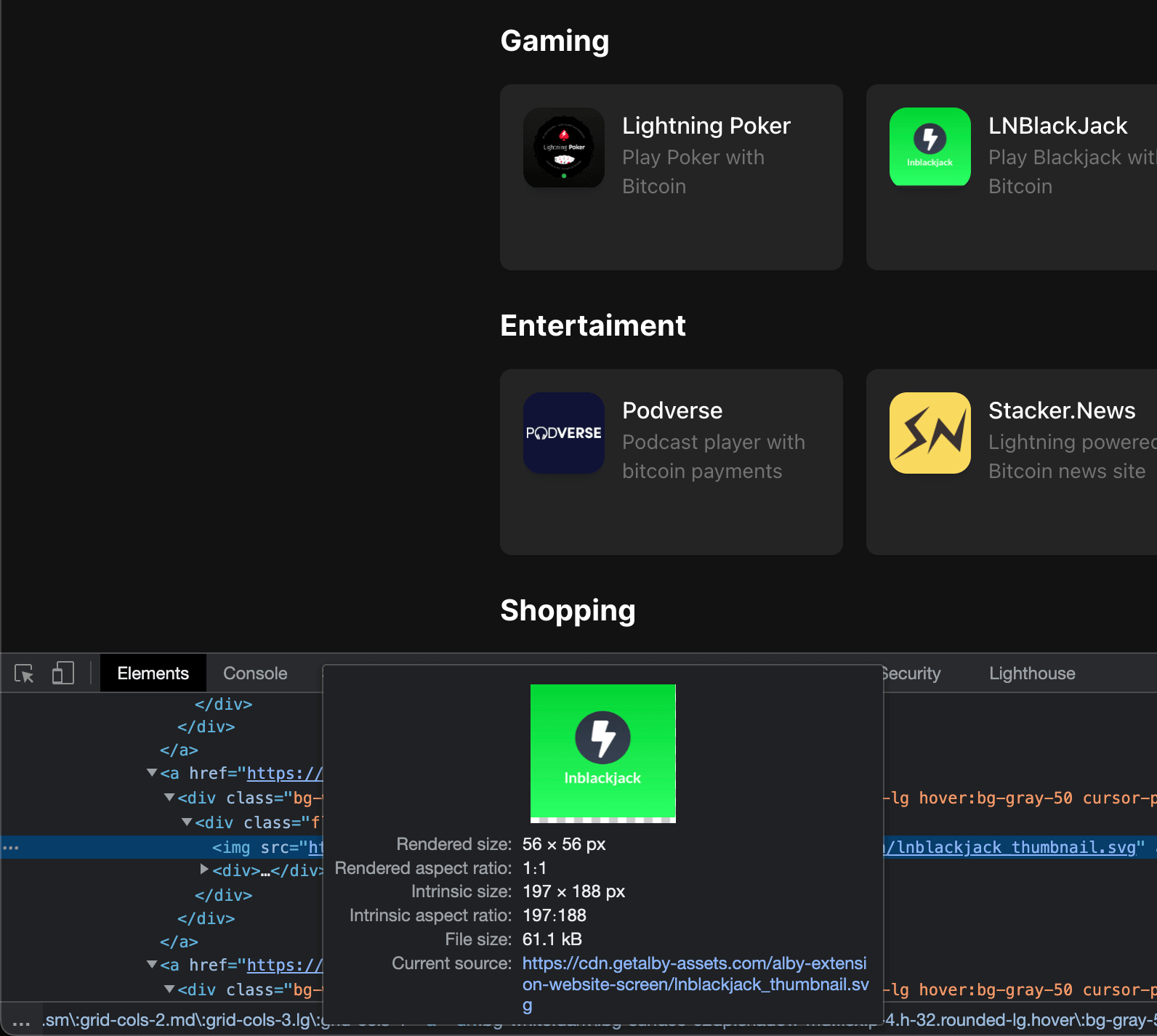
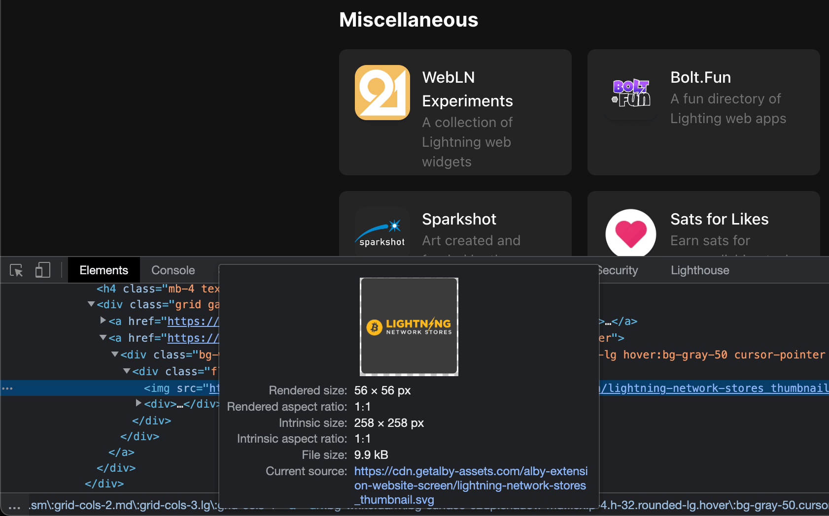
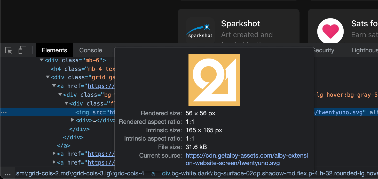
The logos of app on the "Website" screen do not fill the whole place properly.
Screenshots of the changes [optional]
To Reproduce
Steps to reproduce the behavior:
- Visit the "Websites" screen in the Alby extension
Expected behavior
logos fill the place properly without a white space.
Alby information
- Alby Version: 1.17
Device information [optional]
- OS: Windows
- Browser Chrome
Are you working on this issue?
No
The broken logo thumbnails have a transparent gap at the bottom of each SVG image. This is the reason for the incorrect display. In my screenshots you can see the spacing at the bottom.
To display the images without visually errors, all thumbs should be square and completely filled with a (background) color.
Maybe @auwalrg8 can optimize affected thumbnails.
👎
- Thumb 1
- Thumb 2
👍
@rottingcleaner is it possible to use a fill property via css to always fill the square? That means maybe 1-2px might be cut of but at least we solve the general issue no matter what exact icon proportions?
@escapedcat I don't think, it will solve the problem. But I can try it. Which color I should use to fill the squares?
From my perspective we should use prepared thumbnails without spacing around. That will increase the quality.
@escapedcat I don't think, it will solve the problem. But I can try it. Which color I should use to fill the squares?
Um, no, I mean something like this:
https://developer.mozilla.org/en-US/docs/Web/CSS/background-size
background-size: cover;
Although on this issues' case it's not a background-image.
From my perspective we should use prepared thumbnails without spacing around. That will increase the quality.
Sure, that's the nicer solution
Ah, ok. I tried out but also this solution is not really an option as long the thumbnail/image itself has a transparent space.
I think we have no posibilities to fix the issue clean on the CSS side.
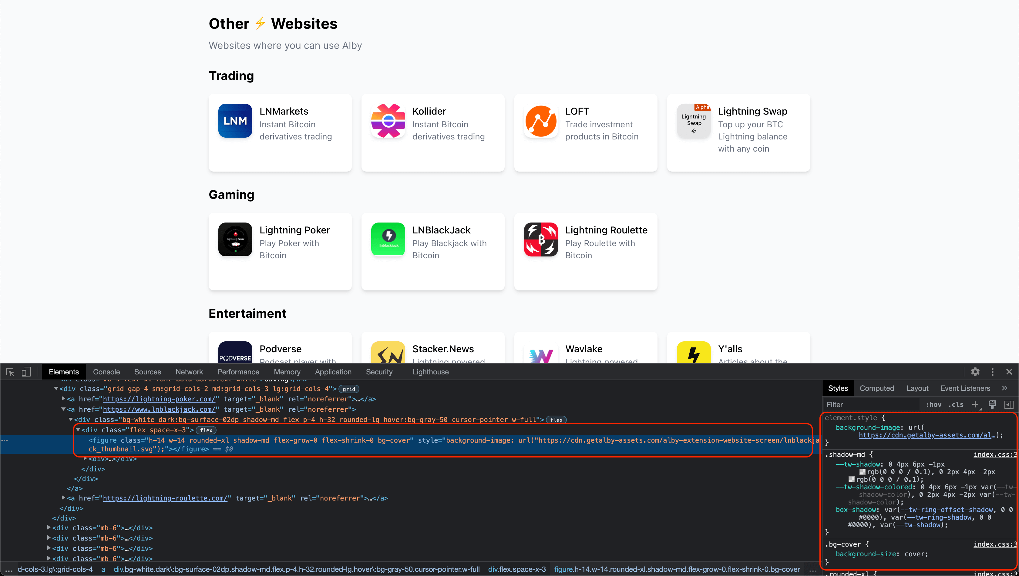

not really an option as long the thumbnail/image itself has a transparent space
Right, thanks for checking!