lightning-browser-extension

lightning-browser-extension copied to clipboard
UX/UI: align "Send" screens
Is your feature request related to a problem?
Currently all "Send" screens look similar but different. This is partly related to different info that is available to be displayed and partly to code-inconsistencies.
Describe the solution you'd like
A general solution which can be used for all these screens. This will hopefully:
- align the UI/UX
- reduce code because we can re-use the same "component" for all screens
Related to:
- https://github.com/fiatjaf/lnurl-rfc/blob/luds/09.md
Are you working on this?
No
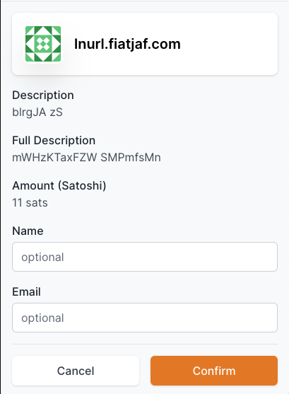
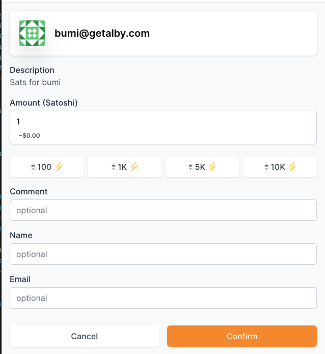
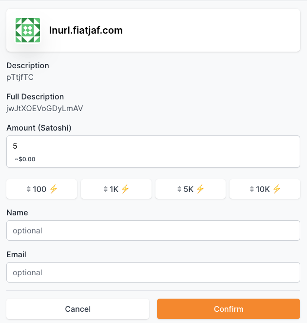
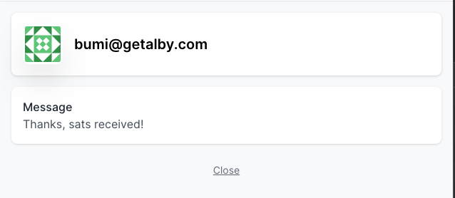
Screenshots
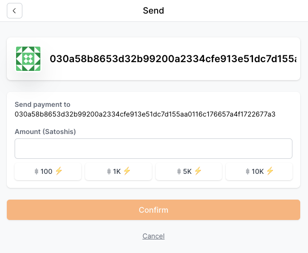
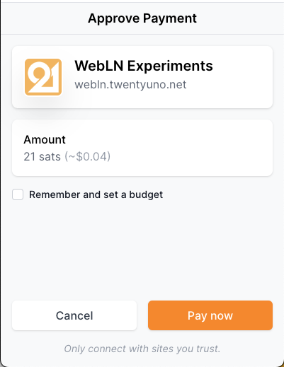
- Keysend (payment directly to a node)
- Start (non-prompt)
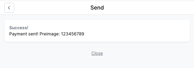
- Success (non-prompt only)
- Start (non-prompt)
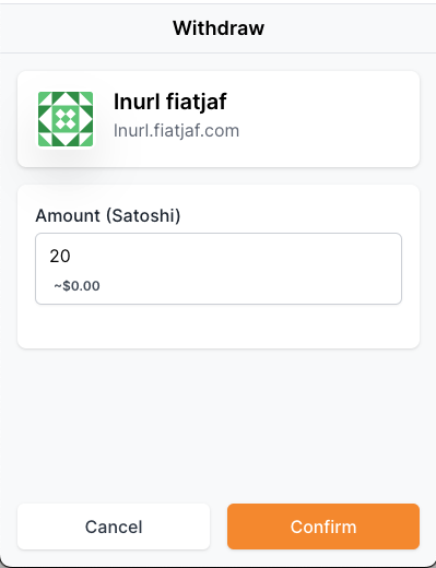
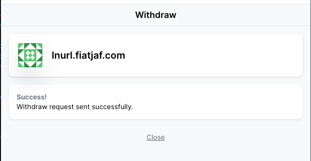
- Withdraw
- Start (prompt)
- Start (non-prompt)

- Success (non-prompt only)
- Start (prompt)
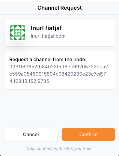
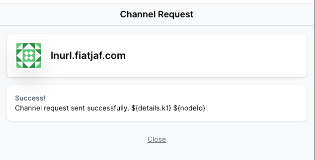
- Channel
- Start (prompt)
- Start (non-prompt)

- Success (non-prompt only)
 -
- nodeIdcan be rather long -k1is "random or non-random string to identify the user's LN WALLET when using the callback URL"
- Start (prompt)
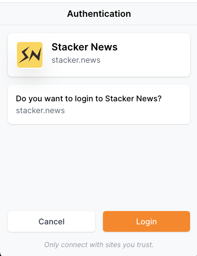
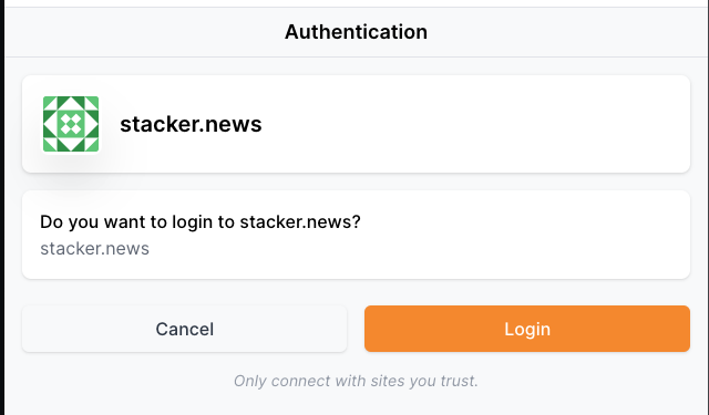
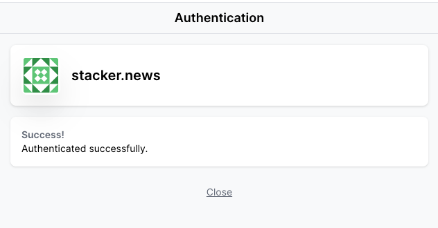
- Auth
- Start (prompt)
- Start (non-prompt)
- Success (non-prompt only)
- Start (prompt)
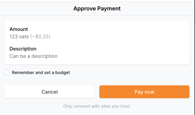
- Confirm payment
- Start (prompt)
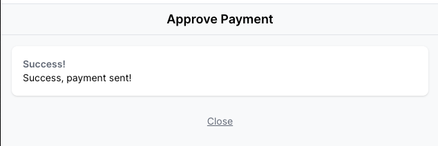
- Start (non-prompt)
- Success (non-prompt only)
- Start (prompt)
- LNURLPay
- Start (prompt)
- Start (non-prompt)
-
 -
- 
- Success (non-prompt only)
- Start (prompt)
Current draft ideas
- No image for actions pasted directly via "Send"
- Header same size but with no image
- Keysend "long" key will get cut off via "..."
- For Popup/Tab success/error screens use desgins from related ticket:
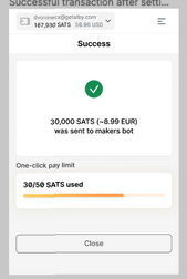 (without the budget info)
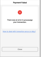
Designs can be found here:
Figma Designs (make sure to select "for Dev" in the left navigation): https://www.figma.com/file/HXIxAFG9OUCcr2EJMJ6JMm/1-Click-Pay?node-id=321%3A5678
One more point:
Add header to LNURLPay screen: "Send"