Minor padding issues
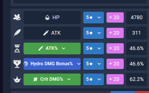 Hydro DMG Bonus is a bit squished
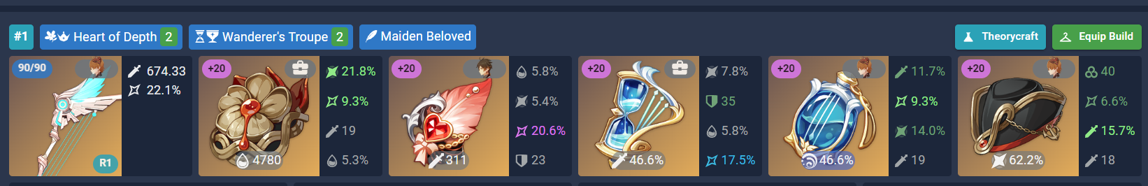 Chip for character side icons is a bit wide
 Slot icons are a bit squished

 Mistsplitter takes up too many columns compared to other weapons
I think the TC page is pending a bit of a redesign for #781. Everything else can be addressed.
I was looking into this but was not able to open the TC page through the characters page. The issue is quite old, so I was inspecting if this issue is still present in the TC page through the teams page.
I was able to reproduce the issues for:
- the weapon icon
- the missing padding for the select element in the artifact box
- the character chip on artifacts being a bit too wide.
The padding issue is actually always there, not only for elemental damage bonus entries. The flex layout is adapting to the item with the biggest width. You can easily reproduce this by choosing 3 times the same main stat:
This should be an easy enought fix by applying a default padding to the select content.
The weapon image shifting could easily be solved by wrapping the image in a contaienr that defines the dimensions and letting the image adjust itself by using the object-fit css property. Alternativly, one could simply set the images width to 30% instead of the current max-width.
For the character icons I'd need to know what the expected behaviour would be. Sure they seem "a bit large" but that could also be an intentional design decision to differenciate to articats from the inventory (although I'd propably would signal that through the chips color).
I'm a bit clueless where the "Slot icons are a bit squished" image is taken from. Additionally, they don't look too "squished" for me, so I'd like to know the expected behaviour on this as well.
If this sounds good to you, you can assign me to the issue. Afterwards I can start working on the suggested changes and provide a PR. 😄