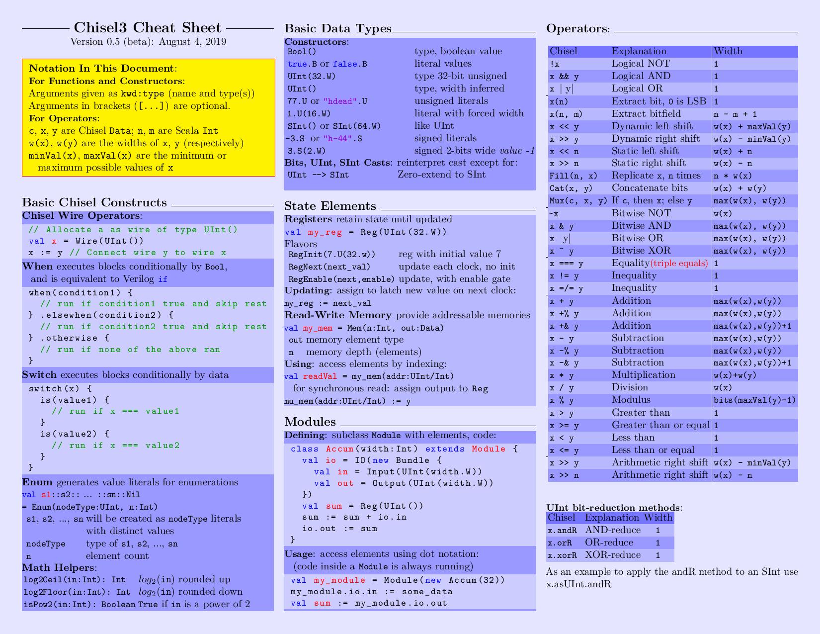
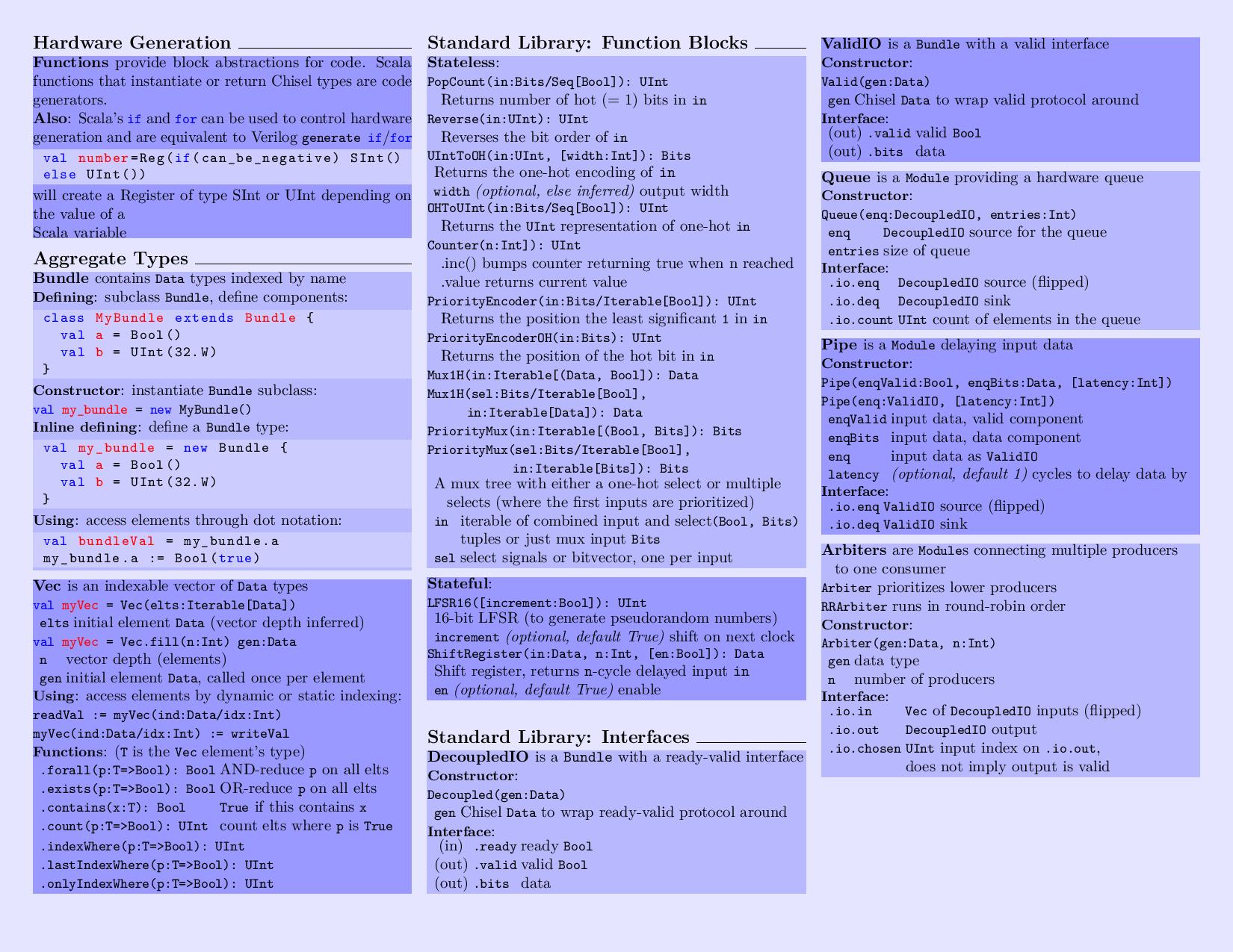
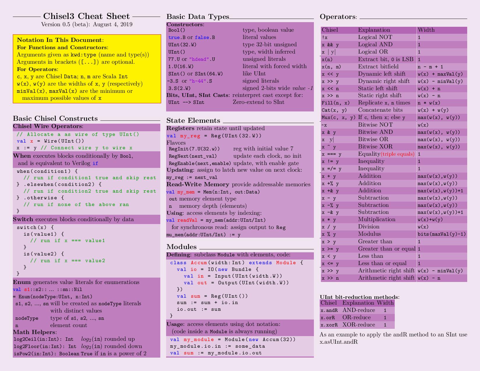
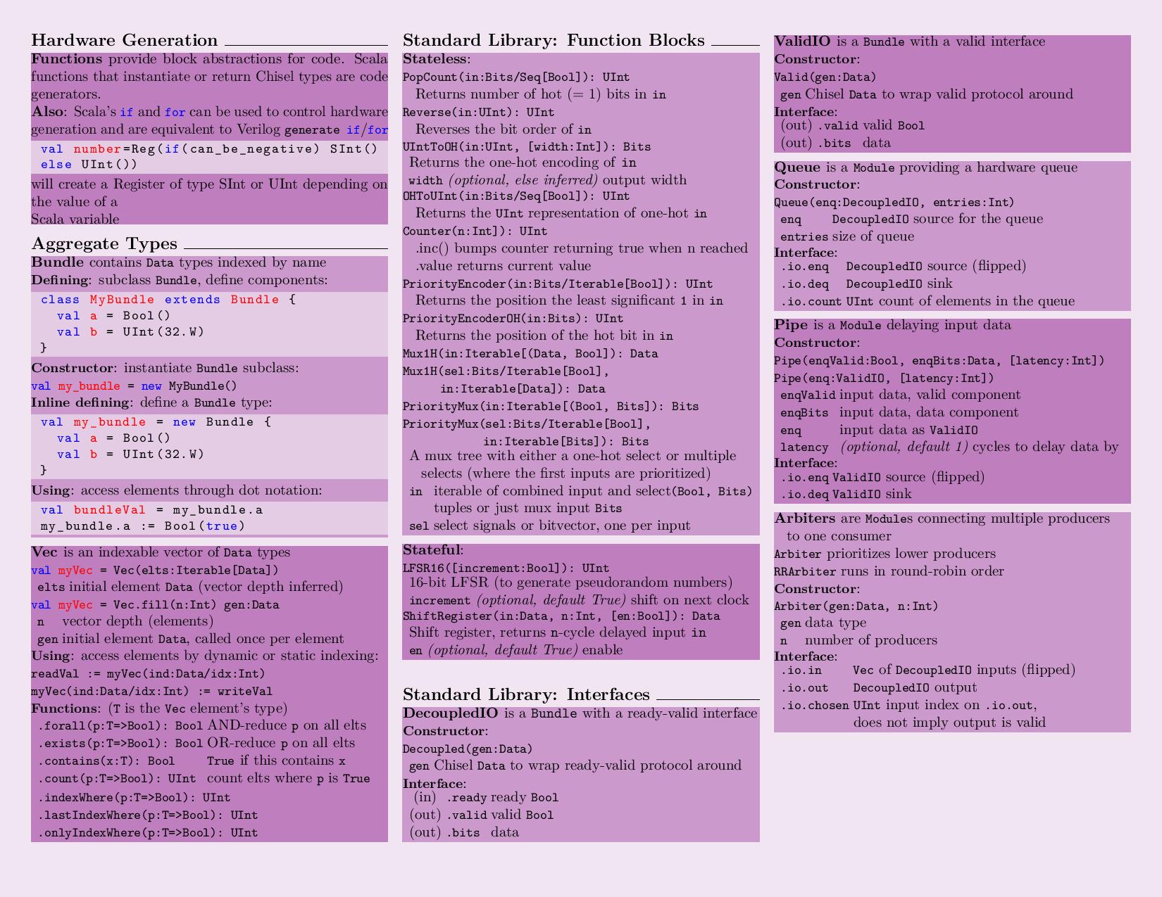
chisel-cheatsheet
 chisel-cheatsheet copied to clipboard
Add colors for better readability
The current version of the cheat sheet IMHO is not easy to read. On the other hand, some people might prefer the original version. To balance the two sides I have added a colors.tex file which specifies the colors that are used by main.tex to highlight sections and code blocks. This makes the cheatsheet customizable.
Note:
I just bootstrapped(stackoverflowed) my way through latex. Please request changes of there are better ways to define colors
The current version of colors.tex has multiple sample colors. Please let me know if you want to change it to a standard color.


What original version are you talking about? The style has largely been the same since the chisel2 cheatsheet from 4 years ago?
The image links you posted above also seem to be broken.
My bad fixed the links. By original version I meant the current version or a version without colors.
This looks cool!
Quick suggestions based on the image preview:
- Can you make the colors a bit more muted (think of making them less saturated or more "transparent" on a white background) - imo the goal is that they should be there as a guide to section boundaries and as a color code, but shouldn't stand out compared to content
- Can the code blocks be made to not be grey, but show (at least somewhat) the background color of that section?
- Consider making it consistent where you change colors, for example, just on section headers (where there's the horizontal black line) instead of on subsections like ValidIO and Queue
- (basically, can this be made as uniform looking as possible)
Looking at code, there seems to be a lot of duplication (such as copypaste of \noindent\adjustbox{bgcolor=blue!20,minipage=[t]{\linewidth}}{), is there a better way to do this using macros? Are there other cheatsheets written in LaTeX with this color coding, and how do they implement it?
I agree on your suggestions I had just highlighted with different colors to show a sample. I'll carry forward the research on better code.
Made some changes:
- created a macro for highlighting sections
\highlightbox. - removed
colors.texand defined the color palette inmain.texwith two 'variable' colors,\themecolorand\tingecolor. - Indented code wherever possible for readability (Not sure about latex styling. let me know if you want me to unindent the code)
Let me know if you want to mute the colors even further.
Here is a preview: [THEME COLOR]-[TINGE COLOR]
Blue-White
Green-Yellow
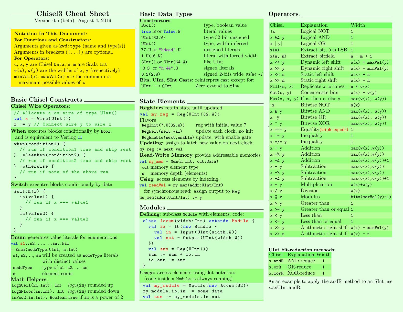
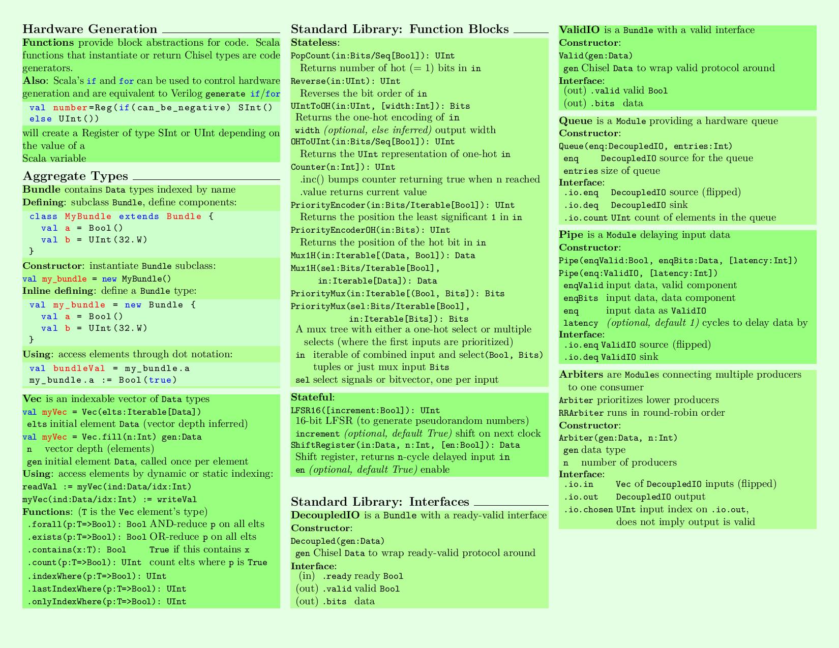
Violet-Violet
Sorry, I didn't see the previous comment about the updates, derrrrrrrrp... This definitely looks cool, and I like the updated styling, it's very clean.
I think the colors should be a bit more muted - my reasoning is that you want a high contrast from text to background (so it's easy to read - and it also prints well on a B&W printer), and you just need enough color to act as a visual cue.
I like that the code blocks are visually distinct too. Not sure if making the background lighter than the rest of the text makes sense. I'm not sure if there's a clear "scale" from white background - main text - code blocks, so I'm wondering if some other visual encoding might make more sense to distinguish the code blocks. Maybe a vertical line on the left side? Or a box? Not sure, probably needs experimentation.
I'll do a more thorough review through the implementation when I have time (sorry...)