Evolvere-Icons
 Evolvere-Icons copied to clipboard
Monochrome icons that don't follows plasma color scheme
I know that you are redrawing all monochrome icons to reflect the color scheme in plasma. By changing my theme to a darker one, I found some of them in the old style, that were harder to spot with a light theme.
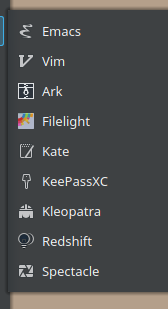 Ark, Redshift
 Gwenview, Libreoffice Draw, Okular
 Konversation, Qbittorrent(?)
 Cool retro term, kinfocenter, ksystemlog, kwalletmanager, k3b
 All libreoffice applications
 All session icons
Also, some sizes of the telegram icon

Hi, sorry for not noticing them earlier. I found these on my other machine with different software.
Two more of them: preferences-desktop-user-password akonadiconsole
I found more of them using kmail with a dark theme
 server(?), inbox, sent, outbox
 Open recent, Import, print preview, check mail, send
 new folder, mark as read
 reply, reply to all, move to...
 OT: The certificates management (which launches kleopatra) isn't monochrome
 notifications settings
 the "what is?", (maybe) the option to notify a bug
Looking at kate:
 the documents icon, the file icon, maybe the kate monochrome icon also?
 print preview, export
 redo, select all
 new window, up, down, left(prev), right(next), quick open, zoom in and out
 full screen
 quick open. also, all split icons seems to fallback on brezze
 find and replace
the documents icon, the file icon, maybe the kate monochrome icon also?
Some icons already have kde monochrome support, the problem is on the title bar/tabs that don't works how it should, or maybe you just need to re-choose Evolvere on systemsettings, then restart.

Found some more in gwenview, qbittorrent and konversation
 rotate left / right, flip horizontal / vertical
 fullscreen, 1:1 zoom
 top, bottom
 that door icon(?)
 close tab, url, log
 that pencil icon
from konsole
 clone tab
from dolphin
 show in groups(?)
plasma desktop context menu
 refresh desktop, activities
from k3b
 eject
eject
Again, always re-choose Evolvere and restart the app (including plasmashell), some of these icons already done.
The outline color is set to the background color, not the background color of the selection, maybe that's why, sometimes, you're see dark parts. This will be "fixed" once all the monochrome icons have been migrated, then, with the script, the outlines can be fully transparent, keeping visible only the text color.
I thought of a better way to find all monochrome icons that don't use the colour-scheme colours, without having to spot them at sight. Just launch this grep in the main icons folder. It searches for all files that doesn't contain the string "ColorScheme" or "currentColor" (case insensitive). There will be duplicates, because it lists all symlinks too.
grep -R -L -i 'ColorScheme\|currentColor' {8x8,10x10,12x12,16x16,18x18,20x20,22x22,24x24}
I don't know if you already have a list of all them, but I thought it could be handy and surely less annoying than me adding a comment every time I found some :wink:
This is very useful, thank you!. Right now I'm optimizing all small icons by hand (if you know any way to do this in batch, would be extremely useful), then apply, via script, the monochrome support.
If it's a simple string substitution or something that can be done from the CLI, I could try to make a script.
edit: I just found that, but never tried it: https://github.com/svg/svgo