studio
 studio copied to clipboard
Update readme structure, image header, and links
User-Facing Changes
Update readme structure, image header, and links
Description
Changes made:
- New header image, title, links, and badges
- The 'contribute' section has been moved above the 'self-host' section (Esther mentions that contribution is a higher priority and self-host)
- Two sets of vertical links sets have been changed to horizontal links to reduce page length
Thing(s) to consider:
- I've kept the existing repo description with the links as is, but they may be redundant with the newly added links: "Foxglove Studio is an integrated visualization and diagnosis tool for robotics, available in your browser or for download as a desktop app on Linux, Windows, and macOS."
Addresses #4615 - Style uplift on Studio Readme
I guess there’s probably not much that can be done to make the new header image look less small on mobile?
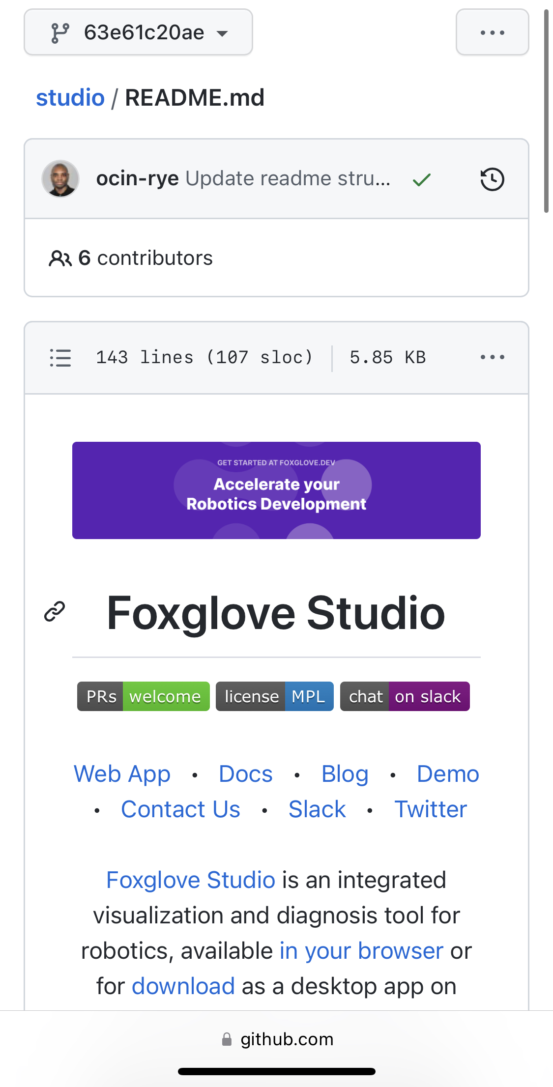
Actually I wonder if we could use this media attribute with a min-width/max-width: https://docs.github.com/en/get-started/writing-on-github/getting-started-with-writing-and-formatting-on-github/basic-writing-and-formatting-syntax#specifying-the-theme-an-image-is-shown-to
Wonder if it should be either “Accelerate Your Robotics Development” or “Accelerate your robotics development”? On the website homepage we use “Accelerate your robotics development” (purple).
@jtbandes
- I'll take look and see if the media attribute is a possible solution for the image responsiveness.
- Good catch, I'm in favor of correcting the title casing to read “Accelerate Your Robotics Development”, but using sentence case makes sense too for alignment with the homepage. @2metres @esthersweon Any preferences or existing branding guidelines for this?
I think we have leaned towards sentence case for strings in our products, but not aware of any existing guidelines around web content/docs

It would be awesome to add an equivalent image to the https://github.com/foxglove/mcap readme too, especially since we're about to present mcap at a conference so it'll be getting a lot more traffic 🔜!

Looks like there's some weird height mismatch issue at the top of that image


I think it's a little strange that we only include "Web app" in the nav links, but then include links to both apps in the following sentence:
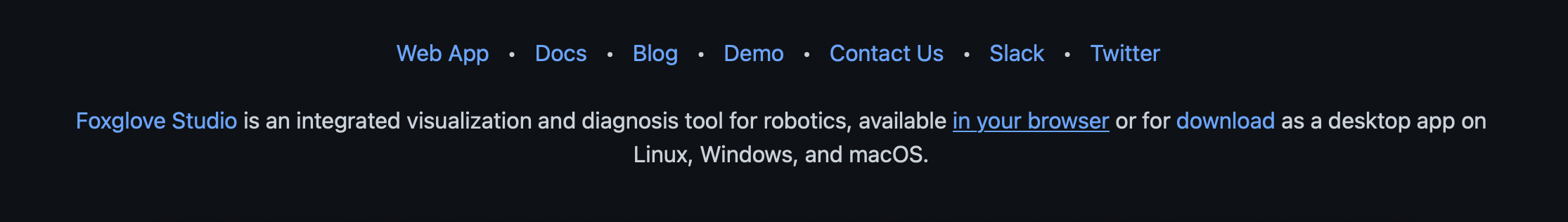
Could we just have "Download" in the nav link to take you to a page for both apps, or have both links in the nav? Or maybe exclude both, since the first sentence takes care of calling out both?
That first sentence is also worded a little awkwardly (I'd recommend "available in your browser or as a desktop app").
I think it's a little strange that we only include "Web app" in the nav links, but then include links to both apps in the following sentence:
Could we just have "Download" in the nav link to take you to a page for both apps, or have both links in the nav? Or maybe exclude both, since the first sentence takes care of calling out both?
That first sentence is also worded a little awkwardly (I'd recommend "available in your browser or as a desktop app").
@esthersweon 👍 I've added this copy/link update