 foundation
Columns are breaking in mobile viewports
How can we reproduce this bug?
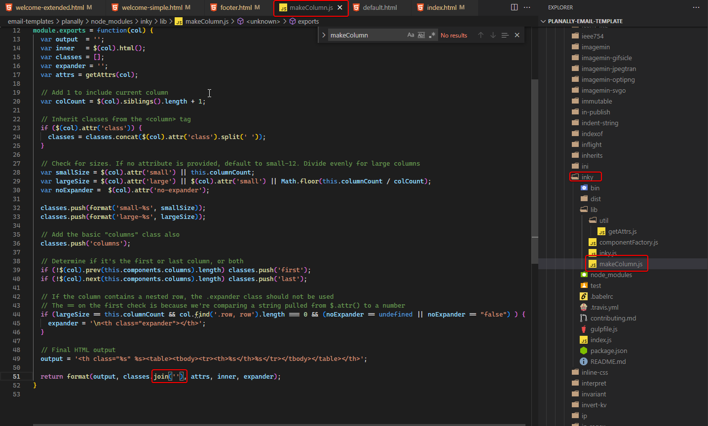
This code:
<columns large="1" small="1">
  {{> icon name="spacer"}}
</columns>
<columns large="11" small="11">
  <span class="text">No new activity…</span>
</columns>
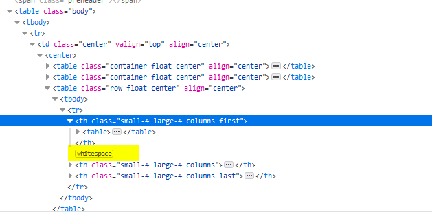
will generate a whitespace between the columns. This is no problem in Desktop viewports, as they are table cells (browsers apply display: table-cell; by default). However, in mobile viewports display: inline-block; is set and enforced with !important. This now means that the whitespace will count as width between the tables and a percentage width will no longer work. Therefore, the columns will break, even when they would fit into it (11 + 1 == 12).
What did you expect to happen?
Columns shouldn't break in mobile viewports, no inline-block should be set!
What happened instead?
Columns are breaking.
What email clients does this happen in?
Every mobile client, especially iPhone.
Solution for me is temporarily using:
<columns large="1" small="1">
  {{> icon name="spacer"}}
</columns><columns large="11" small="11">
  <span class="text">No new activity…</span>
</columns>
the bug is caused by the additional whitespace that foundation is generating
if anyone knows any solution other than mixing the formatting, I am all ears