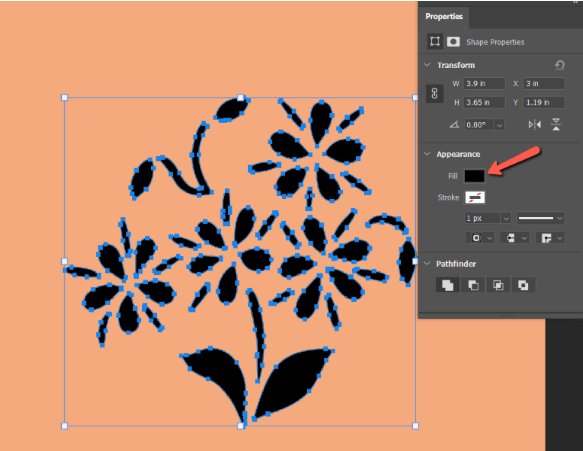
New "stroke color" & "fill color" icons
The current icons are not ideal, first they are not very pretty, the "fill color" icon fills too much of its area hiding the color underneath and especially the "stroke color" icon doesn't really work anymore, because it is now also used for the brush pen color which does not have any shape bounds.
It would probably work better if they are more general for example that the "stroke color" icon shows a stroke line, and "fill color" shows a generic shape area which can work for rectangles, curves, ellipses, etc. Or something like that.
My feeling is the problem here are not the icons, but the UI pattern. I think most other apps use overlapping squares for background/foreground, maybe we could something similar here?
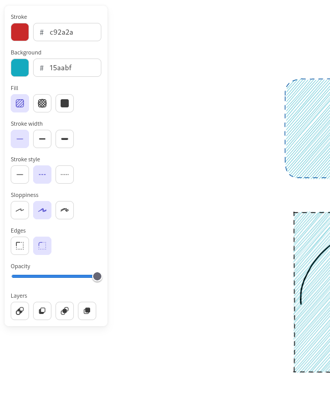
e.g. this is what GIMP does:

This isn't the equivalent tool, is it? In gimp it is a multi-step process, and the fg / bg color is not directly mapped to the stroke / fill of a shape, you can do that with both. Besides, Gimp's UI feels pretty unintuitive to me.
Rnote works differently, where switching between the active stroke color / fill color simply determines which is modified by the palette. I think overlapping them would suggest that the overlapped would be "inactive", which is not really the case.
Edit: for reference, how it looks in other foto / drawing / vector apps:
Photoshop:
Excalidraw:
Inkscape:

I changed the icons to what I think is at least a little bit better than before, but it is still not great
Hmmm yeah my bad, I misread that. So it seems seems like most other apps just use text labels to indicate this, so that's not really helpful for us. I guess the one exception is the Photoshop thing, the color dot with a hole in the middle. I'd be interested in trying if that + tooltips would work, that could be quite elegant.
I am a first-time user, and what was just really confusing to me is that I was not able to deselect a Fill-Style, but now that I see this issue I get that I did not understand that:
- I do not have to deselect the Fill Style, but have to set the fill color to transparent
- The "second" color is the fill color
I thought the fill color is some kind of color picker I have not used, I think mainly because I did not see the "filled" shape on the second color icon. Maybe for the fill color something like the bucket with some kind of color picker can be used?
For my first problem, maybe there could be a fill option "None" or "Transparent", which sets the fill color to being transparent. That would have saved me some headache, but I think I should open a second issue for that.
Maybe the issue isn't the icon but more the lack of contextual cue as to the fact that this refers to fill.
The icon stays there unused and always presented even when it does not matter. The only cases where this is used is
- when drawing shapes (and only for the ones that can be filled)
- when a selection contains such a shape inside
So maybe this shouldn't be displayed all the time but only in these cases. Or we should duplicate the icon and display it contextually in the shape/selector tool section only when it makes sense (shape that can be filled or selection containing it itself).
In the same style the brush setting panel having options depending on the active style or the shape configuration that only apply to the rough style can be confusing (as that relation isn't obvious at first glance)