profiler
 profiler copied to clipboard
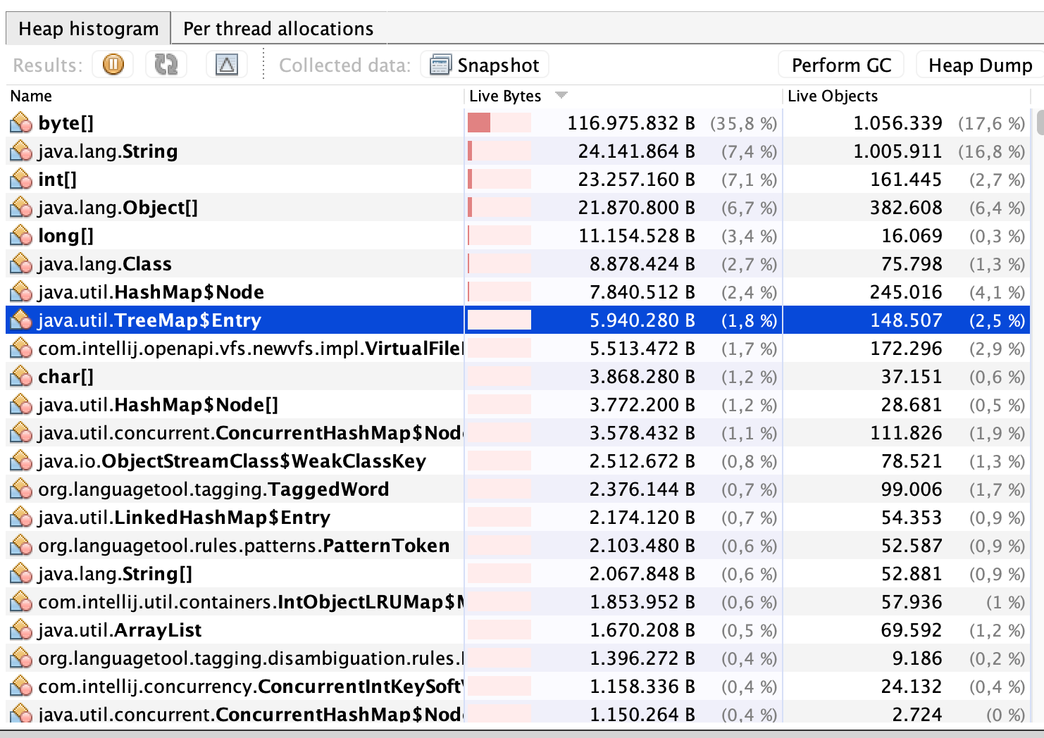
Truncated numbers in the source view when viewing allocation sizes
Profile: https://share.firefox.dev/3ePzHNf
When displaying allocation sizes, the numbers in the source view are truncated.
I would recommend just increasing the width, so that all reasonable numbers can be presented.
In this case I believe it would make more sense to be able to change the unit. But haven't looked at the code yet, to know how easy this would be.
You mean using KB? That should be harder to implement, as we would need changes at a lot of places.
Why M? This is far too large granularity for most use case. It is a difficult change, as it either introduces a new Unit or modifies how we deal data sources.
I agree with Julien that it would be nice to show units here. Users might be unaware that they've selected allocations in the dropdown above, and showing KB / MB would remind them that they're looking at allocation sizes. We can make the columns wider at the same time, of course.
Oh, I had missed that we already display "Total (bytes)" in the table header.
I'd prefer the following behavior: Display "Total" in the table header, and display "23 B" / "1.6 KB" / "265.2 MB" in the table cell, depending on the size.
I find this really confusing. It makes reading the numbers down the table quite unintuitive (as the length of the number is commonly an indicator of the size of the number in such tables).
I actually find the conditional showing of the first decimal place a bit hard to view. In my opinion, we should stick to the same format for all entries.
I agree with Julien that it would be nice to show units here. Users might be unaware that they've selected allocations in the dropdown above, and showing KB / MB would remind them that they're looking at allocation sizes. We can make the columns wider at the same time, of course.
With this logic, we could add "s/ms/ns" to the timings view too (which I'm totally against too).
As a compromise: Could we allow the users (by e.g. clicking on the "bytes" in the column header) or the profile writer to choose between the two options?