Dates are displayed with gaps with heatmap plugin when perspective is used directly from the browser (via websockets)
Bug Report
Steps to Reproduce:
- create pandas dataframe as follows
import pandas as pd
import numpy as np
from perspective import PerspectiveWidget
from datetime import timedelta,date

arrays = {'A':['bar', 'bar', 'bar', 'bar', 'baz', 'baz', 'baz', 'baz', 'foo', 'foo', 'foo', 'foo', 'qux', 'qux', 'qux', 'qux'],
          'B':['one', 'one', 'two', 'two', 'one', 'one', 'two', 'two', 'one', 'one', 'two', 'two', 'one', 'one', 'two', 'two'],
          'C':['X', 'Y', 'X', 'Y', 'X', 'Y', 'X', 'Y', 'X', 'Y', 'X', 'Y', 'X', 'Y', 'X', 'Y'],
          'D':np.concatenate([np.arange(date(2020,6,1),date(2020,6,10),timedelta(days=1),dtype=date),np.arange(date(2020,6,20),date(2020,6,27),timedelta(days=1),dtype=date)])}

df = pd.DataFrame(arrays)
df.set_index(['D'])
- display it via PerspectiveWidget as follows
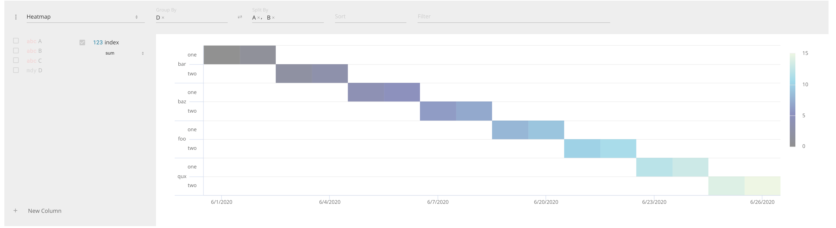
psp = PerspectiveWidget(df, row_pivots=['D'], column_pivots=['A','B'],aggregates={'C':'count'},columns=['C'])
psp
We see that there are no gaps:
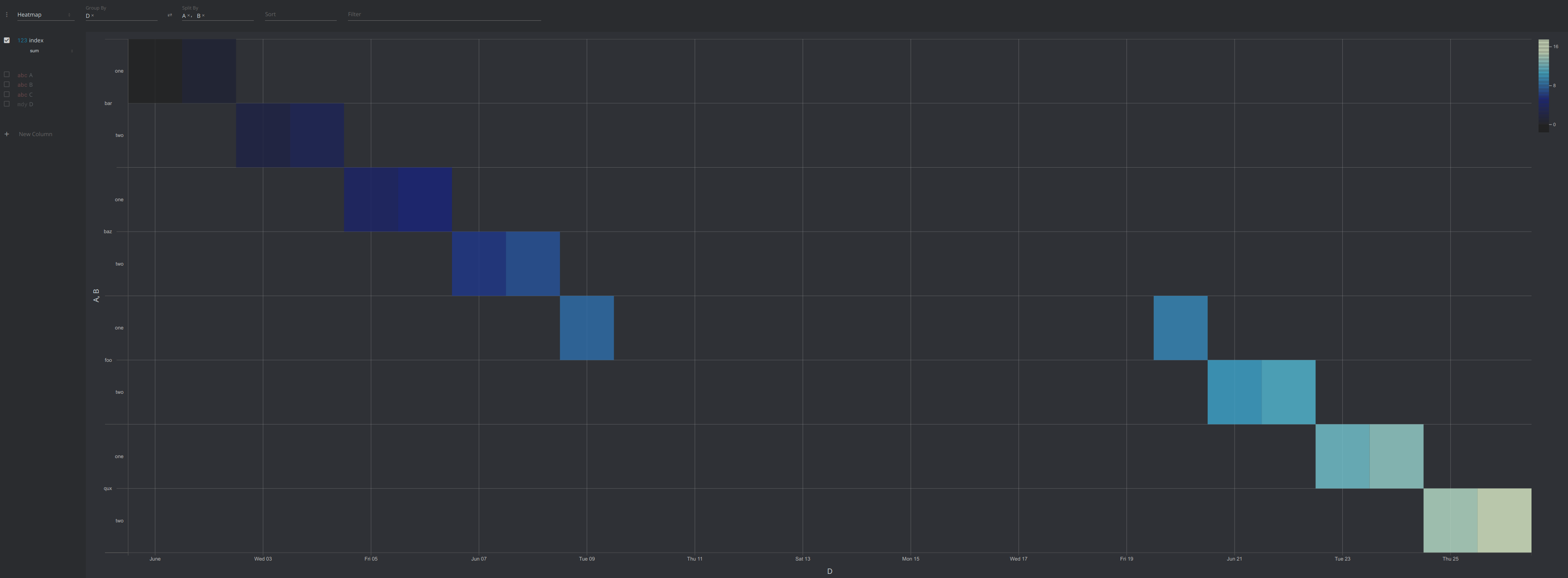
- Do the same via Tornado websockets:
Source code:
Expected Result:
I know that heatmap plugin used by the widget is different from the one used inside the browser. However it doesn't seem right that the behavior is so much different. This can be quite important when working with financial data. My suggestion is to display no gaps automatically, if a developer wants to display the gaps - they can always be added explicitly. On the other hand, if gaps are added automatically, there is no way to remove them and that is bad. For my use case I do not want gaps to be displayed but there is no way of achieving this behavior because gaps are there no matter what I do.
Environment:
Perspective 0.5.1
Thanks for the report!
You are using two different charting plugins. In the Jupyter example, you're using @finos/perspective-viewer-highcharts (which is en route to deprecation ..). This plugin implements datetime axes on Heatmaps as category axes, where every unique datetime is an equal sized tick, hence no gap - however, this is not correct, axes of type datetime should be linear axes, as in the python example in your 2nd screenshot which uses the new @finos/perspective-viewer-d3fc charting plugin.
You can fix this in two ways, but I recommend the latter:
-
Switch your python example to use
@finos/perspective-viewer-highcharts- note the licensing restrictions here, and that this plugin lifespan is limited and will be removed inv0.6.0. -
Use a schema to convert the column
Dto astringcolumn, rather than adatetime, to get category behavior. You can preserve both by simply adding a copy ofDas astring, and use thedatetimeversion as asortproperty and thestringversion as arow_pivotto make sure they are in date, not alphabetical, order.
I think we should also add a stringify computed column to the New Column functions et as well, which would allow you to achieve this at runtime - I'll leave this open to track this addition.