 facebook
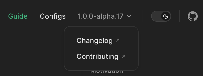
Unify navbar dropdown and sidebar category styling experience
Have you read the Contributing Guidelines on issues?
- [X] I have read the Contributing Guidelines on issues.
Description
The navbar dropdown arrow is not configurable and by default has a different style compared to the sidebar category arrow. We'd like to propose unifying this styling experience:
- Remove the border-based styling from the navbar dropdown and replace it with styling similar to the background styling of the sidebar category.
- Use a variable for the icon of the navbar dropdown and let it default to the same icon as the sidebar category.
Has this been requested on Canny?
No response
Motivation
It would allow for a consistent styling experience for similar components.
API design
Not much would change. The icons would be configurable by either changing the associated CSS variables or by overriding the respective :after pseudo element.
Have you tried building it?
We solve it now by using the following CSS snippet:
.dropdown > .navbar__link:after {
  background: var(--ifm-menu-link-sublist-icon) 50% / 2rem 2rem;
  border: none;
  filter: var(--ifm-menu-link-sublist-icon-filter);
  transform: rotate(180deg);
  height: 1.25rem;
  width: 1.25rem;
}
Self-service
- [X] I'd be willing to contribute this feature to Docusaurus myself.
The navbar dropdown arrow is not configurable
True, the caret is added in :after and comes from Infima classes. In my opinion such elements should always be stylable in a more flexible way, at least with swizzle.
by default has a different style compared to the sidebar category arrow.
I think it doesn't always make sense to share the exact same icon in multiple places. But in this one I think it could make sense.
VitePress uses a similar icon for its dropdown and it doesn't look bad compared to ours so I'd be ok to make that switch
What we must be sure to keep is to give the ability for users to easily switch one icon on the navbar (ie possibly revert to previous style) without affecting the docs sidebar icon: there must be 2 distinct components available to swizzle.
Remove the border-based styling from the navbar dropdown and replace it with styling similar to the background styling of the sidebar category.
Honestly, I'm not a fan of all of these background icon styling using CSS variables. They come from Infima and this was not really designed React-first so the integration is a bit weird.
Use a variable for the icon of the navbar dropdown and let it default to the same icon as the sidebar category.
seems reasonable, but we must keep the navbar icon / doc category icon decoupled from each others
If we change this, we'd rather make real React components that we can swizzle:
- IconArrow (default)
- NavbarDropdownIconArrowIcon (defaults to IconArrow)
- SidebarCategoryArrowIcon for example (defaults to IconArrow + 90° rotation)
Does it make sense?
Open question: what should be the default "direction" of IconArrow 🤪
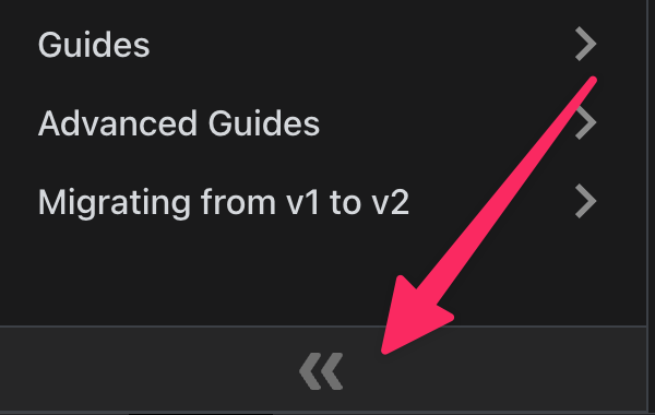
Note, we already have an IconArrow component to collapse the docs sidebar, but it created confusion in a past and we should find a better name like "IconDoubleArrow" or something 🤷♂️