[WIP] Update pydata to 0.10
This PR updates the theme to synchronize with pydata-sphinx-theme~=0.10. The aim here is to just refactor the existing code to harmonize with the latest pydata. So, no new features will be added. Although a lot of CSS rework would be done here, apart from HTML and CSS.
- [x] CSS rework to remove redundancy and mimic the existing sphinx-book-theme style, and use variables wherever possible.
- [x] Handling footer-content in pydata-sphinx-theme. Latest pydata although following most of the skeleton of sphinx-basic-ng does not seem to have a section for footer-content. Which is needed in sphinx-book-theme :
footer-content in sbt:

for reference in s-b-ng:

We can probably just use a hacky one in this PR and update it in relevant sources in upcoming cycles.
EDIT: Done in https://github.com/pydata/pydata-sphinx-theme/pull/861
- [x] Javascript not broken with updated HTML.
- [x] restructuring HTML to inherit as much as possible.
fixes https://github.com/executablebooks/sphinx-book-theme/issues/575
Just a note that some of this has already been done in the PR below, but if you think it's better to start a fresh PR I am +1. Will link below if it's useful
- https://github.com/executablebooks/sphinx-book-theme/pull/574
I think we should use this as an opportunity to simplify and reduce as much as we can...there were many special-cases in CSS, HTML structure, etc that we had in this theme, that we have since upstreamed to the pydata theme, so we should be able to slim things down here a lot more.
Just a note that some of this has already been done in the PR below, but if you think it's better to start a fresh PR I am +1. Will link below if it's useful
* [[WIP] Update pydata theme #574](https://github.com/executablebooks/sphinx-book-theme/pull/574)I think we should use this as an opportunity to simplify and reduce as much as we can...there were many special-cases in CSS, HTML structure, etc that we had in this theme, that we have since upstreamed to the pydata theme, so we should be able to slim things down here a lot more.
Ahh yes, Thank you for linking the PR.
@AakashGfude let's try to add in the content footer in the PyData theme as an empty template for now. That way sub themes can override it even if it's not used in the PyData theme.
@choldgraf I think this is good to review. Sorry, this PR became huge. But it just has the necessary changes to adapt to pydata ~=0.10.1
Thanks, @choldgraf for looking through it. I will review your comments.
This looks like a good start, thanks for all of this conversion! A few general thoughts and things I noticed:
* I was surprised that there was a net increase in lines of code. Our goal should be to re-use as much as possible from the PyData Theme and not re-code our own rules etc. Can you take a pass and see what you can remove from this theme such that it still looks good?
Yes, the lines have increased, unfortunately. But mostly because I had to introduce a lot of CSS here, like in src/sphinx_book_theme/assets/styles/content/_admonitions.scss . Because it was no longer getting styled by the new pydata-sphinx-theme.
I will go through the diff, to find and remove any potential redundant code.
* the right table of contents icon is now showing up on widescreen: 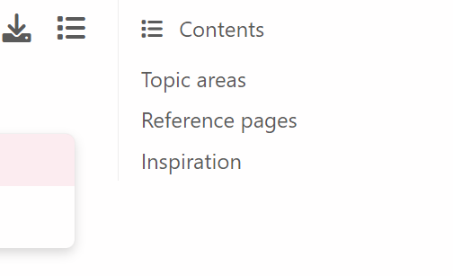
Thanks for pointing this out. Have corrected it now in this commit https://github.com/executablebooks/sphinx-book-theme/pull/597/commits/3e5623996e967321111676af431068d24f1e3933
* search the docs is now very faint on the sidebar: 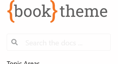
I am not able to darken the color. Somehow my CSS is not getting reflected here, maybe this is where my CSS skills end . I will try again but welcome for anyone to try it.
* There seems to be an intermediate screen width with no margins: 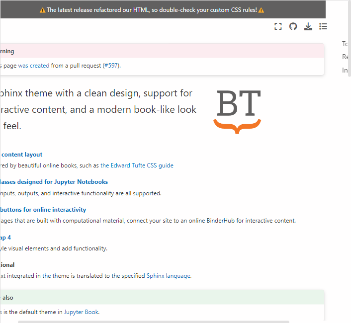
I have corrected it now in this commit https://github.com/executablebooks/sphinx-book-theme/pull/597/commits/3e5623996e967321111676af431068d24f1e3933. The style was inherited from pydata-sphinx-theme and pydata-sphinx has a breakpoint of 1200px, where some UI features change, apart from the usual 768px. But in sphinx-book-theme, there's only one breakpoint of 768px which directly shifts it to mobile view. This is also one of the reasons why the lines of code in the PR are huge, as I have overwritten some of the design decisions of pydata, as I did not want to introduce any new design changes in this PR for sphinx-book-theme.
* There's now a left margin when the primary sidebar is collapsed. Is that intentional? 
Can't see it in the image you posted or maybe my screen color is hiding it?
ping @AakashGfude - when will you have another chance to look at this? I think we should get this upgrade done as quickly as we can because we're just going to keep drifting away from the pydata theme otherwise.
If there are questions or uncertainties you'd like to resolve via a meeting I'm happy to have a conversation if that's helpful.
@choldgraf I am on this one now. Sorry was away, took a cheeky trip to bail. Will work on this, and see if all conversations can be resolved.
@choldgraf let me know what you think on this. I have not done the https://github.com/executablebooks/sphinx-book-theme/pull/597#discussion_r969396971 here. The reason is in that thread. Apart from that, I think the rest of the queries have been resolved.
Also this https://github.com/executablebooks/sphinx-book-theme/pull/597#discussion_r969384783. Not able to test it, or I am doing something wrong?
This is looking better! A few quick comments below:
- Fine to do the icon stuff in a follow-up PR.
- The article header and the sidebar have a break in the shadow now. Can we avoid this break somehow?

- I think our ReadTheDocs JS stopped working, probably a CSS selector change in the JS code:

Anything else you want to tackle here? If not then I suggest we:
- Merge any small PRs that are open
- Make a release
- Merge this PR so that we have time to spot bugs etc
- The article header and the sidebar have a break in the shadow now. Can we avoid this break somehow?
@choldgraf The main reason is actually because, earlier the secondary sidebar was inside header-article:

Now we have moved it outside. sidebar-secondary and header-article are separate items. And box shadow is very fussy. So we can achieve it probably, but will be a bit messy. I will look at some hacks if any.
- I think our ReadTheDocs JS stopped working, probably a CSS selector change in the JS code:
What part is not working? I am able to open the menu and navigate to options, and use the search bar. In the preview.
Anything else you want to tackle here? If not then I suggest we:
I think this PR looks sufficient from my side.
- Merge any small PRs that are open
- Make a release
Let me know, if I can help with this.
- Merge this PR so that we have time to spot bugs etc
Sounds good.
FYI: 0.10 breaks the preview on sphinx-themes.org due to a bug: https://github.com/sphinx-themes/sphinx-themes.org/issues/105
@AakashGfude - sorry for the slow turnaround, I have a bunch of other stuff going on. @mmcky any chance that you could give the docs a look as well and make sure nothing looks off?
re: the "split" between the article header and secondary sidebar, I think it's no big deal - let's see what people think about it and address in the future if need be.
A few things that I noticed:
Dark theme can be auto-set by system
The pydata theme has a default to "use the system preference" for light/dark theme. That means that we might accidentally trigger the dark theme. For example, here's what it looks like when my computer has dark theme on by default:
I think there are two ways to approach this:
- Set the default to light, by following these instructions
- Add the CSS + button for a dark theme in this PR
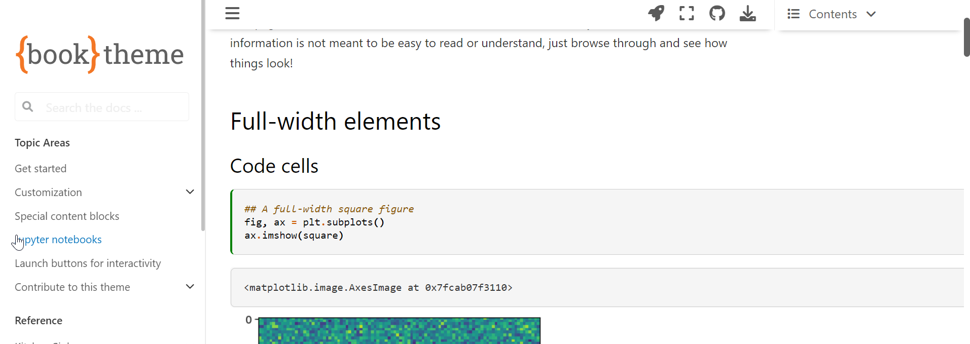
Full width cells are off screen
The full-width cells seem to spill off screen:
The margin notes also seem to spill over and have a littele extra white space on the left:

@choldgraf, I tried introducing a button for the theme mode and added a few CSS changes. But realized that it would need a lot of CSS updates to work seamlessly. So, I think it will be best to do that in a new PR. For now, I have set the default_mode config to "light". And also changing the HTML dataset attributes on page load in JS. To update the localStorage, in case it had a previous value. As setting the default_mode config does not update the localStorage.
Full-width cells should be fine now. And margin style anomaly I could not detect. Probably was fixed by some other changes.
Let me know how it looks now, and thank you for taking some time out for this.
A few more visual bugs. Can you please go through the kitchen sink and the theme-specific elements page and confirm that everything looks normal. That is the easiest way to spot these bugs. I'd like to get this PR merged quickly and I know that we will need to keep iterating, but I at least want to avoid introducing an obvious visual bug into our docs.
- [ ] Admonitions still have a weird margin space:

- [ ] Code blocks with a title have extra margin at the bottom:

- [ ] Sidebar items (and I think rubrics too?) have an extra white space to the left as well, look at the underline of the title:

@choldgraf thanks for reporting this, and looking through all this patiently. I think the ones notified in the last comment have been resolved with the latest push. I will look through those pages for any visual anomalies.
Sounds good @AakashGfude - let me know when you've taken a close look and think it is ready to merge, and then I can give a final look-over.
@choldgraf from my inspection of the pages, I think this PR looks good.
Just pointing out some visual changes, which are inherited from pydata-sphinx-theme. The changes inherited looks better to me.
Left: original right: this PR
- space between caption and legend.


- The position of caption for list tables are above the list tables.


- double ticks are bordered.


Sorry to jump in late with feedback. I like the improvements and customizations made so far.
I found a few more discrepancies that are important to our documentation projects.
The search box hint text is very light and difficult for me to read.
Original

Proposed

The seealso admonition's icon and color changed to the default info admonition. I prefer the green curvy arrow icon.
Original

Proposed

The contents menu no longer highlights the final heading of a page when scrolled to the end.
Original

Proposed

The hint and important admonitions have changed from yellow to green. I think they should be reverted to yellow.
Original

Proposed

The tip admonition has been changed from yellow to green. I think it should be reverted.
Original

Proposed

Thanks @stevepiercy ! A few quick responses from me on next steps for these suggestions:
- The search box hint text is very light and difficult for me to read.
- Should be solveable with
placeholderCSS: https://developer.mozilla.org/en-US/docs/Web/HTML/Element/input#placeholder_2
- Should be solveable with
- The seealso admonition's icon and color changed to the default info admonition. I prefer the green curvy arrow icon.
- Let's fix this one upstream - I opened an issue to track it and am happy to review PRs to implement a fix:
- https://github.com/pydata/pydata-sphinx-theme/issues/1036
- The contents menu no longer highlights the final heading of a page when scrolled to the end.
- I suspect that this is because the end section in this case is relatively short - it is highlighting a section once it is above X% of the page, and I bet it's just not high enough to trigger that here. Maybe we can tweak the UI/UX a bit, but it doesn't feel to me like a "bug" per se.
- The tip admonition has been changed from yellow to green. I think it should be reverted.
- This got changed in the upstream theme in order to reduce the number of unique color variables being used. If we want to use yellow we'll need to define our own color variable in both light and dark modes and apply it to these two admonition types. I feel like we could open an issue and track that one so that it doesn't block this PR.
Thank you for the inputs @stevepiercy, and for the replies @choldgraf. The latest push should have the search field text covered. I agree with the admonition styling being done upstream.
The highlighting on the end of the page, i reckon as mentioned by @choldgraf is subjective it seems. In my laptop, it is working fine:

Thanks for the responses. I agree on the course forward on all points. I will work on the new issues next week. Full speed ahead for this PR!
@choldgraf I agree. Let's merge this one. And continue the tweaks over time.
On second thought, I think the tip and hint admonitions are OK as green, but I think blue would be better. The color green has a universal context of "go", whereas blue's is "information".
I think important should be yellow, not green, as it is similar in purpose and context to caution.
I can see that this theme inherits the colors from pydata: https://pydata-sphinx-theme.readthedocs.io/en/stable/examples/kitchen-sink/admonitions.html
I could open an issue in the pydata theme to discuss, but I wanted to get @choldgraf's opinion first. Please let me know. Thank you!
I think that makes sense to me - let's discuss in the pydata theme and see where that goes - what do you think?