Tablets: have a dual pane view in landscape mode
On the iPad, the app only displays in portrait- it will not rotate to landscape. In landscape, it would look great as a dual pane. Thx
We already fixed the landscape mode not showing in https://github.com/etesync/etesync-notes/issues/18 it was an unfortunate oversight. We will release a new version with the fix soon.
As for the dual pane mode: that's a great idea that we hope to get to soon!
I found this that shows basically how to do it: https://github.com/retyui/react-native-split-view-demo
We need one NavigatorContainer when the view is not split, and two when the view is split. That means we have to tell the app which container to use on navigate.
I think the best option is to create our own useNavigation hook that is gonna dispatch the navigation actions to the proper navigator.
One thing this implementation doesn't seem to care about is linking (and web navigation), although I guess we can come up with something handling our own navigation state with the useLinking hook rather than the linking prop of the root navigator.
I'm wary of all of this complexity. What if we start with just a side pane navigation kind of thing, e.g. when in landscape mode on a large screen, and viewing a note, have the list of notes still visible (or whatever it is that we want)?
So you mean split the view in two in the NoteEditScreen and include the list ?
Maybe I misunderstood you, but it sounded like you were suggesting having two independent views that can both have navigation and everything. I think that's a lot of complexity. We can start with having a more complex layout rather than completely two different navigations.
You're right, that's what I suggested. It's just I wasn't sure I understood what you suggested 😉
What I was suggesting is essentially what tablet apps used to (still?) do, and responsive web applications do. Instead of have true "two apps in one" kind of view, have this more complex view that supports showing e.g. the list of notes + the open note. After you have that, it's fairly trivial to also add another note view, so we can view both. Having two separate navigations sounds like overkill when what you really want is just showing notes side-by-side. :)
I'm thinking we should have the split view with the note list on the left for all the URLs under /notes. That way the UI is consistent and we don't switch all the time between full-screen view and split view.
Yeah, that's what I meant, though only in landscape and only when the screen is large enough.
The implementation I was thinking about is having a Home screen that splits in two when needed and shows the two screens, ie the return would be something like that:
// HomeScreen.tsx
<>
  {splitView && (
    <NoteListScreen params={{ colUid }} />
  )}
  <SomeOtherScreen params={{ colUid, itemUid }} />
</>
But maybe what you were thinking about was having the NoteListScreen added in every screen, like that:
// SomeOtherScreen.tsx
<>
  {splitView && (
    <NoteListScreen params={{ colUid }} />
  )}
  <View>
    // ...
  </View>
</>
It's hard to explain exactly what I meant as the screens are independent, not hierarchical. Though I think the best explanation would be: just show a side pane in the noteeditscreen. :P How that should be implemented? Well, depends on what's cleaner...
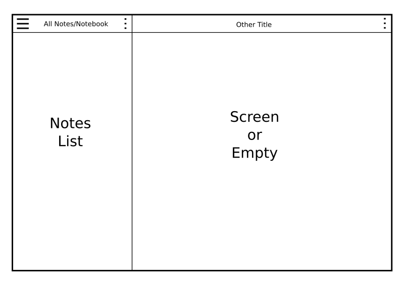
I do believe that for a consistent UX, the left side pane should also be present in all others screens, except maybe settings which could take up the whole screen. Basically all screens should look like that:
Yeah, that's what I had in mind too. You just need to think what to do with screens that try to lock while editing (e.g. note properties) where want to block accidental navigation.
My main concern is to keep the code simple. It's not worth it if we start to go crazy complex.
@zecakeh That looks clean!
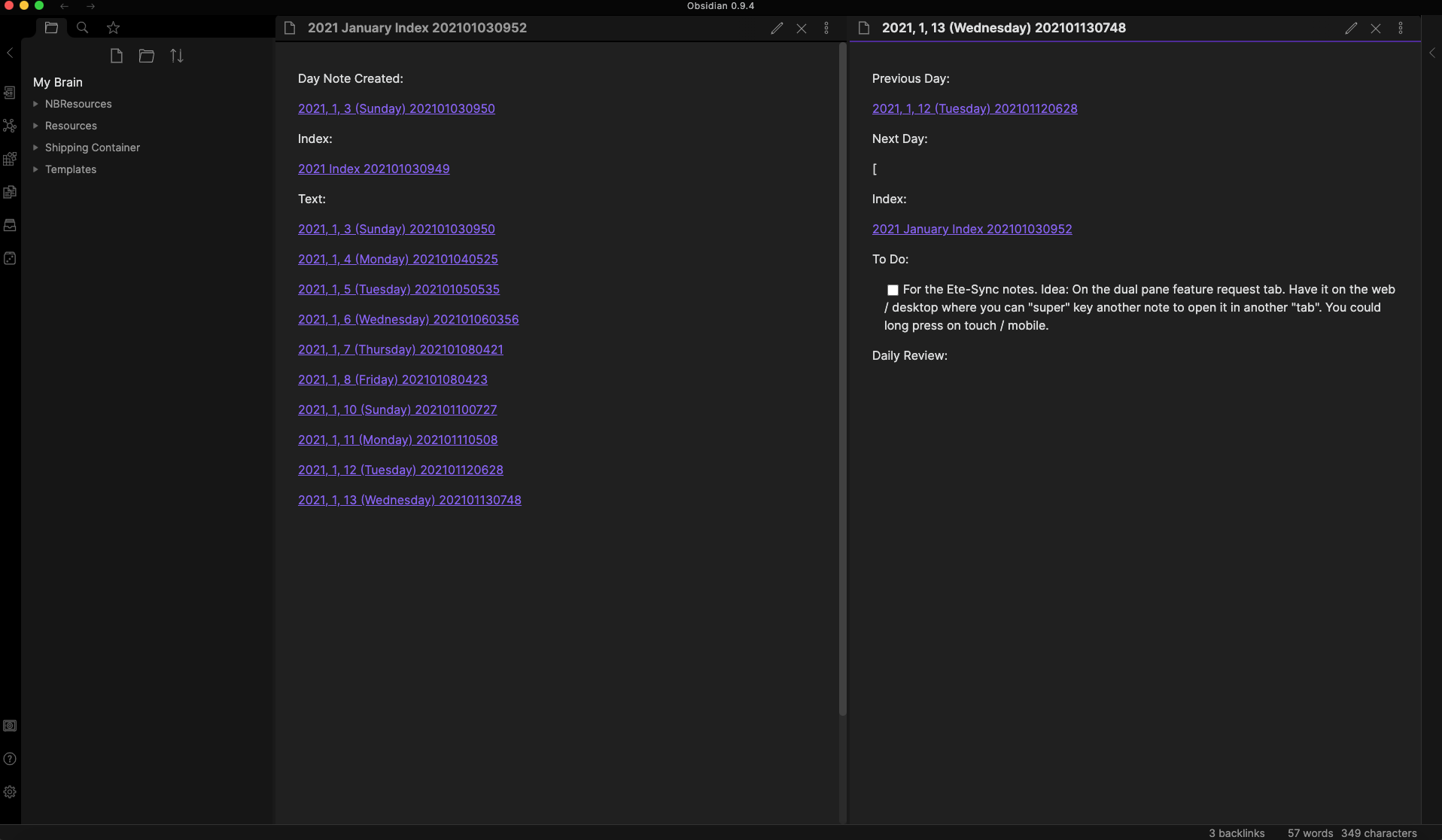
In Obsidian, you have your notes on the left as well. You can click on a note to open it, or you can super key it to open in a new "tab".
For etesync-notes, on the web / desktop you could "super" key another note to open it in another "tab". You could long press on touch / mobile.
This is where:
Feature Request: WikiLinks #91
Would really come in handy.
Edit:
In Obsidian, this can scale too. While two might be great for 8-11 inch tablets? I think 12.9 could handle three. On desktop, screen size is your limit.