Registration journey
Current interaction
In the following, I will somewhat play the role of a user who does not have a good intuition about developer‘s intentions in GUIs. It could be exaggerated at some points, so don‘t treat it too serious or even personal.
- You install the app.
- You open the app.
- You see that screen, and are confused:

- "Did you know?" – Know what? You get a little more tired while reading the white-on-blue fine print. You tap on the bubble. -> The bubble disappears, nothing else happens.
- You think that this is just a little bug and tap on the only (unlabelled) button on the screen (+). -> Login screen is displayed.
- You input a user name.
- You input the short password you use everywhere. (There is no hint that you should check the password.)
- You tap on "REGISTER". -> An email field and a small grey text below the password field are added, prefixed with an asterisk which has no predecessor. Somehow, you do not notice the 14-day-trial text above the user name field.
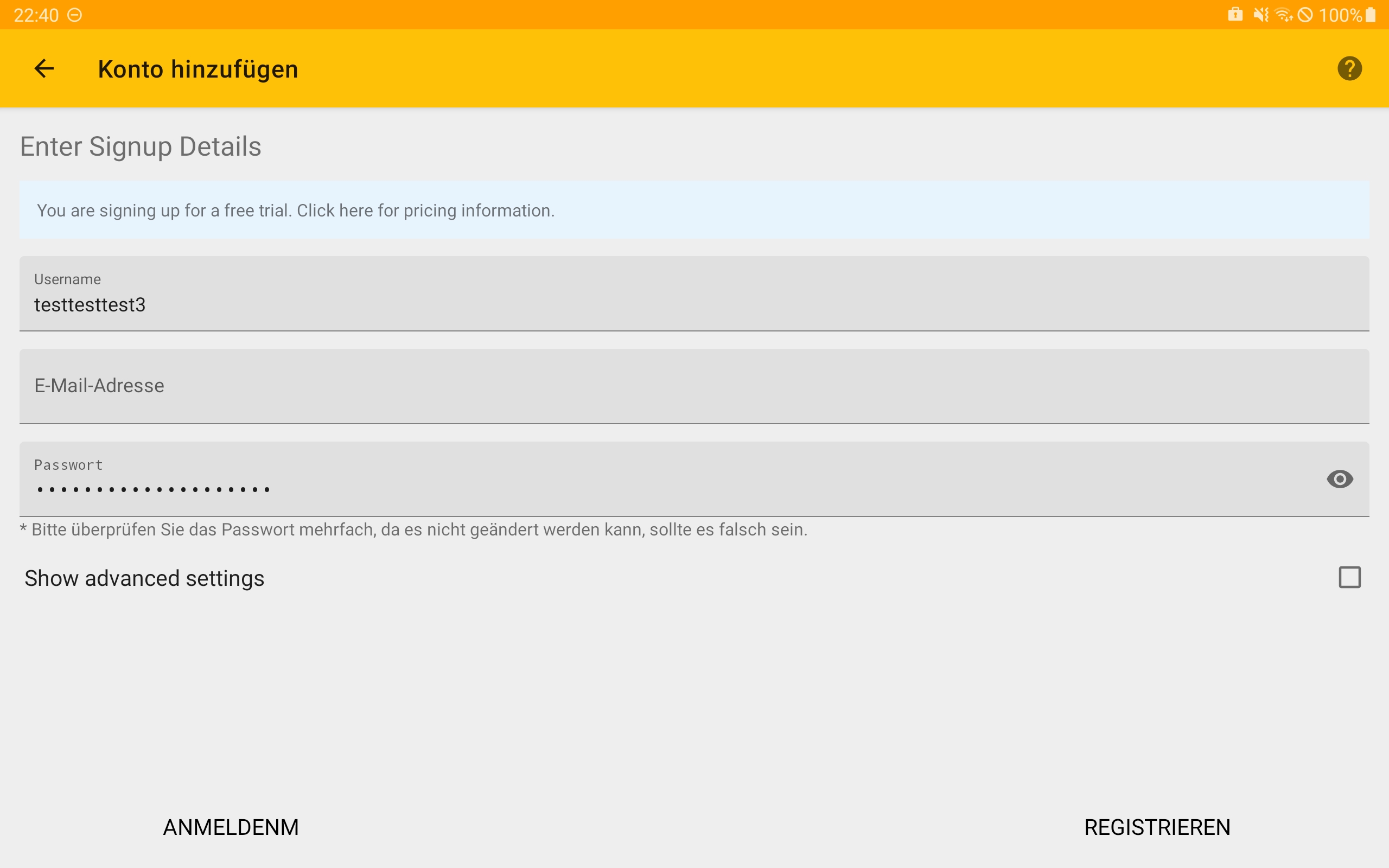
- You first hesitate, but then fill in your email.
- (You might check your password, but you just want to try out the app and skip the small grey text.)
- You look for how to proceed and ask yourself shortly if the "REGISTER" button actually has flipped the position with the "LOGIN" button (which it has) 👻. You ask yourself shortly why there is a "LOGIN" button now.
- You tap on "REGISTER". -> "Encryption is set up" ->
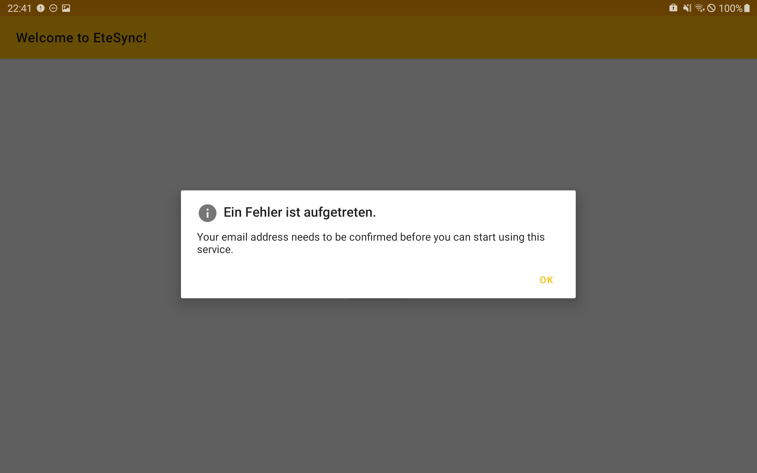
- Your trust in the app‘s quality erodes, and you regret having wasted time again. For a moment, you are motivated to uninstall the app.
- But you do not give up and read that the reason for the error is that your email address needs to be confirmed.
- You tap "OK" in the hope to see how to confirm the email address. ->
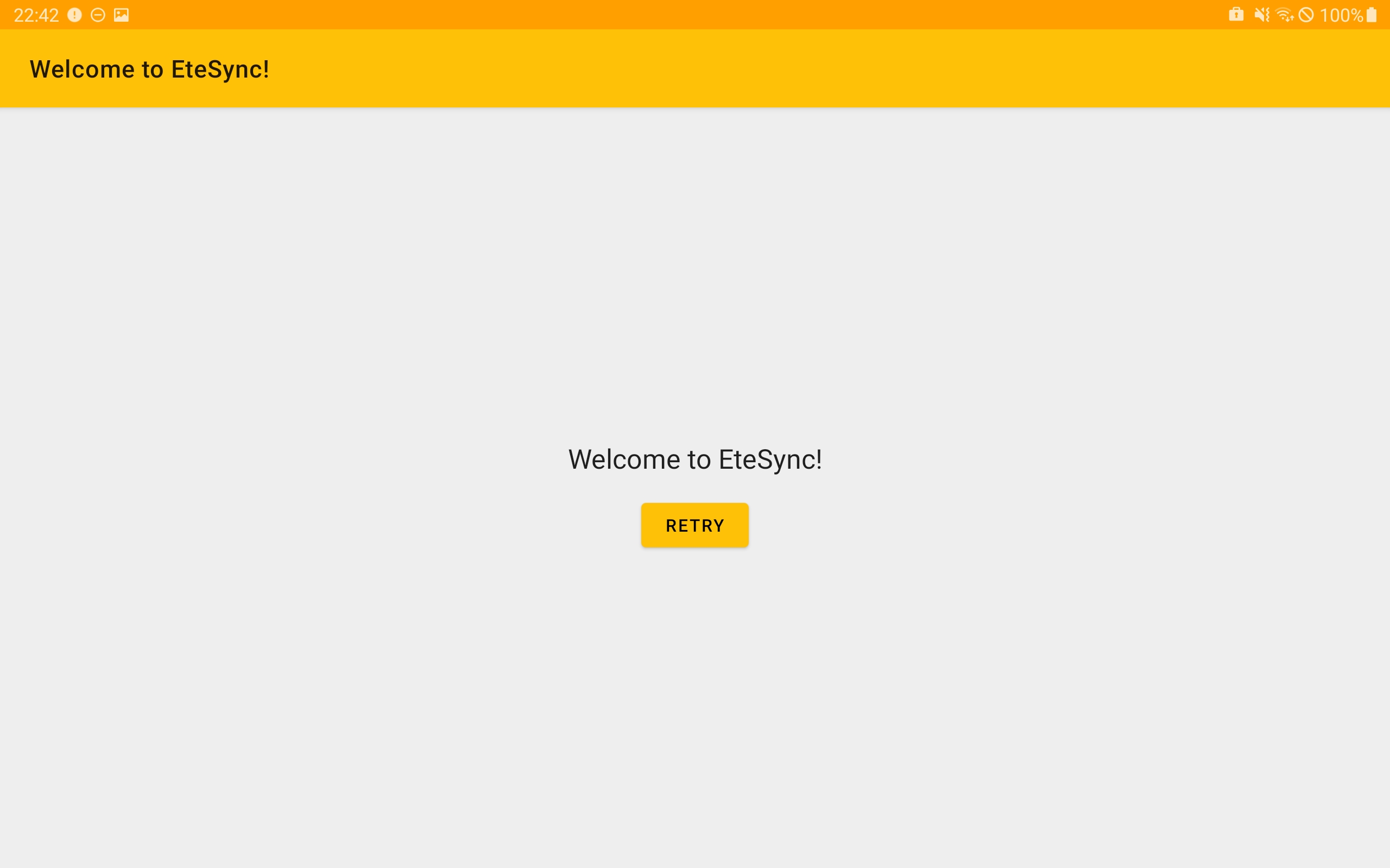
- You might tap "Retry" – as it maybe helps?! (in that case: "An error occurred", go to step 14)
- Ok, you remember that most services send you an email for registration.
- You go to your email app, refresh, but there is no new message from EteSync.
- You switch to another task.
- If you typed in the (deliberately?) wrong email address or your email server classifies the email as spam, you will probably forget EteSync at some point. Maybe you press the "Retry" button again, but you will never receive an email (not classified as spam) and don‘t know how to proceed as the "Retry" button is the only interactive element on the screen. Maybe you discover the functionality of the back button and see your account as a button (account list screen) and add another account. Or maybe you uninstall the app and forget about EteSync. Maybe you try again completely from the start and reinstall the app.
- At some point, you will notice that an email arrived.
- Without reading anything in the English email, you tap on the link, -> button "confirm email" appears.
- You tap on the button. -> An English form titled "Finish Your Signup" appears.
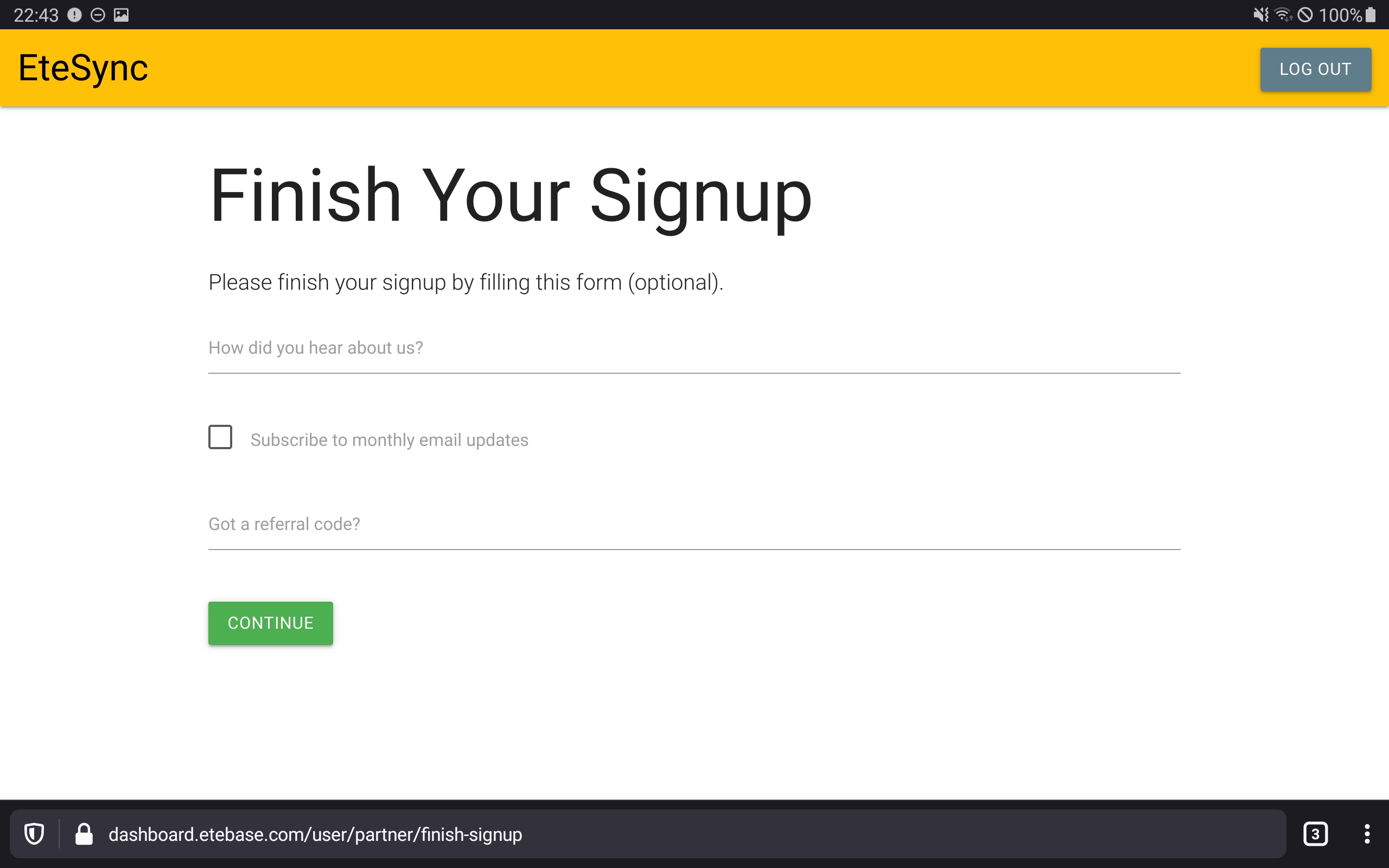
- If you understand the language, you fill in the survey form, and tap "CONTINUE". -> The English "Dashboard" appears.
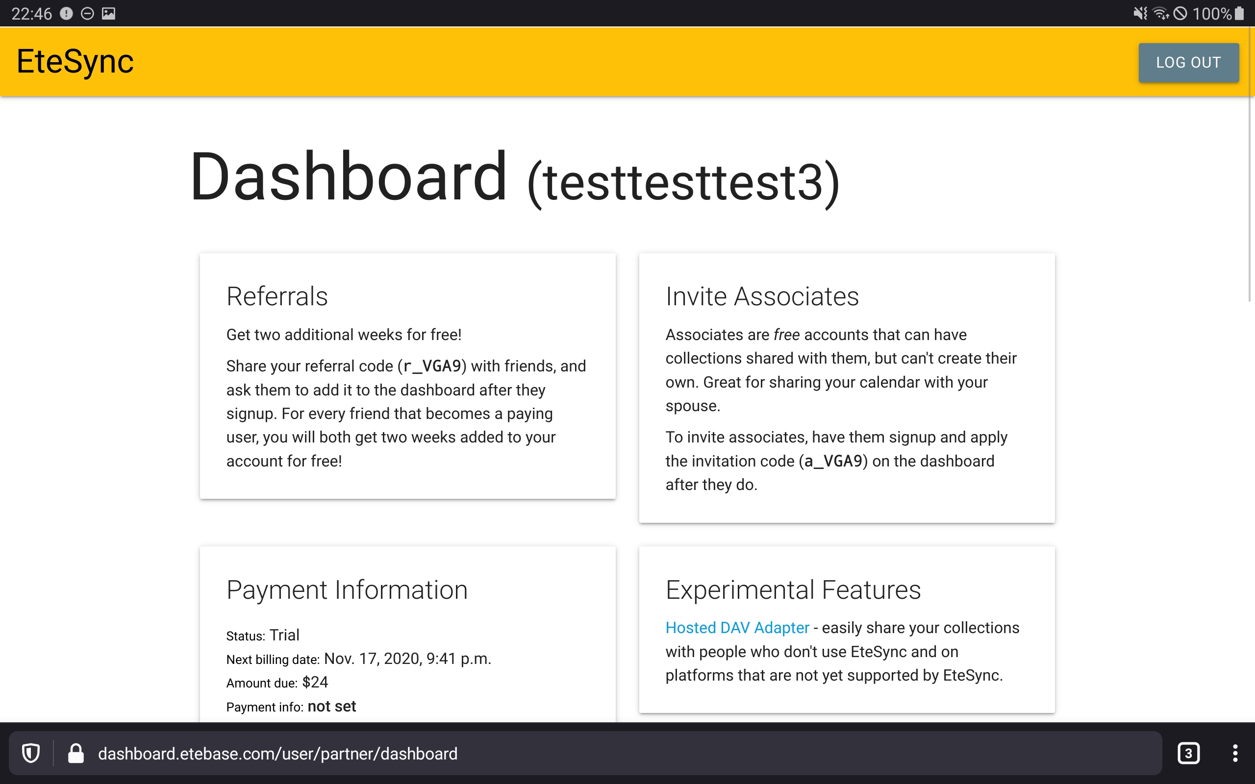
- You are not sure if further action is required as "CONTINUE" does not mean "complete signup". You scroll down the page containing plenty of information but do not find some promising button. The rest of the information seems to be irrelevant for now as you are not convinced you should upgrade or something. You do not notice that you have registered for a trial plan now as that is not shown under the headline "Plans" but instead beneath "Experimental features".
- You do not resign and at the very bottom, you see the block "Account Information" containing your username and email address. You feel your account has actually been activated.
- You switch to the app and tap on "Retry". -> A spinner appears, and your expectations grow. A message (in English) appears, asking you for the creation of a so called "collection".
- You are shortly distracted by the other button but then tap "CONTINUE". -> A box representing your new account appears.
- You tap (+). -> "add account" screen appears again. You are slightly more confused.
- You tap back. -> Account list appears.
- You do not resign, are curious, and tap on your account box. -> You are displayed with a message asking you to import things. Your total task count is now 2.
- You tap "OK". -> You see some categories, each of them having a corresponding "My …" entry.
- You ask yourself if it is necessary to add a collection now. You explore the GUI somewhat but still do not understand what is meant by the term "collection" and forget about it. In the meantime, you also forget your second task to import your contacts, etc..
- In other apps, you see a new address book and you might start using it as your new default address book.
- After 2 weeks your trial expires… (out of scope of this issue)
- After 3 months you drop your phone and by that loose all the contacts created before installing EteSync (because you did not import them).
Proposals
- Immediately go to the login screen after installation of the app.
- Redesign the login screen to contain a prominent toggle "register new account" a the top (some tabs or a checkbox). On registration mode, it should show an additional password field (#145 ) and email field, and the button "LOGIN" should become "REGISTER". After a brand new installation, the screen is in registration mode first. After the user logs out, the screen is in login mode by default.
- Provide a way to generate a secure memorizable passphrase instead of hoping the user is educated in combinatorics and brute force attacks.
- Do not silently flip the position of buttons.
- Do not display the information about the start of the trial with pale colours and not above already filled fields.
- Should a (verified) email address be required at the very beginning or after some days or when starting a paid plan? An email address should not be required for custom servers (most of them being even incapable of sending emails). A privacy-focussed app should probably look for ways to reduce the amount of gathered data.
- Provide a way to see and correct the unverified email address.
- A modal titled "An error occurred" should only be necessary when an unusual critical failure/bug has been detected. When the email is not verified, and it is required to be verified, show this information in the normal GUI, not a modal. Rename the button from "retry" to "check again" in that case. Always explain what the user needs to do if something is demanded from him.
- Will any new user willingly immediately subscribe to the newsletter? I doubt it. Instead, show in the app how to get in contact, or show info about new functionality in the app on new versions or …
- Ask for the reason of registration immediately upon registration instead of adding a step to the email verification process. Think about a selection field instead of demanding prose.
- Provide a prominent success message after the user has done all steps to verify the email address.
- Reorganize the "Dashboard". Most important information like the status of the account should be on top. Extract "Plans" to a separate page reachable by tapping on "upgrade" or something. Move the "Referrals" section to the "Plans section". Group "experimental features" and "Invite associates" into a section "How to share your calendar" or something.
- Some services like those from Microsoft do not show the full email address in the dashboard, probably for security reasons and to have an additional piece of information for authentication in the case of lost passwords.
- Translate the whole registration process.
- Remove the screen telling that new collections need to be created.
- After activating the account, directly navigate into the account, not to the account list.
- Place "Accounts" on top of the account list screen.
- Add an import assistant allowing to import all Android calendars with their colors etc. into corresponding EteSync calendars. Instead of recreating and importing calendars, what about just linking them into EteSync?
Hey,
Thanks a lot for the detailed feedback! There's a lot to unpack here but I agree with all of it (unless I missed something). I don't have time to tackle this at the moment, but would love to get some help if anyone sees this! I may be able to tackle it in the coming weeks though! Have you seen https://github.com/etesync/etesync-notes/ btw? Is it better there? Got any advice for that?
Also, please consider coming to https://www.etesync.com/community-chat/ if you use Matrix/IRC. You seem to have a lot of good ideas, and I'm sure you'd be a great addition to the chat!
New user onboarding definitely needs to be improved, and I appreciate your feedback!
Thanks!