nxviz
 nxviz copied to clipboard
edge labels in CircosPlot
Hi,
I'm trying to set edge labels in a CircosPlot (see under) via the edgeproperties argument, but I don't know which matplotlib line property I should use for it. Do you have any idea how this could be done? I'm aware of the fact that this will result in serious overplotting, but I need the information at least temporarily to interpret the CircosPlot. Maybe a legend would be a solution to deal with the eventual overplotting?
c = CircosPlot(G, node_color='prestroke_GDS_T0', node_order='network_group_id', node_grouping='prestroke_GDS_T0', group_label_position='middle', edge_color='color', figsize=(30,30), edgeprops={'facecolor':'None','alpha':0.2,'label':'network_group_id'})

Hi! Thanks for pinging in. I’m replying from mobile, please excuse brevity.
Try Circos panels: one Circos plot per axes, each highlighting a different edge set. That will reduce the amount of overplotting.
If you can post a link to a sample of your graph (pickle it), with different edge labels, I can give you some starter code.
Thanks Eric! Great idea! I'll try that and post my progress here! Might take some time though, since I'm away from my laptop the next couple of days.
On Fri, Sep 28, 2018, 19:37 Eric Ma [email protected] wrote:
Hi! Thanks for pinging in. I’m replying from mobile, please excuse brevity.
Try Circos panels: one Circos plot per axes, each highlighting a different edge set. That will reduce the amount of overplotting.
If you can post a link to a sample of your graph (pickle it), with different edge labels, I can give you some starter code.
— You are receiving this because you authored the thread. Reply to this email directly, view it on GitHub https://github.com/ericmjl/nxviz/issues/469#issuecomment-425511483, or mute the thread https://github.com/notifications/unsubscribe-auth/AABkHbJSMiOEa_Ku_3hmVyp48U-neeGqks5ufl5JgaJpZM4W9_43 .
Couldn't figure out how to create the subplots via the nxviz api. Would be fantastic if could help me out with some starter code as you suggested. I've pickled the (hopefully correct, never done this before) graph object
Thanks
I have a hack, but it's imperfect at the moment (creates unnecessary matplotlib figures). It looks like to get Circos Panels working properly, I'll have to update the codebase a bit, which is a bit of work.
For now, please see the attached HTML version of a notebook I hacked together. Admittedly, I wrote this having woken up at like 3AM, so please pardon me if there are things that don't seem evident at first glance.
I might need a few days to properly think through the API design for a CircosPanel, and how it might affect the existing codebase. The API design is the most attractive feature of nxviz, but that also means it requires a lot of thought in designing the underlying code.
@landge also, do let me know if you'd like to do a call for a code walkthrough. Happy to do that call.
Sorry for the late reply, Eric! Wasn't able to get back to you earlier.
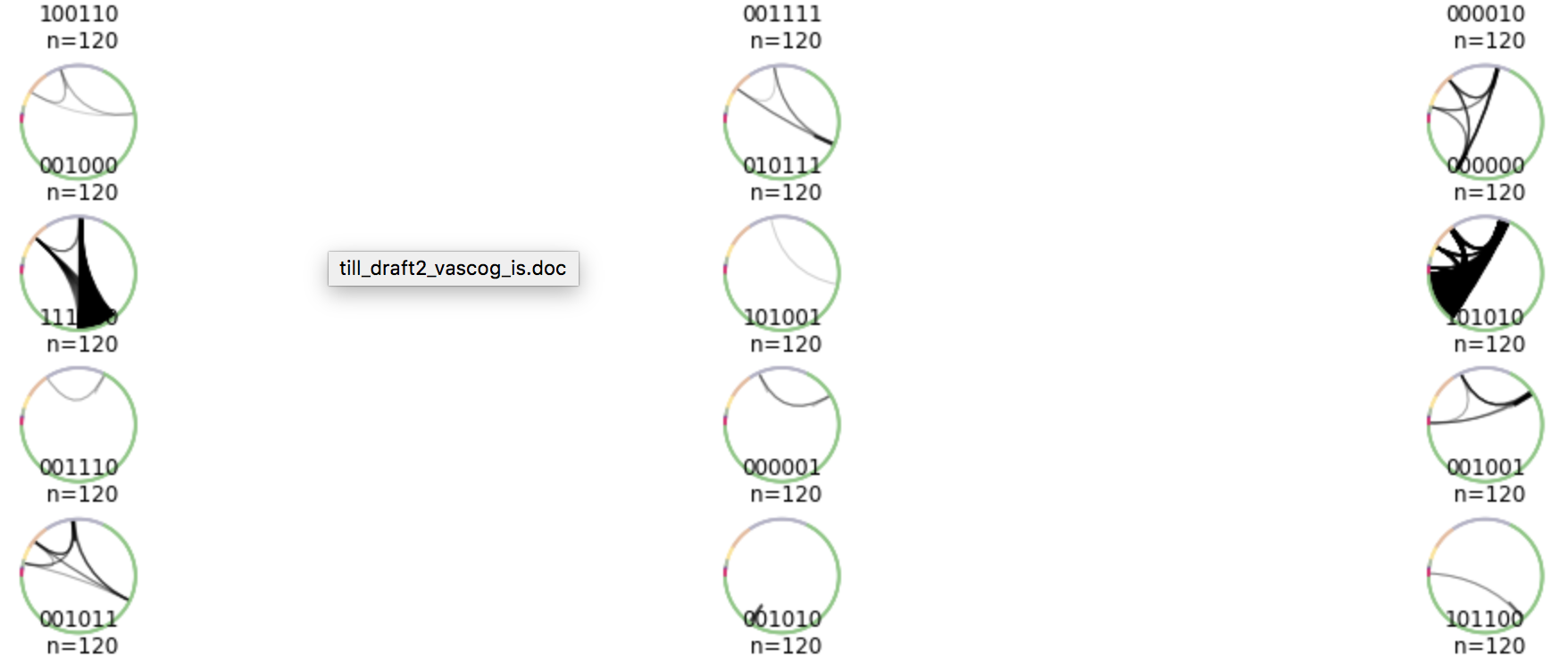
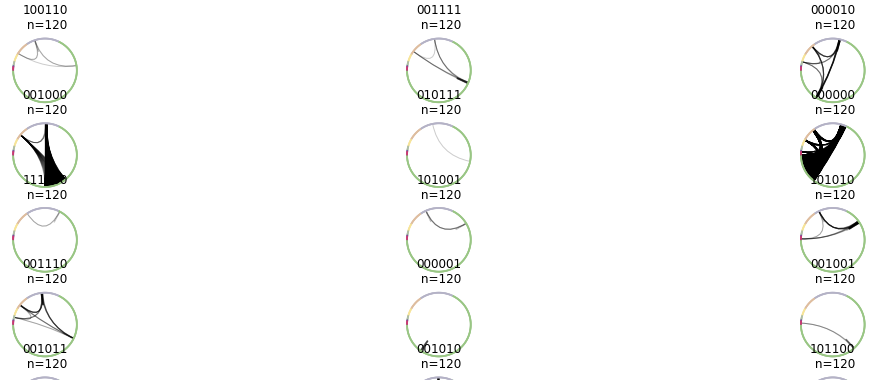
Your code works great for us. I hade no issues to understand it. It's much easier to get an overview of the different edge groups with help of the panels.
Do you think it's possible to increase the size of the axes inside the figure? It seems that the axes don't use the whole figure space.
Thank you very much for your help! Very much appreciated. Looks good?! What do you think?

@landge thanks for the feedback! :smile: Can I just check, how did you modify the code I provided to do what you've done here? It might be something I can check on/fix by looking at the code directly.
Of course:
fig = plt.figure(figsize=(20, 20))
gs = GridSpec(nrows=13, ncols=3)

for i, color in enumerate(colors):
    edges = filter_edges(G, 'color', color)
    ax = fig.add_subplot(gs[i])
    g = filtered_graph(G, edges)
    c = nv.CircosPlot(g, node_color='prestroke_GDS_T0', node_order='network_group_id', node_grouping='prestroke_GDS_T0')
    c.ax = ax
    c.ax.set_title(color+'\n n='+str(number_of_edges))
    despine(c.ax)
    c.draw()

What if you tried plt.tight_layout() at the bottom?
Doesn't seem to have any effect?

Hrm.... I'm not quite sure what's going on here, then. Have you already tried playing with the figure size? I will definitely need to dig into the codebase more.
I've tried different combinations of figsize and grid row and column numbers. And yes, as you mention it, I think there was one combination were the plots came out bigger in the grid. I can try to reproduce it.
Ok, this gives me quite a bit more impetus to do the CircosPanel API now. I think by allowing an axes object to be passed into the CircosPlot, I can provide more fine-grained control as well.
Yes, I think that sounds like a good idea. I would love to help, but I'm not sure if I know enough about the matplotlib internals....