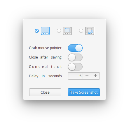
Label the selection modes
It is not immediately obvious, especially to new-to-computer users, what each mode in the screenshot tool means. I think adding labels is important and doesn't really clutter the look and feel of the app.

Want to back this issue? Post a bounty on it! We accept bounties via Bountysource.
These icons don't look as good, but get to the point

And then I went into the rabbit hole, finding some improvements, and realizing my mistakes


Maybe with a camera pictogram instead of "Take Screenshot", and some better kerning.
I think we should go for an option where we remove the radio buttons and make the icons bigger
Look for example how gnome solved this problem:

Your icons are much better but without space to show them (because of the radio button) there's no purpose to update it
- I'll try to provide some mockups without the radio buttons
@hmleal In that vein

I don't think adding text to what could be understood without it solves any issues. From what I remember studies show cognition is delayed that way, more-so than text or picture alone.
Less non-info, more good.
I think having the actual screen frame is better since I seem to mentally connect that to all physical space. Makes less actual sense, but to actually solve it you get into an additional option of "all screens", and then one for "select screens". I don't think that is the audience, but I like that someone cares about UI things here :)
@comradekingu My point was not about the text itself, it was about making the icons bigger removing the radio button. Maybe we can also re-organise the settings section too
Don't like the text either hehe, I really liked this new icon set in your last comment
I think the same logic works for selecting whether to include a mouse-pointer works. Maybe it should show up in the selected version, or does that make it confusing? One selector for each option?
 Don't think "close after saving is needed"(?)
Don't know what "Conceal text" does.
"Conceal text" replaces text in the image with an unreadable font.
I think selecting between
Abc
(blurred)
is clearer, and in tune with the proposal.