Colour label backgrounds on file/dir names look fugly
Problem
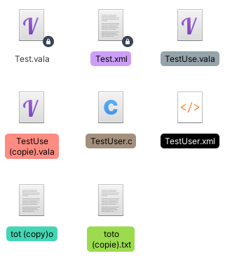
Currently using a colour label on a file or folder draws a solid, dark colour around the black text (in light mode). This is not very accessible, since the contrast isn’t too great. It also looks super out of place with the new stylesheet that seems to prefer dark text having light colour outlines (such as suggested action buttons).
Solution:
Make it draw a lighter, transparent background OR Make the name text white under all circumstances of it has a colour label applied to it
Needs UX team input as to how best to show color tags. At the moment, the text color is set by using the contrasting foreground color returned by the Granite library for the color beneath the text. That is why the text on color tags is (at the moment) always black regardless whether light or dark variant is used because the color tags do not change. Presumably that function calculates that the contrast between the color and black is greater than between the color and white. To me, the text is more readable using the dark variant especially for the darker tag colors but I think that is an optical illusion caused by the bright white folder background in the light variant.
Other ways of showing the tag color could be considered e.g. a colored frame or a separate tag emblem.
I have confirmed that, with an experimental black color tag the text does indeed change to white. However, the legibility is still not good on my screen. Maybe the weight of the font should be increased??

Maybe this can be considered during or after porting to Gtk4 dynamic views?