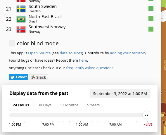
Colourblind mode checkbox/info panel obstructs region list on short desktop screens or when zoomed in
Also bug report form
This app is Open Source (see data sources). Contribute by adding your territory.
Found bugs or have ideas? Report them here.
Anything unclear? Check out our frequently asked questions.
Is in the way of the menue
Could you please attach a screenshot or specify your device and/or browser? Which menu is obstructed?
I'm assuming you mean this section? (Screenshot from Firefox on desktop)
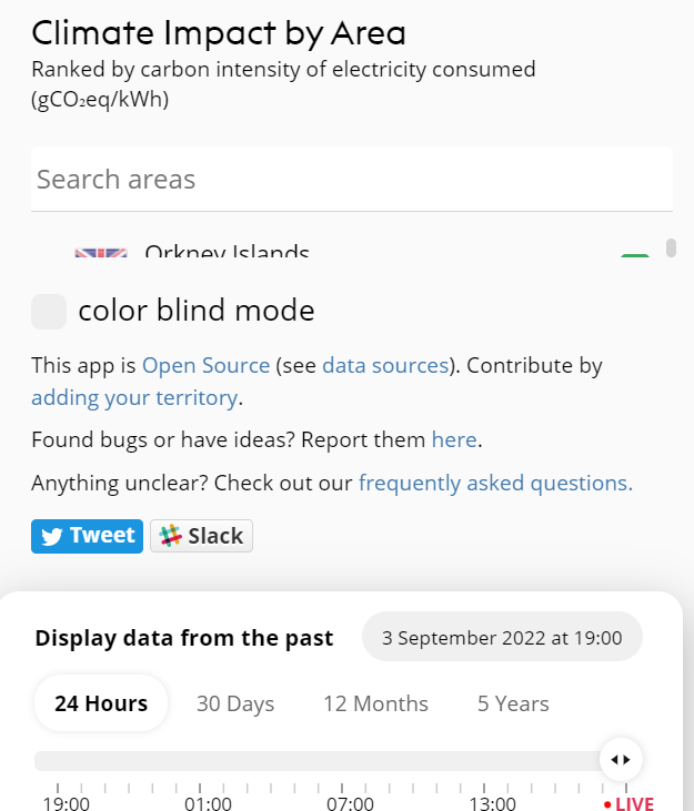
Yes it is. It's on chrome on windows. When zooming out the panel gets visible like in your screenshot.
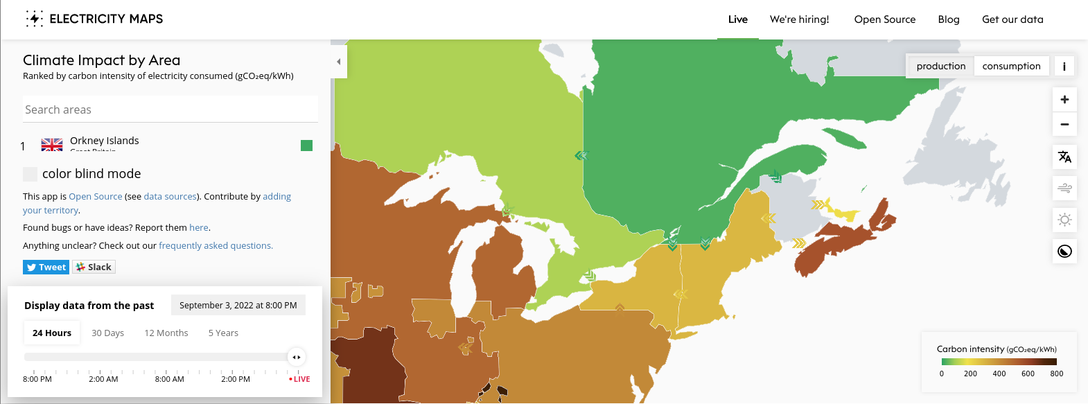
I can reproduce this in desktop Firefox 104.0 with zoom 100% and viewport size approximately 1570x583:
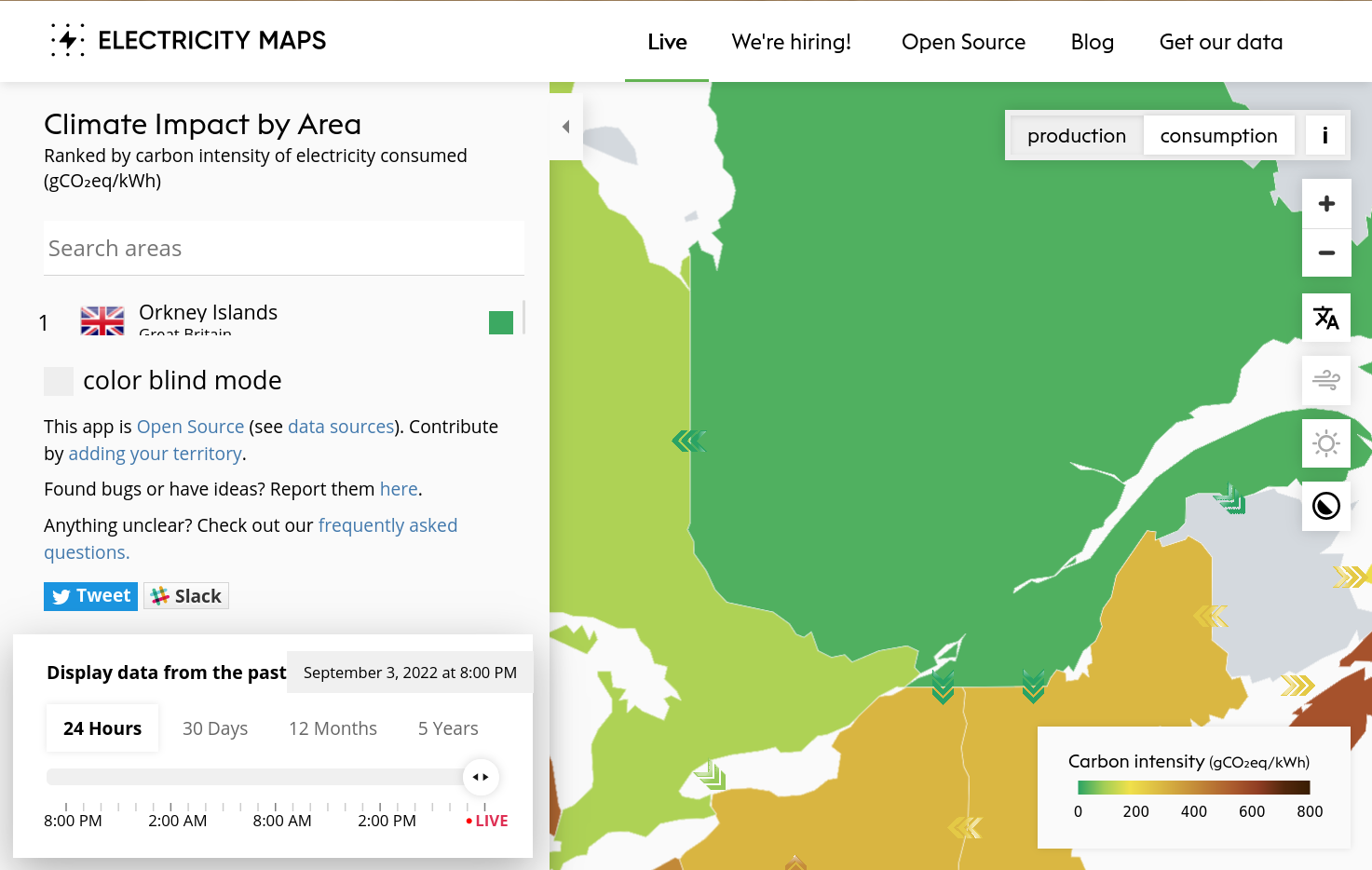
Or with zoom 150%, viewport approx 1473x934:
Looks like any viewport wider than 720px will show this layout. We might need to ensure the region list is always tall enough to fit at least a few regions?
I think the best way to "fix" this would be to move the color blind settings to a settings menu like we did for mobile.