docspell
 docspell copied to clipboard
improve user-field-pills
trafficstars
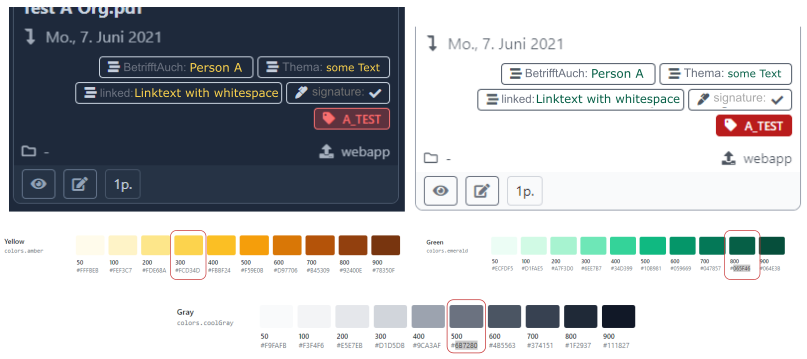
In order to improve the readability of the user field pills in card view, it would be nice to optically separate the field name from the content. As discussed here could
- add an additional separator and adjust the text colors and / or the text style.
- Another or additional option would be user-defined icons for each user field. The field name could be left out, which would save space.
Here is my mokup (tailwind default color palette):
