Minor issue: Improving the State/Progress-Bar text
[x] I have searched open and closed issues for duplicates.
Environment info
- Duplicati version: 2.0.2.19_canary_2018-02-12
- Browser: Google Chrome 64.0.3282.167 (Official Build) (64-bit)
Description
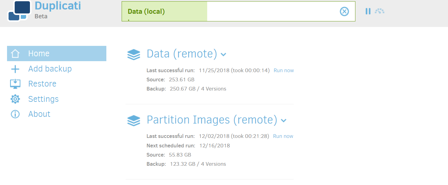
I have a large backup job running. At the top of the Home page, it has a progress bar that says: FileServer_CompanyFiles: 168338 files (255.23 GB) to go at 1.00
If I triple-click that and CTRL-C then CTRL-V into notepad, I see that the truncated text is supposed to say: FileServer_CompanyFiles: 168338 files (255.23 GB) to go at 1.00 KB/s
If I refresh the page, the progressbar text changes to just: FileServer_CompanyFiles: Running ...
- Format the number of files with thousands separators, like 168,338.
- Fix the text so that the whole string is visible. Note that zooming in/out on the web browser will change the size of the contents but does not help display the truncated text. It seems that the blue circle "x" button may be floating above the text, hiding it, instead of being inline with it.
- I don't know how to get from "Running" to the more detailed "168338 files (255.23 GB) to go at 1.00 KB/s". Maybe it changes on a timer, but I suggest adding a button or something to immediately show those details. Or just always show the details and never just "Running".
I second that.
Maybe it makes sense to make it two line?
Backup job xyz @ aws 168338 files (255.23 GB) to go at 1.00 KB/s
Things seem to be more broken on the current 2.0.4.5 beta.
I'm running a backup job right now, and it's breaking to a second line in the progress bar right after the name of my backup in Chrome 71 on Win 10
The progress bar breaking onto a second line is a caching issue. See #3485 and try to clear the browser cache.
That sort of seemed to fix it, though now the spacing is still weird, with the colon and the message pushed way to the right.
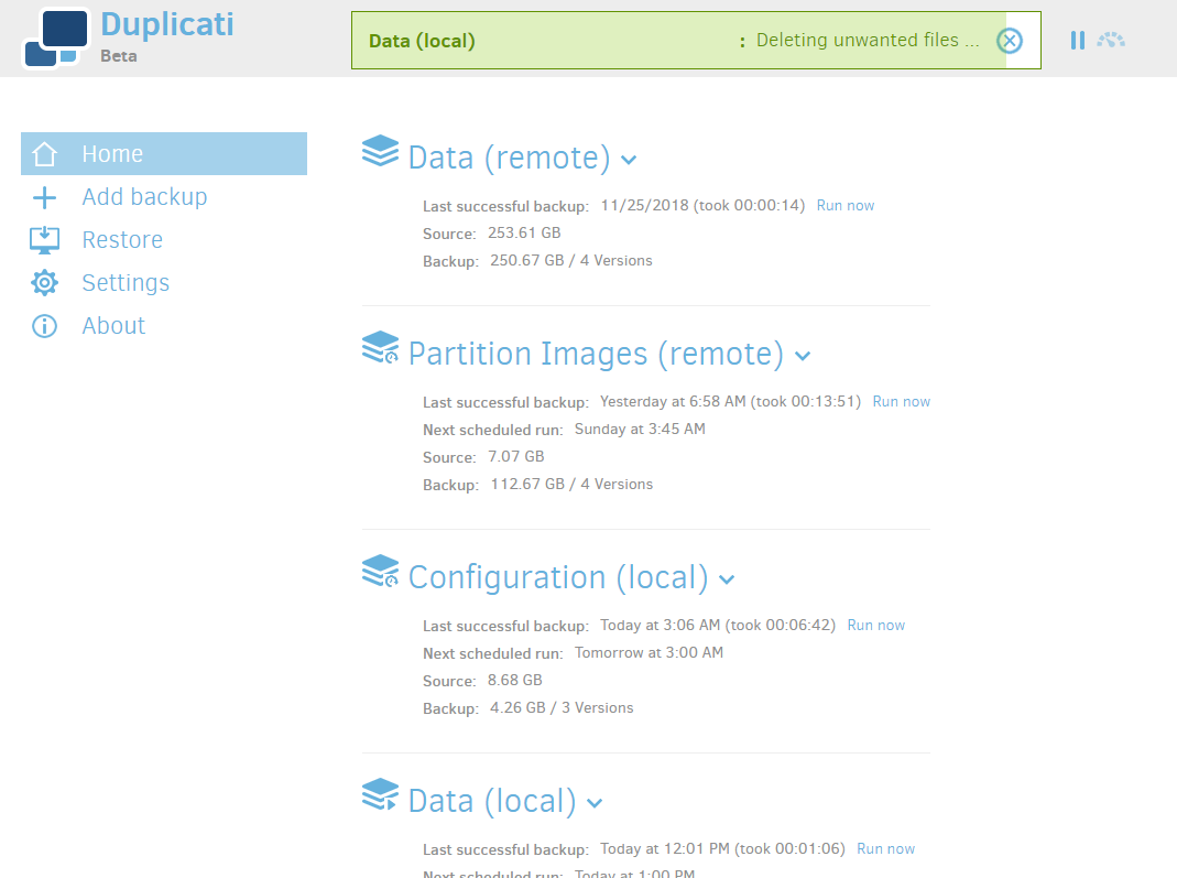
Can anyone still see this? I can't, the colon is right where it should be: directly next to the job description
I haven't heard anything, although I somehow missed it being mentioned here.
It looks a lot different now than it did in the 2018 screenshots. It's still one line, but proceeds through several phases.
I'm not sure how much more tweaking will be done, but I'll mark this as enhancement, in case more feedback comes.