Visualise statistics over time
General idea would be that each day & week is given a score based on the completed pomodoros, bruised and swished tomatoes. The user can then compete with themselves to improve the score.
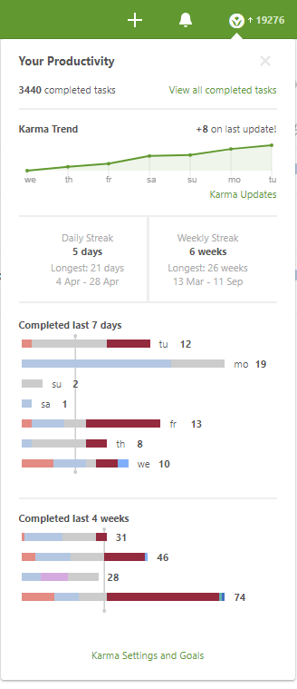
Todoist is an example of a tool doing this well with their karma system.
Any excuse for graphs and charts gets a 👍 from me! 😄
Would be cool to have the ability to share this on social media.
This also relates to #12. I agree with @Odonno about it being analytics - I hate the word gamification ;) @lukemerrett Happy for me to rename your issue title?
I almost closed this as a duplicate of #12, because it's pretty much the same thing. This is an Electron app, so the UI is HTML anyway - so it would be a lot of shared code to have a UI and an exported HTML file. Will leave open for reference for now though.
I think this would probably have extra things like filters - eg. like you mentioned in #31, you might want to see items tagged with personal, etc. Also, there would be date range filters, etc. Perhaps, the report generation in #12 is just a button called "Export" that exports the current filters shown in the stats UI.