BenchmarkDotNet
 BenchmarkDotNet copied to clipboard
Graph: Combined Jitter Scatter-plot and Box-plot
With all the data that any benchmark gets as results and the amount of times operations tend to be executed, its not a bad idea to also allow outputting this kind of graph
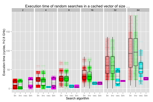
The explanation of the graph is here: https://www.pvk.ca/Blog/2012/07/03/binary-search-star-eliminates-star-branch-mispredictions/
Hey @AndreyAkinshin ! I was wondering if this issue is still relevant? I'd like to contribute, although I might need a bit of help getting started
@dbgoytia yes, it's still relevant. At the moment, BenchmarkDotNet doesn't have its own plotting subsystem. The only way to generate plots is [RPlotExporter]. It uses locally installed R and a custom R script that could be found here. Thus, the only way to support a new kind of plots is to add the corresponding changes in the R script (no C#, sorry).
P.S. It would be nice to have own plotting system so that we can draw charts without installed R. However, we don't want to add any additional dependencies to other NuGet packages. Thus, we should implement such a plotting logic from scratch. It's a huge tasks that require a lot of efforts, so we don't have it in the roadmap for the nearest future. Also, it makes sense to implement it on the perfolizer side rather than in BenchmarkDotNet.