onlineweb-frontend
 onlineweb-frontend copied to clipboard
 dotkom
Complete Header design
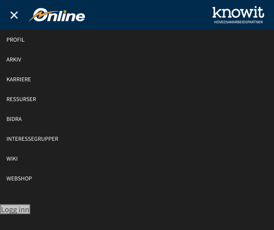
The header needs to be completed. Right now it is just a temporary design, created to have something. Currently, it does not scale at all for mobile devices.
@sardred Has looked into designing this earlier.
Tasks:
- [ ] Color?
- [x] How to highlight the page you are currently on.
- [x] How to do the login functionality.
- [x] Make it scale.
- [x] Decide on how to display the many sub-pages. There is quite a lot to show.
The current login button really needs a redesign as it changes the whole header:

I have to say I forgot a bit about that one, was a bit too eager to merge the authentication parts, as it was terribly needed 😞

I think that since we are going with a sort of app-like experience for mobile users, it would be nice to go with a bottom style menu for our mobile version?
Having a few important icons available in the menu at all times (like 4 or 5), and leaving the rest of the options in a side-drawer type thing?
Do we still feel the need for a bottom style menu? I can't really decide if its necessary, do we have any examples of other sites using this sort of bottom menu?
I think a bottom menu is a good idea as it makes the menu more accessible. Android apps, like twitter and facebook, have also recently (1-2 years ago) made such a transition. Apple apps mostly had it from the beginning - and it seems like it was a good idea as it did not go the other way.
Personally, I would prefer that web apps did the same (as of tablet-sized phones), but by doing this you create a totally different layout for desktop and mobile. This may lead to inconsistencies and more effort on the development side.
You can look at how https://m.youtube.com has implemented it. They have kept it small with four buttons. They also have a top menu. They also hide both the top and bottom menu when scrolling down - which may solve the problem with using too much space on the screen.
This is a nice to have, and I do not see any disadvantages weighing out the pros. But reasoning from the current situation of dotKom, we should probably focus on finishing the design overall first. Meanwhile, we can add this to the backlog.