Not all graph colours coming through
I'm submitting a ...
Check one of the following options with "x" and add the appropriate label to the issue as well
[x ] Bug report
[ ] Regression (behaviour that used to work and stopped working in a new release)
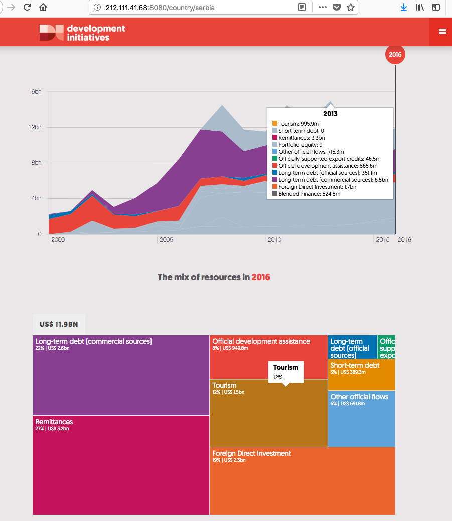
Describe the Issue The first graph is showing a lot of grey, based on the burst box graph below I think it is incorrect and there should be more colour details.
To Reproduce Replace the content below with the steps to reproduce the behaviour.
- Go to http://212.111.41.68:8080/country/serbia
- Click on 'international resources'
- Scroll down to graph
- See error
Expected Behaviour For example I expected to see the colour for tourism on the graph
Screenshots/GIF
Desktop (please complete the following information):
- OS: [e.g. iOS]
- Browser [e.g. chrome, safari]
- Version [e.g. 22]
Smartphone (please complete the following information):
- Device: [e.g. iPhone6]
- OS: [e.g. iOS8.1]
- Browser [e.g. stock browser, safari]
- Version [e.g. 22]
Environment/Server:
- [ x] Production
- [ x] Staging
- [ ] Test
- [ ] Development
Additional Context This is a medium priority, as it isn't a full blown data integrity issue is it less important than some of the other bugs in the backlog but it would be NTH for the ITEP update but not essential.
Requested Delivery Date: dd/MMM/YYYY
There's also inconsistencies with the legend, also noted by Laurence in a different chart. Legend colours seem to change for the same series as one hovers through the years. I think these two issues are connected, arising from gaps in the data i.e. take tourism for example, it could have an appearance in 2000 to 2004, then no data for 2005 - 2006. For these years with no data representative, the chart has no reference and so goes with the default, setting the colour to grey and the value to 0. I think filling in these gaps with actual data that matches what's expected could fix this.
Hi @edwinmp, sorry if misinterpretation, unfortunately filling the gaps with actual data (values greater than 0) is generally not a feasible option for the time being or from my experience as a longer term fix for financial resource flows. Whilst some instances of zero data are related to known poor quality of data, there are other instances where the zero is genuine for a given year. Neither of these we can control for. As a rule I'd advise against even plugging gaps we know are due to poor data with estimated numbers. Some flows which are volatile (e.g. portfolio equity) could not be accurately estimated, whilst less volatile flows with missing data may have seen significant changes from the average trend in the years with missing data, for example poor data may link to a crisis which also impacts on the flows. Finally the intentional gaps/0s we get in the OECD data on export credits and OOFs are in many cases correct; it would be poor practice to edit these. Unless there's a patch around this such as setting each 0 to 0.001 or having the legend recognise zeros. This is always going to be the case with the data we use.
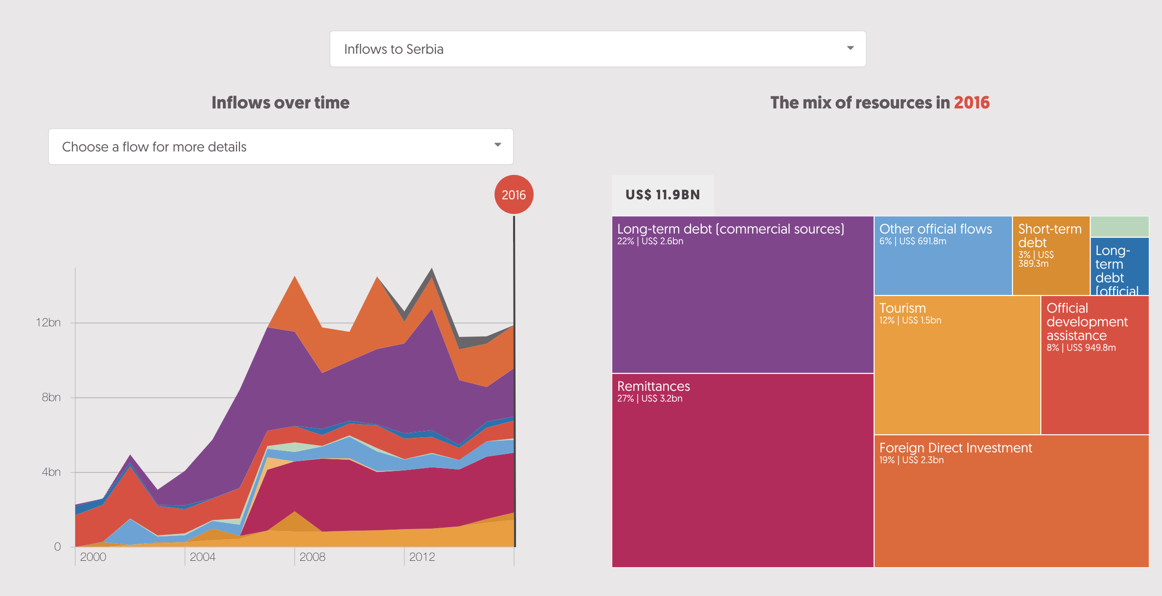
Same fix applies to the issue @laurenceford spotted on this country profile visualisation
@Duncan-Knox, I'm not making any data estimates. I'm simply setting data gaps which already appear as having a value of 0 on the charts, to actual 0, but I also add the rest of the configurations that are required for this visualisation to function. With those gaps, the visualisation breaks, as is reported here.
@edwinmp sorry for the mis-understanding my end. I misread the initial comment to meaning the data needed values >0 to prevent the visual breaking. Checking through the fix now.
I know previously this was all grey but now is looking good: http://212.111.41.68:8080/country/montenegro
I'll wait for Duncan to do the more detailed check from the analyst pov.
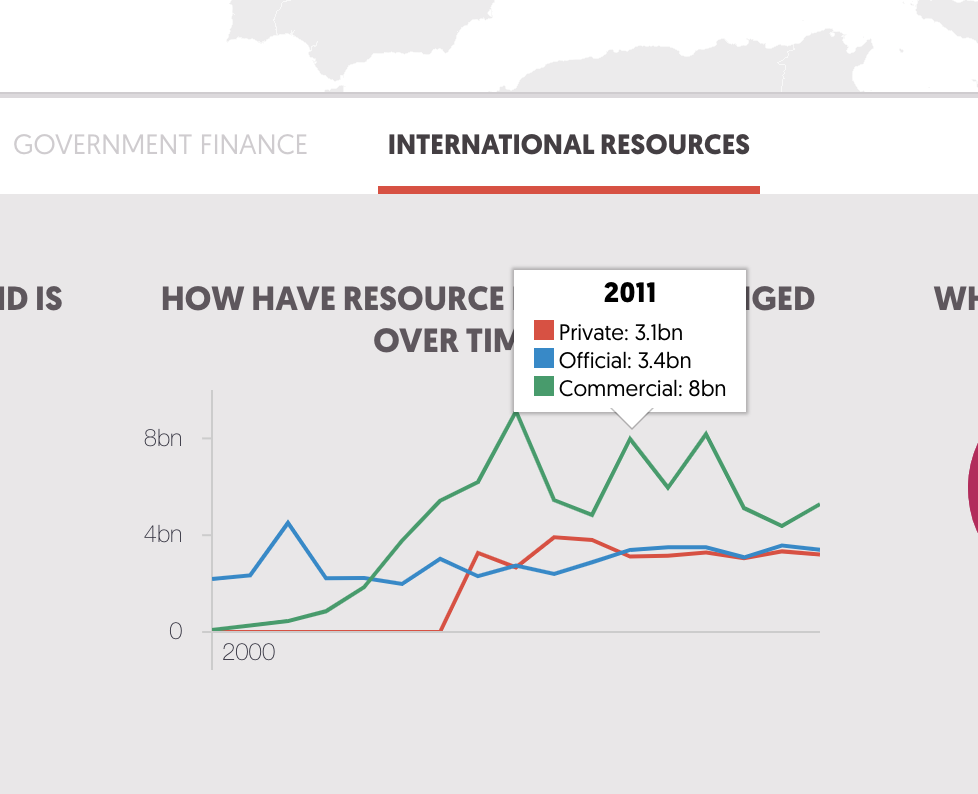
The green lines issue is now fixed on the how have resources changed over time visual. The colouring on the in detail international resources visual has fixed ok in many if not most cases, however there are still instances of the bug cropping up. This looks related to outflows of commercial and official long term-debt. For example:
For Cambodia: the data on capital repayments of long-term debt (commercial sources) are purple on the right hand chart and grey on the left had chart over the course of 2011-2016.
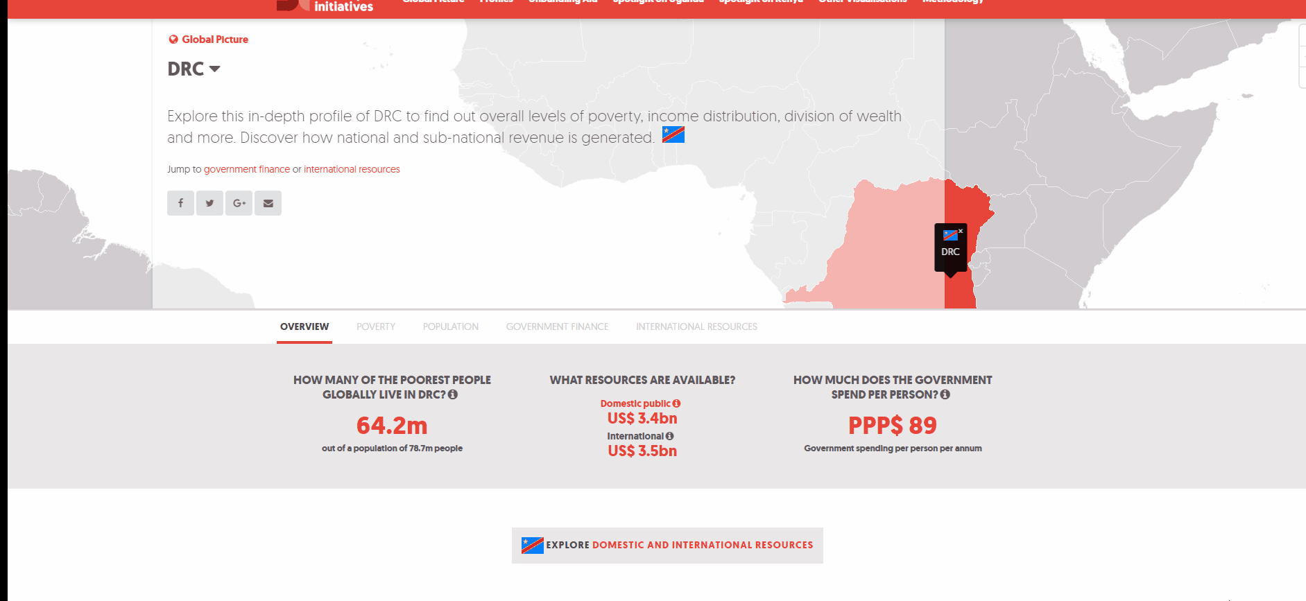
For DRC: the data on interest payments on long-term debt (official sources) and capital payments on long-term debt (official sources) is grey on the left hand side chart when it is coloured blue on the right-hand side chart, this stands out in 2008 more than other years where this data is higher in volume.
Hi @Duncan-Knox ... can't seem to replicate the problem in your last comment anymore. Please try to replicate on your end.
Hi @edwinmp I've still got the bug on colours showing my end:
Can this type of issue tie into the way the CMS stores colours?