preact-mdl
 preact-mdl copied to clipboard
 developit
:boom: A collection of Preact Components that encapsulate Google's Material Design Lite.
preact-mdl


A collection of Preact Components that encapsulate Google's Material Design Lite.
Quick Start

Grab the App Skeleton from JSFiddle, Codepen, or Code Sandbox
Using TypeScript? preact-mdl-example is an instant full project setup.
Documentation
Installation
npm install --save material-design-lite preact-mdl
What does it look like?
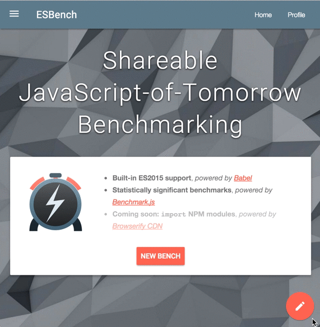
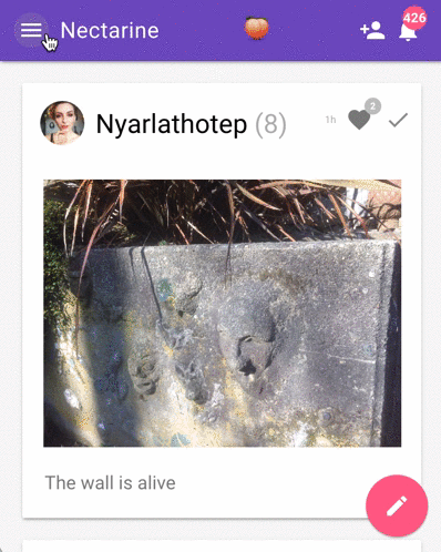
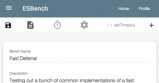
See for yourself - preact-mdl powers ESBench and Nectarine.
Here's some live-action demos:

Usage
- Add MDL stylesheets to your html
<!DOCTYPE html>
<html style="height: 100%; width: 100%;">
<head>
    <meta charset="utf-8">
    <meta name=viewport content="width=device-width, initial-scale=1">
    <link rel="stylesheet" href="https://fonts.googleapis.com/icon?family=Material+Icons">
    <link rel="stylesheet" href="https://code.getmdl.io/1.2.1/material.indigo-pink.min.css">
    <title>Preact-mdl Example</title>
</head>
<body style="height: 100%; width: 100%;">
  <script src="/bundle.js"></script>
</body>
</html>
- Import mdl module and components from preact-mdl
import { h, Component } from 'preact';
import mdl from 'material-design-lite/material';
import { Button } from 'preact-mdl';

export default class MyButton extends Component {
  render() {
    return(
      <div>
        <Button>I am button!</Button>
      </div>
    )
  }
}
Demos
For now, browse these Open Source projects using preact-mdl:
 developit