lovelace-plotly-graph-card
 lovelace-plotly-graph-card copied to clipboard
Secondary y-axis title/tick-labels are shifted if `layout: xaxis` is added
Describe the bug If I add for example
layout:
  xaxis:
    tickformat: '%H:%M'
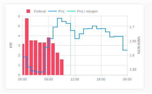
the title for the secondary y-axis ends up on top of the tick labels.
Without layout: xaxis

With layout: xaxis

The same issue appears if I for example add a yaxis config (from the "now line" example)
layout:
  yaxis9:
    visible: false
    fixedrange: true
Screenshots If applicable, add screenshots to help explain your problem.
yaml
type: custom:plotly-graph
hours_to_show: current_day
refresh_interval: 10
defaults:
  entity:
    line:
      width: 2
config:
  staticPlot: true

entities:
  - entity: sensor.kaifa_active_power_import
    name: Forbruk
    marker:
      color: '#FF4560'
    statistic: mean
    type: bar
    unit_of_measurement: kW
    filters:
      - map_y_numbers: y/1000.0
  - entity: sensor.nordpool_kwh_krsand_nok_3_10_025
    attribute: raw_today
    name: Pris
    line:
      color: '#008FFB'
    filters:
      - fn: |-
          ({states}) => {
            const ys = [];
            const xs = [];
            let state = states.slice(-1)[0]
            let raw = state.attributes.raw_today
            for (let i = 0; i < raw.length; i++){
              let start = new Date(raw[i].start)
              xs.push(start);
              let end = new Date(raw[i].end)
              xs.push(end);
              ys.push(raw[i].value);
              ys.push(raw[i].value);
            }
            return { xs, ys };
          }
  - entity: sensor.nordpool_kwh_krsand_nok_3_10_025
    attribute: raw_tomorrow
    name: Pris i morgen
    line:
      color: '#00E396'
    filters:
      - fn: |-
          ({states}) => {
            const ys = [];
            const xs = [];
            let state = states.slice(-1)[0]
            let raw = state.attributes.raw_tomorrow
            for (let i = 0; i < raw.length; i++){
              let start = new Date(raw[i].start)
              start.setDate(start.getDate() - 1); // subtract one day
              xs.push(start);
              end = new Date(raw[i].end)
              end.setDate(end.getDate() - 1); // subtract one day
              xs.push(end);
              ys.push(raw[i].value);
              ys.push(raw[i].value);
            }
            return { xs, ys };
          }
Additional context Add any other context about the problem here.
I'm kind of able to fix it with the following config, with the downside that I have to manually set the y-axis label.
layout:
  xaxis:
    tickformat: '%H:%M'
  yaxis2:
    title:
      text: "NOK/kWh"
      standoff: 10
    autoshift: true
    anchor: 'free'

I was able to fix it in a more flexible way, by adding yaxis: y and yaxis: y2 to the respective entities (and keeping yaxis: y9 for the "now" line). Perhaps this is useful for fixing the underlying issue?
Here's the result:
Full card config:
type: custom:plotly-graph
hours_to_show: current_day
refresh_interval: 10
defaults:
  entity:
    line:
      width: 2
config:
  staticPlot: true
layout:
  xaxis:
    tickformat: '%H:%M'
  yaxis9:
    visible: false
    fixedrange: true
    range: [0,1]
entities:
  - entity: sensor.kaifa_active_power_import
    name: Forbruk
    yaxis: y
    marker:
      color: '#FF4560'
    statistic: mean
    type: bar
    unit_of_measurement: kW
    filters:
      - map_y_numbers: y/1000.0
  - entity: sensor.nordpool_kwh_krsand_nok_3_10_025
    attribute: raw_today
    name: Pris
    yaxis: y2
    line:
      color: '#008FFB'
    filters:
      - fn: |-
          ({states}) => {
            const ys = [];
            const xs = [];
            let state = states.slice(-1)[0]
            let raw = state.attributes.raw_today
            for (let i = 0; i < raw.length; i++){
              let start = new Date(raw[i].start)
              xs.push(start);
              let end = new Date(raw[i].end)
              xs.push(end);
              ys.push(raw[i].value);
              ys.push(raw[i].value);
            }
            return { xs, ys };
          }
  - entity: sensor.nordpool_kwh_krsand_nok_3_10_025
    attribute: raw_tomorrow
    name: Pris i morgen
    yaxis: y2
    line:
      color: '#00E396'
    filters:
      - fn: |-
          ({states}) => {
            const ys = [];
            const xs = [];
            let state = states.slice(-1)[0]
            let raw = state.attributes.raw_tomorrow
            for (let i = 0; i < raw.length; i++){
              let start = new Date(raw[i].start)
              start.setDate(start.getDate() - 1); // subtract one day
              xs.push(start);
              end = new Date(raw[i].end)
              end.setDate(end.getDate() - 1); // subtract one day
              xs.push(end);
              ys.push(raw[i].value);
              ys.push(raw[i].value);
            }
            return { xs, ys };
          }
  - entity: ""
    name: Now
    yaxis: y9
    showlegend: false
    line:
      width: 1
      dash: dot
      color: deepskyblue
    x: $ex [Date.now(), Date.now()]
    y: [0, 1]
This looks like a bug in plotlyjs, but I'll take a look to make sure it's not me (this card). You could also try setting the right margin manually, which is set automatically by the card depending on if any entity uses the y2 axis, but you can override it like this:
layout:
  margin:
    r: 60
Congratulations on posting the issue number 100 by the way 😁
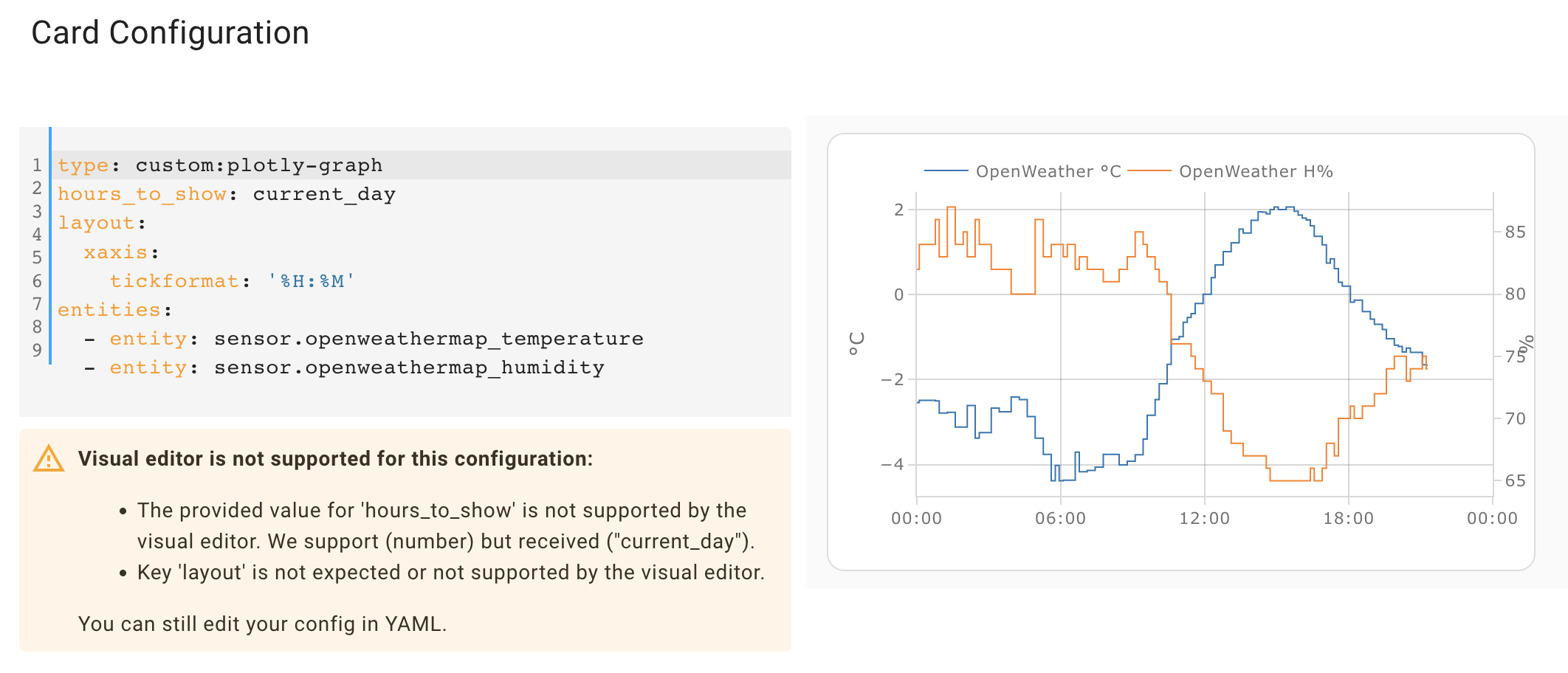
Interesting, I can't reproduce this. I removed the filters and plugged some thermometers and I get this:
 Note I added the now line and the right margin still looks intact.
Which version of the card are you using? Are you sure it is the latest one?
Note I added the now line and the right margin still looks intact.
Which version of the card are you using? Are you sure it is the latest one?
here's my adapted yaml (same as yours but w/o attributes and filters, which should have zero effect on the plot itself)
type: custom:plotly-graph
hours_to_show: current_day
refresh_interval: 10
defaults:
  entity:
    line:
      width: 2
config:
  staticPlot: true

entities:
  - entity: sensor.openweathermap_temperature
    name: Forbruk
    marker:
      color: '#FF4560'
    statistic: mean
    type: bar
    unit_of_measurement: kW
    filters:
      - map_y_numbers: y/1000.0
  - entity: sensor.garden_temperature
    name: Pris
    line:
      color: '#008FFB'
  - entity: sensor.wintergarten_thermometer_temperature
    name: Pris i morgen
    line:
      color: '#00E396'
  - entity: ""
    name: Now
    yaxis: y9
    showlegend: false
    line:
      width: 1
      dash: dot
      color: deepskyblue
    x: $ex [Date.now(), Date.now()]
    y: [0, 1]
layout:
  yaxis9:
    visible: false
    fixedrange: true
On a side note, nice job transforming the data from the attribute, power user 💪!
Just watch out on the missing "let" for the end variable, and missing semicolons at the end. On certain cases the missing semicolon results in very unexpected behaviour (two statements in two lines end up being interpreted as a single one in ways one doesn't expect)
I'm on v3.3.1 via HACS. I'll try to make a simpler example and see if something different happens.
Thanks for the JS pointers! It's pretty hard to debug JavaScript inside YAML :D
I managed to reproduce it with a minimal example

type: custom:plotly-graph
hours_to_show: current_day
layout:
  xaxis:
    tickformat: '%H:%M'
entities:
  - entity: sensor.waveplus_temperature
  - entity: sensor.waveplus_humidity
If I remove the layout-section it looks as expected

I've cleared my cache and done hard refreshes, but the bug still appears.
Ok, I'll give it a try this evening. To debug the js, take a look at the debug section in the readme. You can make the browser stop and go step by step in a $fn by using the debugger statement
Oh, I know what this is. The default right margin depends on the entities: if there is one that uses yaxis2, then the right margin is increased from 30 to 60.
Here:

The problem is that the yaxis an entity will use depends on its unit_of_measurement, and that is only known after processing (fetching, etc) the entity. Since you define the layout before the entities, the defaults for the layout also land before the entities, but that means their yaxes are not yet known.
This is an oversight on my side, and in the current implementation, the only thing I can do is to make the margin function throw an error if it's evaluated before the entities. I'll have to think about this but, but in the meanwhile, you have 2 options:
- move the layout to after the entities
- or set the right margin manually
Nice detective work :) It's not an issue for me anymore with my current config, but nice to know the workaround of putting the layout after the entities. Never knew the order could have that effect.
Well, the order shouldn't actually have an effect, that is my mistake. In the other places where there are dependencies between the sections of the yaml, having the wrong order throws an error and the UI clearly indicates that the order needs to change.
This is a bit odd when caused by a default, because the error talks about flags the user didn't set themselves. I did it this way because I'm internally reusing the universal-functions' mechanisms, which tremendously simplify the handling of user-config-dependant-defaults. They were a bit of an ugly nightmare in v2.