dartdoc styling seems off on bleeding edge and dev
Compare
dev

beta

stable

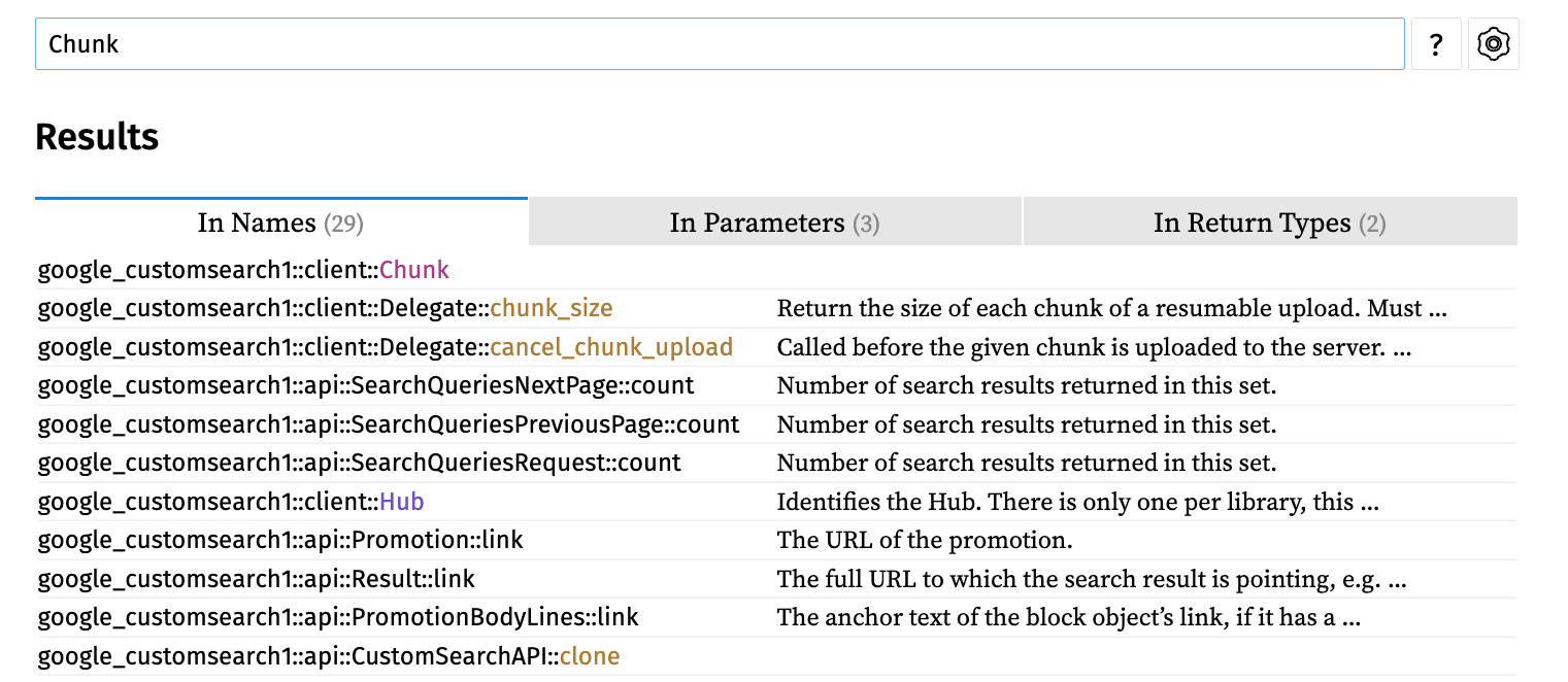
Stable looks fine visually. Good padding between dropdown and contents, easy to read (method name first, classname under it). Then progressively UI deteriorates. Beta introduces weird boxes around method names, class name is too prominent, padding from top and left is inconsistent. Dev gets even worse. No padding on the left, too much padding on top, class name is written two times (on top and on the right).
I suggest to go back to nice and compact output from the stable unless there is some strong reason why we don't want that. Otherwise maybe we need some CSS tweaks to make things more consistent.
/cc @mit-mit
Thanks for the feedback. Most of this is intentional 🤷 . In a recent intern project, the changes which resulted in the diff from stable to beta went through a UX review. After that, @Hixie gave feedback that the new design was very busy and there were too many lines for each result, so I streamlined them into one line each, which results in what you see in dev.
Everything you cite about dev is accidental:
- zero padding on the left of each result
- too much padding on the top
- class name is written twice
@srawlins do you have any artifacts from UX review? I'd be curious to read the motivation. Stable seems much cleaner to me than either dev or beta, so there must be something I don't grasp.
The screenshot for dev has two lines per result still, is that intentional? I agree that the stable screenshot is cleaner, but I think it'd be even cleaner if there was literally just one line per result (and no headers in the results) and also if the library was explicitly mentioned in the line (so you can distinguish dart:html and package:flutter results, for example).
The screenshot for dev has two lines per result still, is that intentional?
No, accidental.
I agree that the stable screenshot is cleaner, but I think it'd be even cleaner if there was literally just one line per result (and no headers in the results)
Yeah. Rust does this (though their design does not fit for us - because our search box is located in the corner) and theirs in the center.
Probably we could still render things as dart:html > Event > stopPropagation following the same format as breadcrumbs at the top of the page use. Though this will require extending the width of the dropdown.