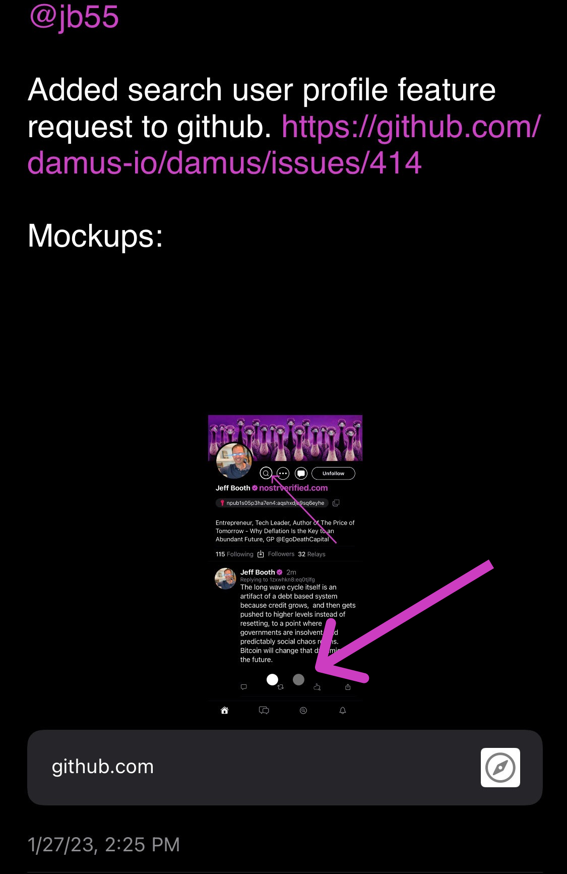
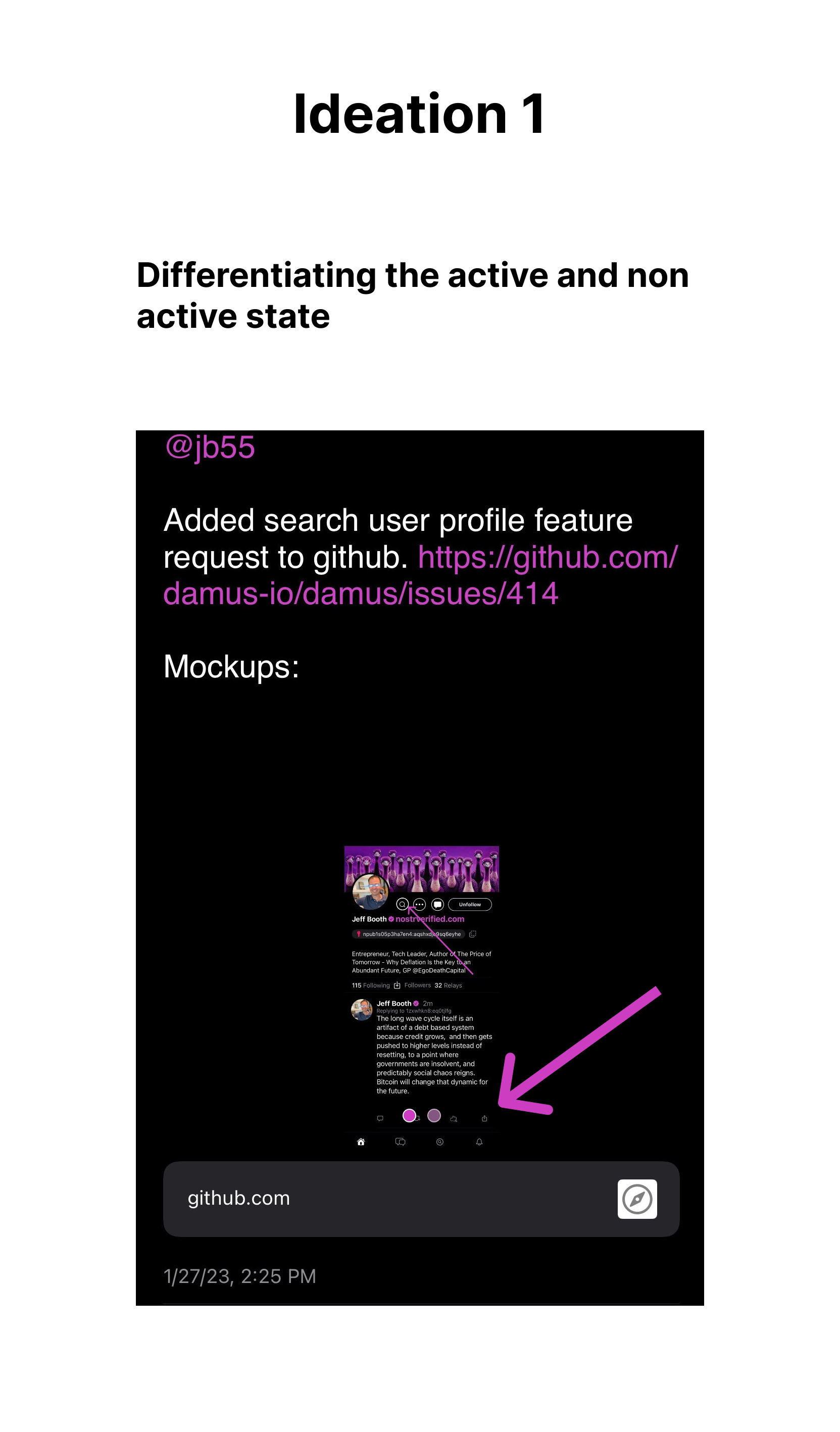
Improve contrast/visibility of multiple image in one post UI [enhancement][UI/UX]
On posting a note with multiple images, visibility is low that there is a sideswipe option. See current state, and an example revision from a non-designer:

Hey, I recently came across damus and think it could really benefit from good design to make it more user friendly. I would love to contribute to this in any capacity.
I am building up on your approach to make the UI more prominent. I am not sure about the guidelines for contributing, but I think I can help in this ideation. Please let me know if there's a set protocol to help with design or where is a better place to contribute. Here are my thoughts on this issue.

@AruneshSingh you could reach out to @elidyweaver, Damus expert designer, to ask how you can help. See Elidy's post on LN zaps/tips: https://github.com/damus-io/damus/issues/308.
Will do! Thanks. How do we progress with issues like this though? Should I create more iterations?