specter-desktop

specter-desktop copied to clipboard
UI Suggestion: more consistent display for wallet name & balance across all wallet screens
Just a suggestion here to modify the UI to add a bit of consistency. Here are two different screens, with two different ways (and verbiage) to display the balance.
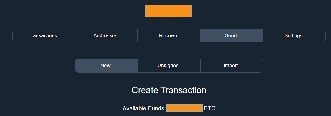
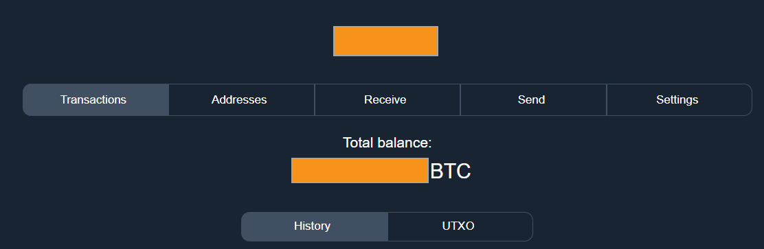
My instinct would be to move the balance up to just below the name of the wallet is, and keep it displayed across all wallet-related screens (unless user toggles to hide balance).