coqdocjs
 coqdocjs copied to clipboard
Missing blank lines with folded proofs
Now that #4 has been merged, the behaviour of the proof folding to "swallow" the (usually) blank line after the "Qed." (which was fine with the old invisible "Proof.") becomes problematic. It causes lemmas, particularly those with one-line proofs, to look "glued together" even though there is a blank line between the proof of the lemma and the statement of the next in the source code.
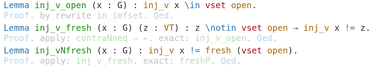
Good:
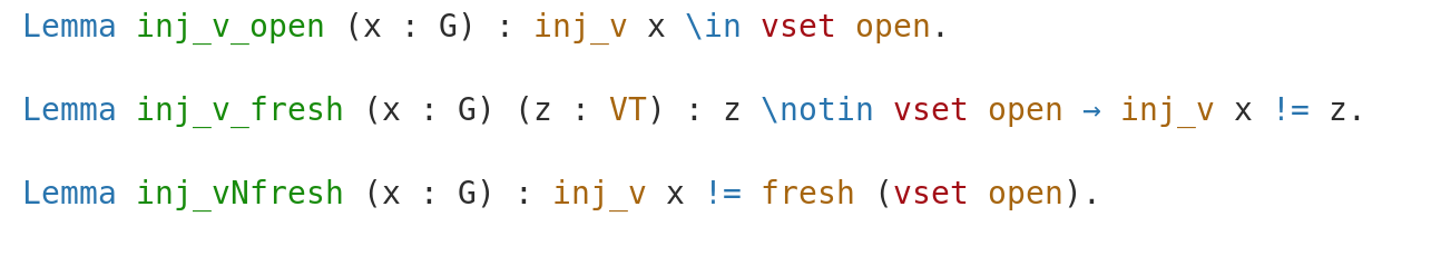 Bad:
Bad:
Yeah, not sure what's the best solution here. The fully transparent proofs look clean but are more difficult to find. And a bigger gap is also wasteful...
Actually, I think the old solution was a reasonable compromise, the proofs were easy to find (even though the display was a bit flickering when moving the mouse) but it looked neat with the folded state. Perhaps the best solution is to just revert #4, not sure.
Hm, i really had a hard time seeing that one can unfold something, at first I thought that I imagined proofs to be unfoldable.
So my opinion is that newcomers probably will not see that there are proofs unless the "proof" is more visible...
Theoretically, one could hack around this unfolding the blank line if the proof is unfolded, but that seems hacky
I am in favor of keeping the "Proof." visible, for the same reason as Fabian. Also, I disagree with calling displaying the existing blank lines in the source code as "wasteful". I see two (non-exclusive) possibilities
- Let the "Proof. ..." line fade out, so that even for one-line proofs not much more than the "Proof." is visible.
- Stop suppressing existing blank lines between "Proof. ... Qed." and the subsequent command.
I think 1. is a good idea in any case, but I am doubtful that this is enough to avoid the "glued together" effect.
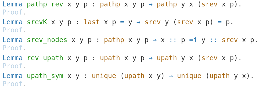
Maybe my proposal for (1) is overkill. It might be enough to just suppress everything except the "Proof." for folded one-line proofs. Here is a sequence of lemmas with short statements and multi-line proofs.
To me, that doesn't look too bad. It would be great if one-line proofs would be rendered the same. However, I don't know how to achieve this using CSS/JavaScript.
I guess we could even replace the folded proof with a button "Show Proof". That's certainly possible with JavaScript and would be most obvious, especially if it looks like a button. That would also solve the problem with one-line proofs.
I would prefer something unobtrusive. Something that comes to mind is some icon:
Lemma pathp_rev x y p : pathp x y p -> pathp y x (srev p). ↲
with a Show Proof tooltip on the ↲. That would have the advantage of providing a genuine blank line between lemmas. However, that might go against Fabians intention of making it obvious for first-time users (reviewers) how to unfold proofs.
What to you think? The precise Icon is of course up to discussion. Another option is the </v type of arrow also found in many modern UIs.
I'm in favor of the button, as it makes it very clear that there is interaction possible and buttons are a well-known UI element. While just the icon from Christian is locking slick, I prefere a more visible/suggestive method
What about "►Show proof." as clickable text? ( as in #2 from https://ux.stackexchange.com/questions/55990/what-is-a-standard-symbols-for-more-info-or-expand-to-show-more ?)
@fakusb @palmskog I'm trying to revive this issue, because I'm trying to update one of my projects and I still find this pretty annoying.
I find myself agreeing with Tobias:
Actually, I think the old solution was a reasonable compromise, the proofs were easy to find (even though the display was a bit flickering when moving the mouse) but it looked neat with the folded state. Perhaps the best solution is to just revert #4, not sure.
At the very least I I hope that we can reach agreement that #4, in general, does not improve things. So I would be in favor of reverting #4 until someone comes up with a PR that combines enhanced visibility for unfoldable proofs with a clean look for sequences of lemmas with one-line proofs.
Alternatively, we can keep both versions of the CSS in the repository so that one can use the "high visibility" version for code under review and the "sleek" version. Admittedly, I'm a bit worried about maintaining this, unless we can separate the "looks" from the functionality.
@chdoc what do you think of the solution we used in Lemma Overloading and some other projects: https://coq-community.org/lemma-overloading/docs/v8.11.0/coqdoc/LemmaOverloading.heaps.html
@chdoc what do you think of the solution we used in Lemma Overloading and some other projects: https://coq-community.org/lemma-overloading/docs/v8.11.0/coqdoc/LemmaOverloading.heaps.html
Looks like another reasonable compromise to me, even though the behavior on one-line proofs (the whole proof is initially semi-transparent and merely becomes fully-visible on click) is also less than ideal.